How design flexibility gives you a better dashboard experience
Our Head of Product Design and Creative Director, Tony Prysten, has worked in brand, design and advertising roles over the course of his career. Bringing his wealth of experience to Yellowfin, he now shapes the creative and UX experience of our product. Here he shares his thoughts on how design flexibility improves the dashboard experience.
What is good design?
Good design always looks good but good design isn’t just about looking pretty. Good design is about how someone feels after looking at or using something that’s well designed. A great example of this is getting into a ‘nice’ car. It might be the sound of the doors shutting or the feel of the steering wheel. Good design is the intangible little things that leave you with a good feeling because you can do what you need to without thinking about. When it comes to analytics good design is no different.
Take the dashboard as an example. When someone looks at a dashboard, we want them to come away with a feeling that it was easy to use, has a logical flow and that they understand the data in front of them. But they might not actively say that - they just might use the dashboard, easily discover something in the data and then take action on it or make a decision.
How does Yellowfin 9 give people design flexibility?
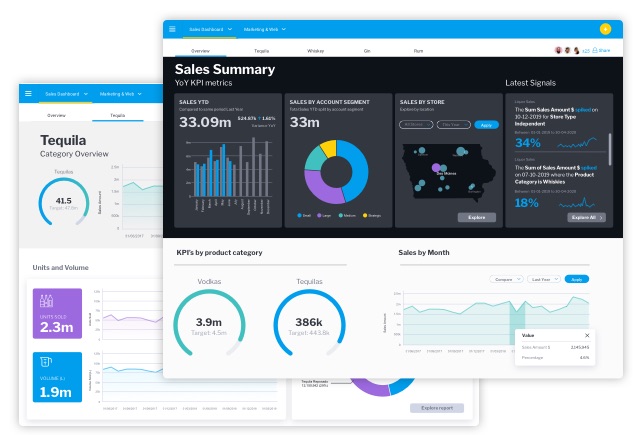
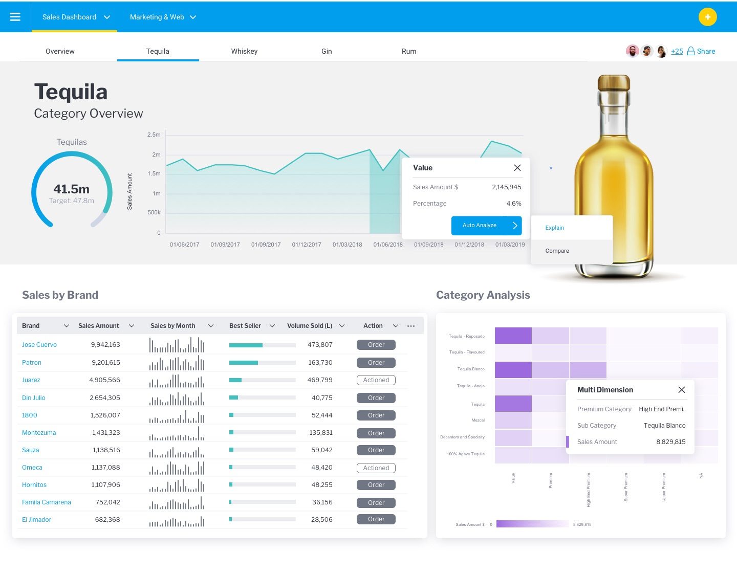
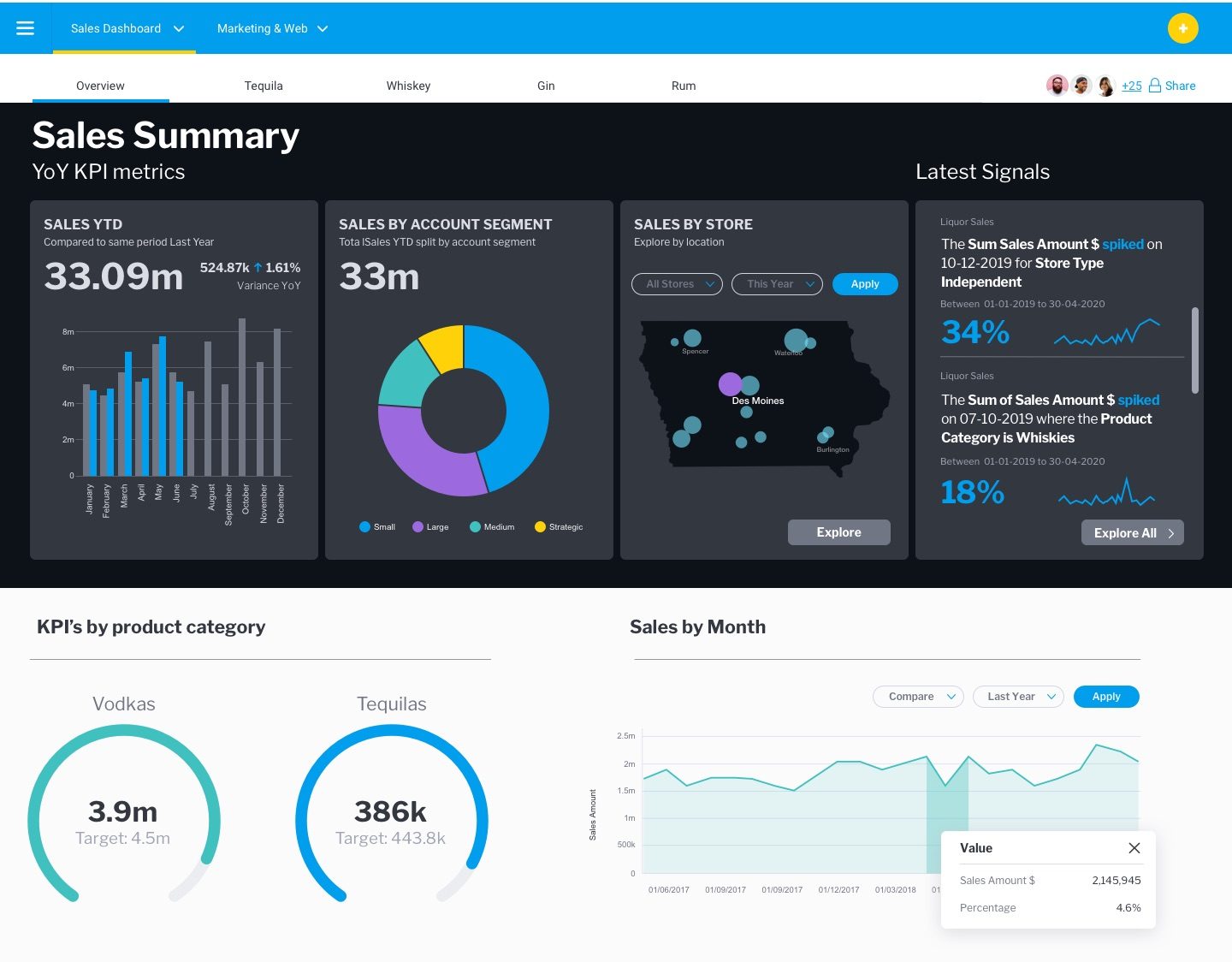
We've built Yellowfin 9 in a way that allows people to create any sort of dashboard that they desire. It has a UI similar to most graphical interface type software, so you're not bound by grids, colors or anything.
A new feature called ‘Blueprint’ allows dashboard creators to map out what they might be looking for. Advanced report creators and an amazingly flexible design platform allow any component of the design to be easily customized. The flexibility allows design elements such as colors and fonts to be created in a way that is optimal for a particular use case. So you're not bound by rigid grids or fixed components, the designer can actually do all the things that they would like to do to for that particular dashboard.
For enterprise, this means that your dashboard can be on-brand. Software development companies can code in actions using common developer languages or use no code at all and create very on-brand or on-platform looking dashboards that suit their exact analytics experience. This means they can take a step back and think about what experience is going to be the best for their end-users. Then they can work with someone who understands their data and someone who understands design principles to create a really good dashboard analytics experience for their users.

Can anyone use these tools to create a well-designed dashboard?
Design tools in the wrong hands don’t necessarily lead to a better outcome. Just look at most PowerPoint presentations. There's the ability within PowerPoint to do anything you want but how many times do we look up and see a PowerPoint that makes us cringe? That's because most people are not professionally trained as designers or don't have a good backlog of experience in design.
Design flexibility allows designers to follow proven design principles to help guide people through their dashboard experience. But good dashboard design is not purely the job of a designer. A really good dashboard experience is an iterative collaboration between the business user, analyst and designer. How? The business user defines what they need. The analyst understands the data and determines the best way to show the right information at the right time. Then a designer uses proven design principles to make sure that the design does not obstruct what the business user is trying to do and actually makes it easier for the right things to be identified and acted on.
With Yellowfin 9, we’ve created a platform that allows flexibility for the data analyst, the business user and the designer to come together so they can iterate great dashboard design.

What are the benefits of design flexibility for an organization?
Design flexibility helps you make data more accessible to your users. If your goal is to become a more data-led organization, the more that you can do to make data more accessible the better.
How To Deliver Modern Dashboards That Automate Action
Using low code and no code functions as well as augmented analytics, you can deliver powerful dashboards that automate action and integrate your workflows. Download your free guide.