3 Reasons Your Data Presentations Need Governed Data (And How That Makes You Look Smart)
Presentations. Slide decks. PowerPoint. Do these words elicit yawns? Even if they do, we all know that presentations are central in the business world for keeping people across the business up-to-date and informed of organizational progress and changes.
One frequently used presentation format is the end of month/quarterly update full of numbers and charts. But putting data in your presentations presents some issues. Sure, it’s easy enough to drop a chart into a Keynote, but it’s still a static image of the data.
- What if the data changes overnight?
- What if someone asks you a question about the data that can’t be answered using the visualizations you've shown?
- As a viewer, how do I know the data you are showing me is accurate? Where did it come from?
There is no data lineage to prove you’re using governed data in the average presentation - unless you go the extra step to manage it. Here are three ways that data governance can elevate your data storytelling through presentations (and make you look smart).
What is the Meaning of Governed Data?
First, let’s look at the more common term ‘data governance’.
Data governance is the management and protection of the company’s data through the use of people and technology, to guarantee correct, complete, trustworthy data that is secure from being tampered with. This part is critical - without data governance, there is no trust and without trust there is no action taken on the insights that are said to have come from the erroneous data. Data becomes useless without proper governance.
‘Governed data’ is the data and data visualization that have data governance (the management and protection) applied to them. You know the data is accurate, because you have implemented data governance processes to ensure that.
But how can you embed live, governed data visualizations into a presentation? Embedding visualizations is surely the only way around our issues.
Read More: Data Security and Compliance - 5 Essential Considerations

Benefits of Governed Data in Presentations
If you are able to place live, interactive data visualizations into your presentations, you instantly level-up the data story you are telling and win the trust and confidence of your audience. How? You can do these three things:
1. Demonstrate data accuracy
Having the live data directly from your BI and analytics platform in your presentation ensures you are using accurate numbers in your presentation. You can rest assured that the data is governed from within the BI platform and doesn’t hold an Excel typo that throws off your analysis. And you can communicate that to your audience and anyone that you share the presentation with.
2. Drill on demand
Having live data in your presentation also means that you can drill down into the data if further questions are asked. You don’t have to wait until after the meeting to search for the answers to the list of questions you wrote down. Live reports should be able to be explored with the full breadth of functionality offered via the core application. No more, “I’ll have to get back to you on that point.” You can drill to the detail as you present.
3. Reuse and recycle
Having live data also means you can reuse presentations time and time again and the numbers will always be up to data and accurate. You don’t need to add new visualizations to the slide deck at the end of every month. You just need to refresh the report and update the narrative. This is a huge time saving.

How to Put Live, Governed Data in Presentations
As great as all this sounds, you need to know how to make any of this possible. And fortunately, there is an intuitive solution to the governed data presentation issue.
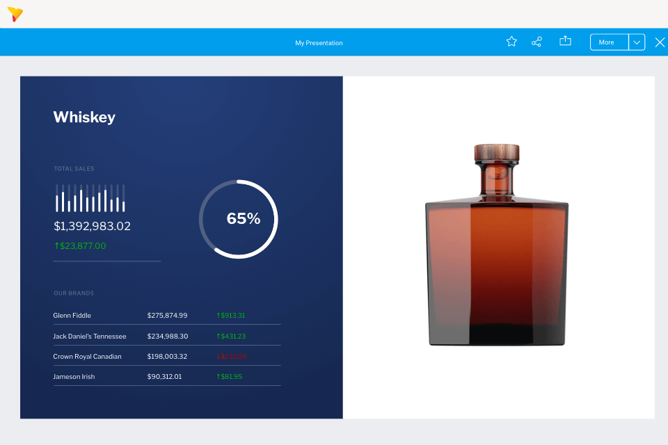
It’s a data presentation module that is interactive and fully integrated with a BI platform. It allows you to create data presentations with live data visualizations alongside other presentation content like images and videos. And it’s called Yellowfin Present.
Present lets you pull the data straight from the analytics suite into the presentation slides so that even if the numbers change overnight, you will have the most up-to-date data to present. If you want a snapshot from a point in time instead, you can include that too. But as it’s coming directly from the analytics suite itself, you can be assured that the data is accurate.
Yellowfin Present is an enormously powerful tool for sharing and communicating data to people of all business backgrounds. Organizations spend a lot of time and money working out how to capture information: Yellowfin Present enables business people to connect to and share that knowledge for better information management - and allows them to engage in data storytelling with governed data that’s accurate and reliable.
Download Now: Data Storytelling - Using the Power of Narrative to Influence & Engage the Business

The Need for Data-driven Storytelling in Data Presentations
It might seem fairly obvious to you why data is important - facts and figures about the progress of the department or organization. Having those helps you see progress and decline and indicates what needs to be fixed or built on. Presenting data to the organization is at the heart of collective process optimization and progress. But in a presentation, there’s more to the data than the figures read out (well, there should be).
The data comes with the narrative delivered by the presenter - which is data storytelling.
The data needs to be explained in the context of the rest of the business, the industry, and the wider economy. The supporting narrative may include qualitative data too, which can’t be captured in a chart. These are all essential to interpreting the cause of changes in the data, whether positive or negative. All of these feed into the data storytelling. And the data storytelling informs our insights, understanding, and resulting actions. After all, data doesn't speak for itself; not everyone can glean insights from just numbers alone. This is why having trusted, governed data in a presentation, and why data storytelling is so important.
Presentations are a great platform for data storytelling. In fact, that is a significant part of the world-famous TED talks that inform, entertain, and enlighten us on every topic under the sun.
“Numbers have an important story to tell. They rely on you to give them a clear and convincing voice,” said Stephen Few, Data Visualization Expert.
When we combine data with narrative, we help people understand the facts and convince people of their importance. When the data is understood and valued, there is a need to act. The data story should be compelling.
Brent Dykes, Forbes Contributor, said, “Unless we can improve the communication of these insights we will also see a poorer insight-to-value conversion rate. If an insight isn’t understood and isn’t compelling, no one will act on it and no change will occur.”

Steps For When You Next Deliver a Data Presentation
When you’re presenting data from now on, ask yourself these four questions:
- Is the data I’m presenting able to be easily cross checked by my listeners (i.e. is it visibly governed and therefore trustworthy)?
- Can I answer questions about the data on the fly to build confidence with my audience and reduce my time spent in data discovery later?
- Am I creating a narrative around the data, providing context, that compels people to act?
- Can I reuse this data set to minimize the time spent on building slide decks and maximize the usefulness of this presentation?
Present data stories that are governed for trustworthiness
Find out more about Yellowfin Present, our data storytelling presentation module that lets you present live data that's governed, and our data governance capabilities.