It’s true. I did some data research to work out if this post would work from a marketing perspective.
I mean, you would’ve too, wouldn’t you? Anyone who does any form of marketing should invest in a bit of data research.
Data-driven marketing is collecting data on your audience, topics that gain traction, headlines that grab attention and platforms that rack up shares besides much more. It’s the logical way to make sure your brand’s voice is heard. Improve on the tried and tested options and spot new niches where you can become the prime player.
Problem is, most of that data is spread across a range of marketing platforms. Each segment of data is separated from the other, so getting a holistic picture requires a lot of switching between tabs or mass copy and paste into spreadsheets. You can’t see the full-funnel campaign reports. And then there’s tracking down endless email chains from your ‘collaborations’ with colleagues. It’s far from ideal.
What about the hot seat questions flung at you by your manager? “How much did we spend on the new campaign? And can you break that down by cost per platform?”
Now you have to trawl through all your reporting platforms to extract the multiple pieces of data you need to give the manager a big picture view. Time drain! It’s just not that easy to track the full funnel of each campaign when it’s spread over so many mediums and platforms.
How about those campaign forecasts and end of month reports? Yeah, I hear you. Wrestling data into spreadsheets. Typos creating miscalculations. Having to start from scratch for each month’s report because the data won’t magically update itself.
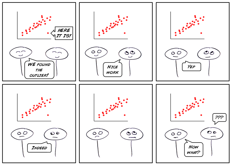
Then there are the outliers in your data. What happened? Why are they so different from the norm? Where do I find the factors that could’ve affected them?
And if you’re fortunate enough to have analysts who can do the complex stuff for you, by the time they get round to answering your report requests, it’s probably out of date, or not so relevant anymore. Maybe, you just can’t even remember why you needed it in the first place. Nightmare.
Go Big or Go Home
You want to do the data-driven marketing thing properly. You want to drive real success. You want to track your campaign’s performance from implementation to the five thousandth share and beyond. You want to know who picked up the message, from where and when.
If that’s you, here are six obstacles you’ll need to smash through for data-driven marketing success. And I’ll tell you how to smash them too.
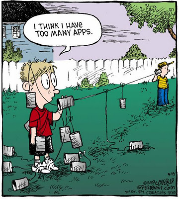
1. Too Many Apps and Platforms

This is critical. If you ever want to easily track every element of data around your marketing, you’ll need all your data in one place.
Multiple applications or platforms just create headaches. Copy and pasting raw data into spreadsheets that then need reorganizing and reformatting to make sense together is time-consuming, arduous, and delivers outdated, error-riddled ‘insights’. Not good.
How do you overcome it?
Find yourself a modern BI solution that has all the API connectors you need for your marketing platforms and applications – Google Analytics, Facebook, YouTube, Twitter… The BI solution can then pull all your data into one place and give you fast and easy options for consuming your data through trustworthy, real-time reports. Yes, reports that are never out of date! You can then combine the live application data with your internal business data sources so you can truly get the full picture. Some BI solutions even come with pre-built reports and dashboards for connectors so you can start using it to gains insights as soon as you log in.
2. Disjointed, Piece-by-Piece Performance Reviews
What if you could, instead, have a single, real-time, end-to-end view of campaign performance? Ideal, right? You can.
Nobody should have to piece together data from multiple silos to see the performance from click to final conversion. With a few simple tracking parameters, IT or analysts can easily automate daily campaigns to appear as full-funnel, real-time reports in your BI solution. Then you can review test results, deliverability and early stage revenue results with ease. Add calculations to your funnel report to show rates for opens, clicks, conversions, cart abandons and more. Then you can enhance your marketing efforts in line with the data.
3. Unhelpful Forms of ‘Collaboration’ (Including Instant Messaging)
We all know that email is a far cry from helpful when it comes to collaboration. But even switching to modern, instant messaging platforms to get fast action on your data is not great. You take screenshots, alternate between applications, message explanations, clarify and then get a response that is now referring to data that has already changed. It’s disjointed.
What if you could collaborate where your data was? What if you could comment directly on the report or dashboard you were looking at while adding annotations, attachments and links that all appear in a Facebook-like timeline? It’s all possible in the right BI solution. You could send a task to an individual that links to the live report. Or create a discussion thread with voting and polling. Then share the live report with anyone. Collaboration that makes sense.
4. Impossible Answers and Guesstimated Forecasts

The manager is going into her meeting in fifteen minutes and she needs to report on the campaigns’ successes and the forecast for next year’s performance. You hold the answers, and she’s only asking you now. To give the full report in fifteen minutes is impossible, right?
Not if you’ve got an intuitive BI solution with all your data in one place. Just share that live report and the statistics are now at her fingertips. Don’t have the right report? A drag-and-drop report builder with automated help pop-ups will help you work magic to deliver those fast, accurate answers. And forecasts can be generated at the click of a button. The BI tool will use your historical data to project forecasts and display trends, accounting for all your outliers. You can even change the data to see how that affects the outcome, and the forecast is ready.
5. Death by Creating End of Month Slide Decks
Every four weeks. You’ve barely presented the last end of month slideshow and you’re back into your slide decks doing the same thing from scratch again. Unending. Deadly dull. Tedious.
Or you could embed the live report or dashboard straight into a Storyboard that is integrated with your BI software and, hey presto, there are the latest reports every time you open it. (Just remember to change the month name on the first slide!) It’s so easy it feels like cheating. You can even drill down into that report right from your slide deck to answer those questions for which you forgot to prepare a slide. Simple. Next!
6. The Outliers with No Explanations

Then there are those outliers. You see that spike in traffic to your website? Looks great! But why did that happen? Or the vast difference in opens between two emails about the same event? You need some context.
With quality analytics platforms, you get the option of adding annotations directly onto the reports and dashboards. With notes detailing the promotion you ran that saw the spike in traffic, you and others can instantly explain the outlier. Actually, there’s a blog post you might like on the best practices for adding context to your data.
Take the Next Step
So you see, these are the biggest roadblocks to true, efficient data-driven marketing. And they can all be flattened with the right BI solution. Really, it’s very easy.
But I haven’t covered all of your headaches, and I’m sure you want more detail on how exactly all of this collaboration in the platform and predictive analysis works.
So I’m inviting you to joindata-driven marketing experts on a webinar that can help you be the data-driven marketing luminary you really want to be.
Join the live webinar on April 5th at 14:00 BST (or sign up and you can get the recording for afterward) and learn how to reach the place you’ve always wanted to be in marketing.
Level up your data-driven marketing here >