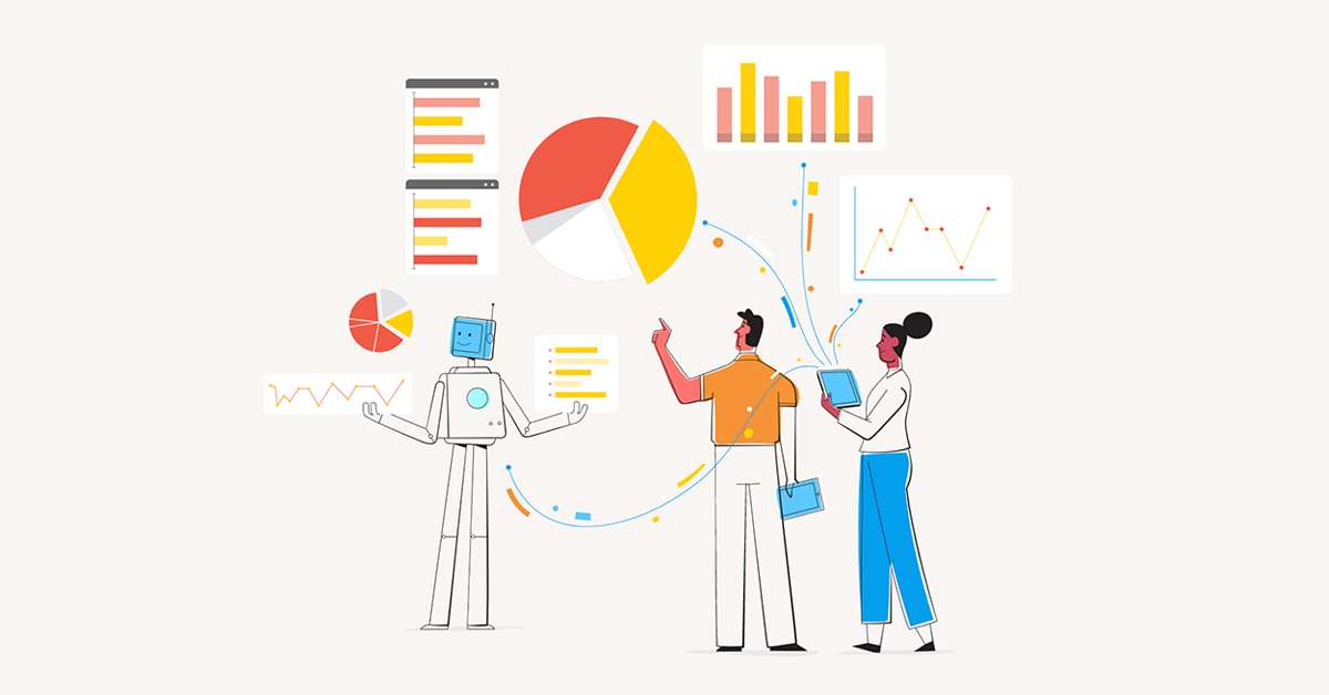
One of the really big trends that we're seeing in the analytics space, is the move towards talking about the analytics experience. Analytics experience is about supporting or triggering decisions and transactions. This is a shift from what I would describe as the passive use of analytics, where people were expected to use dashboards and reports that didn't add a lot of value to their transactions or decision making. The difference sounds subtle, but it's really quite profound.
For example, we're a big user of Salesforce. Salesforce has reports but they don’t do the job that we actually need them to do for us. The reporting that you get is pretty much about the here and now but it doesn't really drive decision making in terms of managing your sales organization.
Cue Yellowfin
So, we've extracted the data out of Salesforce, merged it with our financials and created a dashboard specifically designed to support our sales organization. This gives us much deeper visibility into where each deal is at and allows our entire sales organization to have a bridge to plan management meetings. They go through the current month and quarter, and look at every deal that is in the pipeline and discuss what deals they need to close to hit our numbers. They know what's in the pipeline, what's upside and what we’re forecasting.
Our team can then click on the dashboard and it'll open Salesforce so they can update it immediately. Those changes then flow through back into the dashboard in real-time so they can see the results in the meeting.
This sounds like terribly simple stuff but the reality is CRM software doesn't actually do it. The simple dashboard in Salesforce doesn't give you that detail and interactivity within the workflow. The dashboard is passive. It’s the old school way of working with data.

We’re using data to really drive behavior, make decisions and move the organization forward. Our sales dashboard has been built to optimize an outcome and a process flow rather than just show us a point in time. It supports active decision making and processes, so that we have much deeper visibility into every deal, and can manage our salespeople effectively. It’s not just a passive dashboard, it’s been built using best practices around analytics and with a view to how people will use the analytics to drive action, trigger or support transactions.
AX versus UX
This is where analytics experience differs from user experience. User experience (UX) looks at how a person moves through a process, but analytics experience isn’t about optimizing one transaction, it’s about delivering more data to inform people to make the best decision possible.
Analytics experience combines both UX and how people consume the information provided to them in an analytical process. Product managers often build product by working towards a target outcome - I want people to buy this or fill in that form. For the most part, it's not about choices. When dealing with choice, you need to provide people with information about how to make that decision, and that's where analytics experience comes to the fore. You can build a user experience for analytics, but unless you build the analytics to communicate that data well to help support the end users and their analytical needs, you’re not going to deliver what the end user needs.
What it comes down to
It comes down to design optimization. You don’t just throw the numbers on the page, but you optimize to actually communicate the data in a way that enables people to make choices, whether they’re strategic or operational.
By thinking about analytics experience and using analytics in this way, you create more than just a better user experience. You help people use data to drive behavior and that's what makes the analytics experience so exciting.
How design flexibility gives you a better dashboard experience
Our Head of Product Design and Creative Director, Tony Prysten, has worked in brand, design and advertising roles over the course of his career. Bringing his wealth of experience to Yellowfin, he now shapes the creative and UX experience of our product. Here he shares his thoughts on how design flexibility improves the dashboard experience.

