By Daniel Shaw-Dennis
We talk a lot of talk about being the world’s easiest Business Intelligence solution – purpose built for data consumers. But, it’s another thing to walk the walk. If you’re a Yellowfin customer, you know what we’re talking about.
Like many umbrella terms or phrases – used to describe a notion, idea or process – the end result is often derived and justifiable via the culmination of many small elements that, when combined, deliver an overall result, impression or experience.
At Yellowfin, we get it. Ease-of-use and an intuitive user experience, in the context of reporting and analytics, is about the total impact of many small features and functions. Color association for metrics and dimensions is one of those features.
Color association for metrics and dimensions
Color association for metrics and dimensions is a feature which lets you color code the content within your data sets, to promote fast visual information absorption and analysis.
For example, if I worked for a university and analyzed research revenues generated by faculty, I might set figures from the science department to always appear green. Or, I might color code by a metric like invoiced amount, setting it to always display in yellow. By doing this, you and your users know straight away what you’re looking at – you develop an instant understanding and association with certain colors and different aspects of your data.
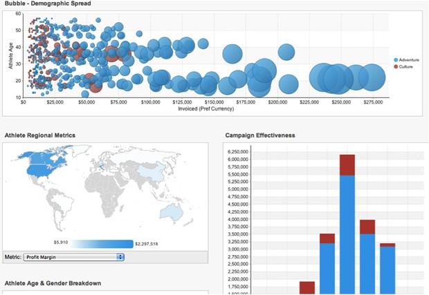
In the below example, our demographics are color-coded (blue/red):


Thanks to color-coding for metrics and dimensions, you and your users can now have a visual association with specific metrics and dimensions across your entire data set(s) and BI deployment.
Yellowfin: Making efficient and effective data visualization and data analysis easy!
