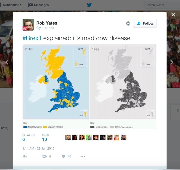
Damn it. I was really hoping, for the sake of comedy amidst a time of potential calamity, that it was true. Alas, the Internet, rather than the truth, has won the day once more.
Shortly after the leave campaign triumphed in the ‘Brexit’ vote – Britain’s referendum regarding its European Union (EU) membership – an amusing set of comparative map-based data visualizations appeared.

Brexit vote vs Mad Cow Disease: A convenient correlation?
Putting aside the important distinction between correlation vs causation for a moment, the apparent association between the two data sets provided more than a little comedic relief. On face value, it appeared the parts of Britain that voted to leave the EU matched exactly with the areas affected by the 1992 outbreak of Mad Cow Disease.
And, at first, it was enough to get people pretty excited – even some prominent journalists and economists were taken in by the convenient (and, in hindsight, suspiciously perfect) parallel:


Sadly, it wasn’t too long before avid social media users had debunked the suggested relationship.
Leave vote vs mad cow connection disproved
As it turns out, the images are the same – both mapping the location of Brits who voted ‘leave’ or ‘remain’. Some smart-aleck named Michael Von Freising, according to his Facebook account anyway, simply made a grey version of the same map showing the geographic disbursement of Brexit voters, adding a new key and year.
And, exposing our propensity to laugh first and seek the truth later, the image has been shared over 43,000 times since appearing on the day of the referendum result (June 24th, 2016).
As some red-faced media personalities have discovered, it’s always prudent to undertake some fact checking before publishing data as truth. And, incidents like this illustrate the importance of sharing data-based ‘insights’ in order to add contextual and complementary understanding and information.
Collaborative Business Intelligence validates data against third party sources
Similarly, in the context of reporting and analytics in an organization, the best Business Intelligence software and most complete data sets can’t safeguard against awkward mistakes if decision-making processes are undertaken in a vacuum.
The emergence and integration of collaborative decision-making modules within Business Intelligence (BI) platforms – otherwise known as CDM, or now more commonly referred to as Collaborative BI – greatly enhances the number of people within an organization who can benefit from fact-based decision-making. Additionally, and crucially, it can also act as a review cycle, through which other available information and human knowledge can be added or overlayed on that data to both validate its accuracy and add useful context.
Or, as Gartner puts it: "CDM combines social software with Business Intelligence. This combination can dramatically improve the quality of decision-making by directly linking the information contained in BI systems with collaborative input gleaned through the use of social software.”
Collaborative BI encompasses many features for sharing and discussing data analysis, as well as for deciding on collective action. Without going into unnecessary detail, here’s a simple example: Adding annotations to a sales report enables users to instantly understand the real-world events that gave rise to notable trends, without having to drill through to more granular detail. But, what it also does, is match peaks and troughs in the chart with actual events, thereby validating its accuracy.
For more on the importance of collaboration and BI, take a look at the collaborative BI report HERE >
