

The Business Intelligence Dashboard in 2025: What Is It & How to Use
The business intelligence dashboard, also referred to as BI dashboard or business dashboard, is an important data analytics tool for aggregating, accessing and analyzing operational metrics and key performance indicators (KPIs).
Business intelligence dashboards allow your organization to display its most important information on one screen, and share data and insights quickly for strategic planning and decision-making. Think of it as a centralized hub for monitoring, tracking and interpreting critical data at-a-glance, and a handy, constantly updated live overview of your business.
Today, understanding what a business intelligence dashboard is and how it works can help transform your reporting processes from gut feeling to data-led decisions. In this blog, we cover what you need to know when adopting BI dashboard solutions in 2025, including what new features that a modern business intelligence dashboard software solution brings like Yellowfin to the table.
What is a business intelligence dashboard?
The primary purpose of a business intelligence dashboard is to empower planners and decision-makers (in your organization, department or team) with concise and easily digestible overviews of operational data to improve business visibility and decision-making, and to accurately understand and track what is going on in the business at the moment of analysis.
Instead of traditional, static spreadsheets that need to be continuously and manually updated to stay relevant and up-to-date as a source for insights (which takes up a lot of time and repetition), BI dashboards enable your people to glimpse key information updated in real-time quickly, and form their own analysis of insights on display, faster and easier - when built and used correctly.
When you carefully combine the use of dashboards with other tools offered by modern embedded analytics platforms, such as AI analytics, data storytelling, and automated business monitoring, you can greatly improve time-to-insight and speed-to-value with your newly invested BI solution. See what Yellowfin offers in our dashboard video, below.
Who are business intelligence dashboards for?
Dashboards are designed to be a helpful information tool that can make important business data readily available to more people - not just your IT team, or data analysts.
BI dashboards can help communicate general performance through the entire organization, as well as metrics that are more specific to departments, teams, or C-suites, with results organized and condensed in a convenient visual format to suit more people.
Traditionally, legacy BI dashboards (previously called executive information systems) were only meant for use by executives or managers, which limited their value and visibility across departments. Legacy BI dashboards are also often more simplistic in what they offer, typically only providing limited customization of the dashboard design, lacking modern automation and AI-powered features, and only basic data visualizations.
Today, more organizations than ever are adopting analytics solutions that offer modern BI dashboards, to make access to data for use in important decision-making easier for all.
Related reading: The History of BI Dashboards
What are the key features of a business intelligence dashboard?
Business intelligence dashboards offer an array of options when it comes to displaying, exploring and analyzing collected data. While each BI solution on the market provides their own version of dashboards that vary depending on the vendor, the following features are generally considered to be core components of the best business intelligence dashboard solutions today - and all are included in Yellowfin BI.
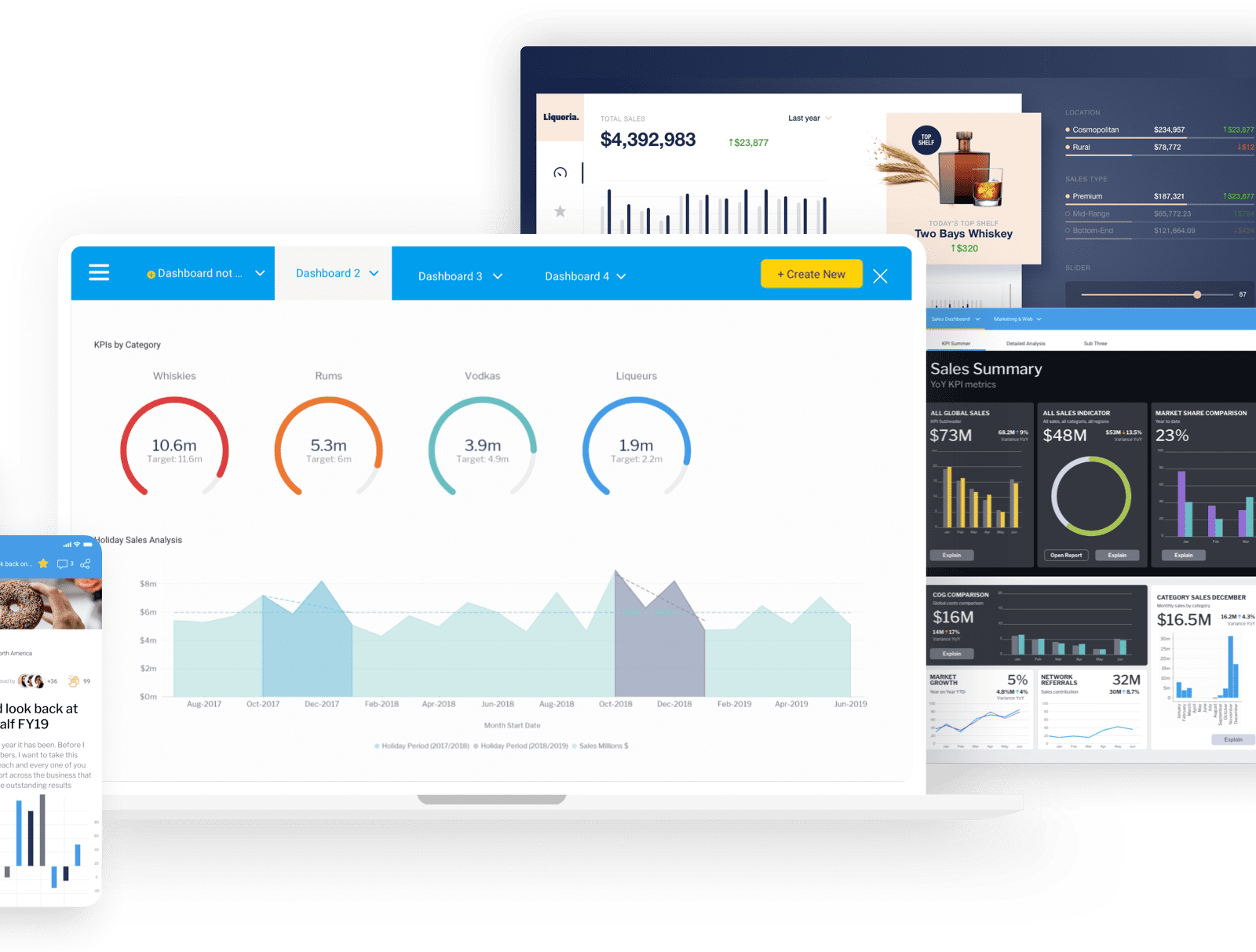
1. Customizable visual interface
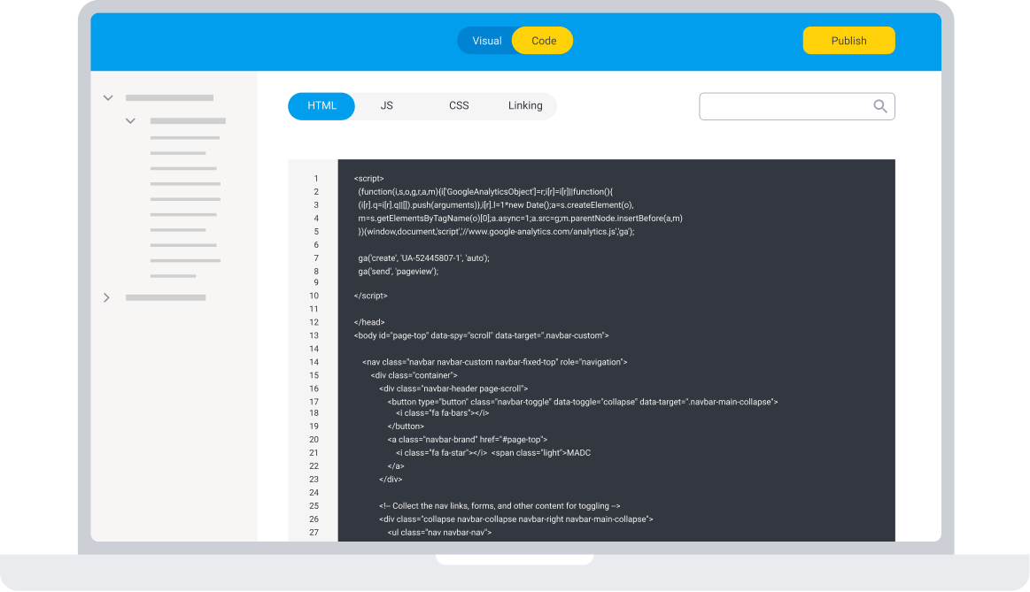
The presentation of information in the best BI dashboards should be highly customizable using dashboard design tools and interactive elements to display results in a user-friendly way. Numbers, text, images, charts, graphs and reports can typically be designed and grouped together in a specific layout to suit your audience (non-technical, executive, or expert) and help them engage with your analysis. The exact level of dashboard customization made available to users is dependent on the selected BI vendor - for instance, Yellowfin provides visual-based, drag-and-drop design tools to make designing a BI dashboard accessible, and offers a low-code, visual mode for non-technical users. For advanced use cases, Yellowfin dashboards also support Code Mode and the ability to use GTML, JS, CSS and other scripting languages for deeper customization.
Learn more: How to Create a Dashboard in Yellowfin - A Step-by-Step Guide
2. Data visualizations
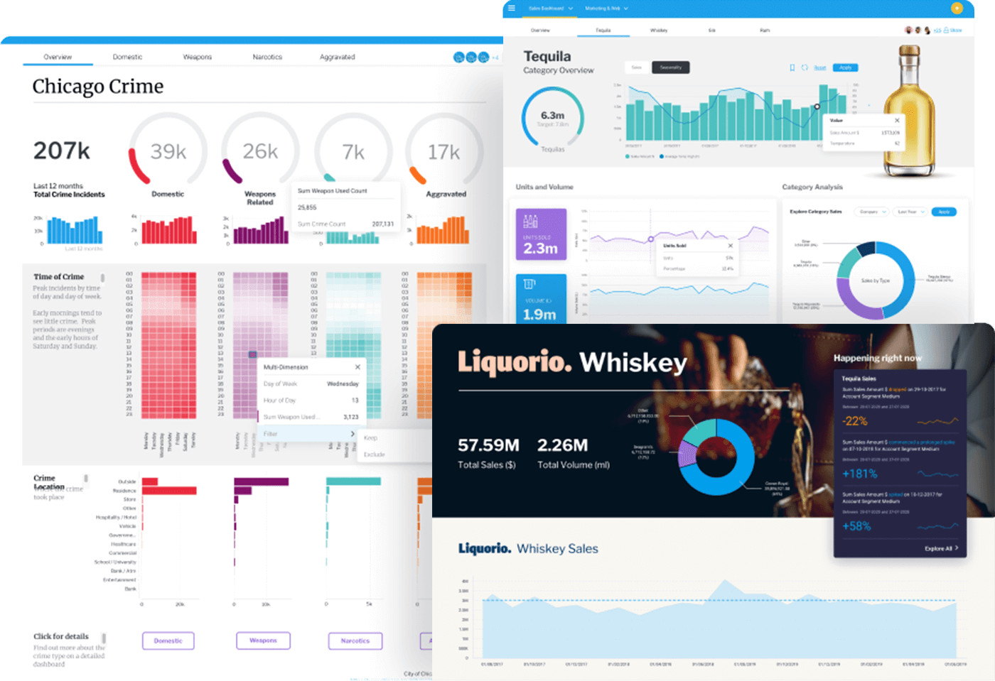
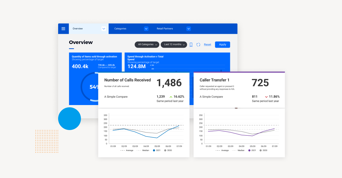
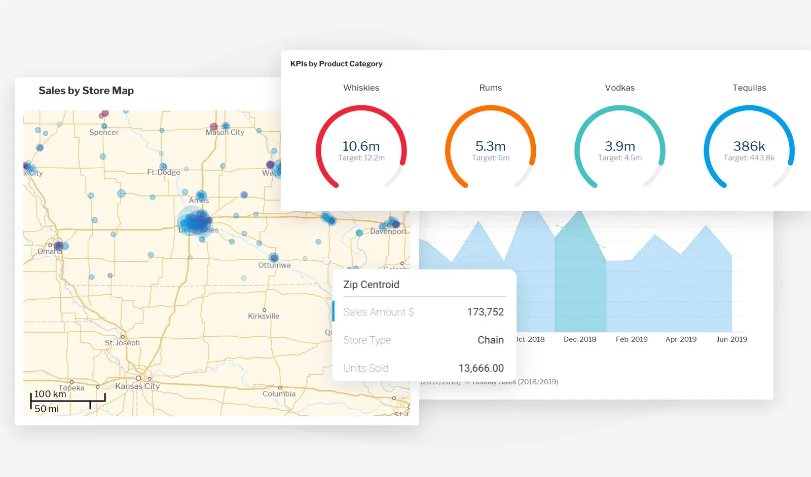
Business intelligence dashboards typically offer data visualization capability to help you convey your most important business metrics on one screen, such as graphs, charts, heatmaps, scatterplots, and more. Business intelligence and data visualization together help condense large volumes of information and represent operational metrics, KPIs, and tracked statistics in a visually engaging way, whether it is intended to show comparisons, relationships, and/or distributions between data-sets. The types of data visualization available to use in a BI dashboard, like all features, is largely dependent on the analytics vendor you select. For instance, Yellowfin’s dashboards offer 50+ visualizations out-of-the-box chart types, as part of its overall data visualization tools.
3. Data source connections
Business data typically comes from a wide range of sources on-premises and digital sources, such as cloud applications (Software-as-a-Service), CSV files, databases (DB2, JBDC, Oracle, SQL, etc), data warehouses, data lakes, and operational systems (Internet of Things, industrial equipment, etc). Business intelligence dashboards can be connected to these sources, but the exact level of data source connections supported depends on the analytics solution you select. For example, Yellowfin’s data preparation module, integrated at a metadata level (called Yellowfin View) supports a wide range of data sources out-of-the-box (with third-party connectors also supported) and helps transforms such data into a suitable format for exploration, analysis, report building, and to eventually populate your business intelligence dashboards with real-time data.
See more: Yellowfin Data Connectors
4. Real-time data
Datasets used in business intelligence dashboards are able to be refreshed and updated in real-time via cloud services, ensuring the information your stakeholders see on the screen is up-to-date, relevant, and reliable. This makes having a real time dashboard far better for general analysis than static spreadsheets, as they gather data automatically and direct from the source, rather than rely on individual users to make manual updates just to ensure the latest information is available.

5. Interactivity
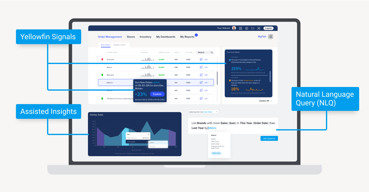
The best business intelligence dashboards allow for dynamic, user-driven analysis through the use of interactive features. Users can explore and manipulate data within data visualizations and reports using data filters (category, date range, country, etc) and drill-down (also called drill through or drill up) functionality (changing the level of detail displayed) to further customize their view of the data on the dashboard to meet their exact requirements. Certain BI vendors offer unique features to further enhance the interactivity of dashboards; for example, Yellowfin’s Assisted Insights feature allows users to right-click on any element in a Yellowfin dashboard and request an explanation or comparison, which is automatically generated using natural language processing (NLP). The results are explained in both high-level, easy-to-understand text and data visualization formats.
Read more: What is Yellowfin Assisted Insights? How to Get the 'Why' Faster
6. Sharing capability
The best BI dashboard solutions include ways to quickly share entire dashboards and their embedded reports and data visualizations, whether in the original format or exported in another format, as sometimes there are moments when key stakeholders require the information contained within but do not have access to Yellowfin, or are not a regular user of Yellowfin. For example, Yellowfin provides an exclusive feature called Yellowfin Export, a module which allows Yellowfin dashboard users to export reports and dashboards as PDFs, CSVs, DocX (MS Word files), Printer, Text and XLSX (Microsoft Excel).
7. Augmented analytics/AI analytics integrations
Modern business intelligence solutions have further streamlined the user experience of their BI dashboards through the use of sophisticated technologies, such as automated business monitoring and augmented analytics (also called AI analytics). The fact is that even with today’s dashboards being incredibly user-friendly, sometimes organizations face difficulties in getting their analytics users to engage with their newly invested BI tools, so the use of augmented analytics features aims to further simplify exploring a dashboard for information and create a whole new class of dashboard, often called the AI dashboard. For example, Yellowfin uses its Signals feature to automate the alerting, detection and analysis of key changes in data contained in your dashboards.
Learn more: The Critical Elements of Effective BI Dashboards
What are the different types of business intelligence dashboards?
BI dashboards have rapidly evolved from static to dynamic platforms that can be molded to suit specific audiences and use cases. Today, there are several types of dashboards provided by different analytics solutions vendors. In general, however, there are three broad categories:
Type #1 - Operational dashboards
Operational dashboards provide a real-time view of performance and help organizations manage day-to-day, short-term activities. These dashboards focus on highlighting whether operations are meeting targets and revealing any developing shifts or patterns. By showcasing a variety of KPIs, they offer a snapshot of past and current performance, enabling better forecasting, streamlining processes, and faster responses to potential issues.
Type #2 - Analytical dashboards
Analytical dashboards offer a deeper dive into data, facilitating the management and visualization of complex information to reveal key business insights. While operational dashboards focus on real-time performance, analytical dashboards leverage historical data to spot trends and make predictions by comparing information across multiple variables. They are primarily designed to support in-depth analysis by senior management, facilitate trend identification, comparisons, and forecasting. Due to the large datasets they handle, analytical dashboards are often more complex than other types and are better suited for an audience with advanced or expert knowledge of data analysis solutions.
Type #3 - Strategic dashboards
Strategic dashboards provide a high-level view of organizational performance, focusing on long-term strategy execution. These tools help identify trends and inform strategic decision-making. More complex than some other dashboard types, they offer enterprise-wide insights, tracking performance metrics against overarching strategic objectives. By summarizing company performance over extended periods (e.g., monthly, quarterly, or annually), they ensure progress aligns with established goals and timelines.
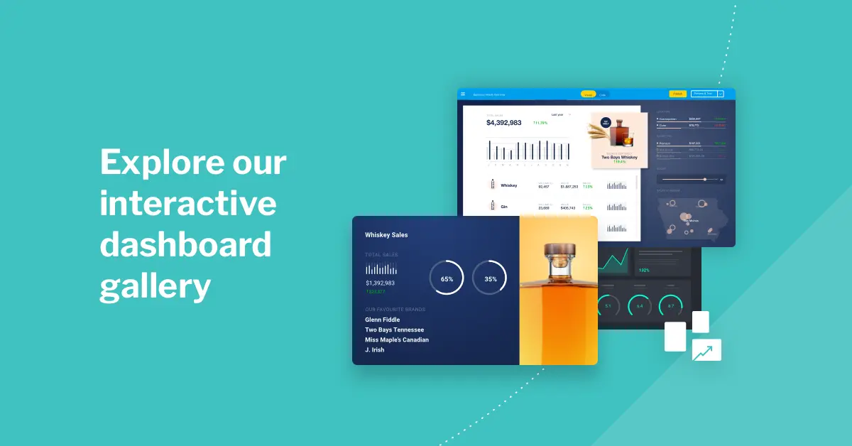
You can find visual examples of operational dashboards, analytical dashboards and strategic dashboards in Yellowfin’s Interactive Dashboard Gallery, and our more detailed guide: Operational, Strategic or Analytical Dashboard: Which Type Is Best for BI?
What is the difference between a business intelligence dashboard and report?
Reports and dashboards are highly interconnected. Understanding the differences between a dashboard vs report, then, is important to get the most insights and usability out of each format.
A report is a static snapshot of business metrics and performance at a specific moment in time. Reports typically collect charts, graphs, tables and text with pre-set filters and groupings to offer a more detailed, curated view of data (compared to dashboards, which can be interacted with via user-selected dimensions, filters and drill-downs to explore different views). Data in a report is grouped, filtered and organized to highlight key metrics that the report builder intends for the end-user to consume, making it best suited for a more comprehensive analysis of specific data.
Reports are just one of the many elements that make a BI dashboard, and they can be embedded into a dashboard to drill through and view in more detail. The presentation and interactivity of the embedded report is dictated by how you opt to design the dashboard.
What is the recommended best practice dashboard design?
A BI dashboard is only effective if the way you present your data is able to help your audience identify, interpret, understand, and act on the data you collect in it.
Sometimes, presenting key metrics in graphical or tabular form is not enough to ensure your dashboard end-users will actually find value from the information, or be able to use it; this is where following best practices for dashboard design.
The most important considerations of good business intelligence dashboard best practices for design center on:
- Clean, clear layouts for an effective user experience
- Legible language, fonts and typography
- Considered use of color, images and icons to simplify complex data or categories
- Layout, grouping and hierarchy to tell a structured data story

For more detailed information about BI dashboard design tips and considerations, we highly recommend downloading our free whitepaper on dashboard best practices.
What are the benefits of a business intelligence dashboard?
The benefits of BI dashboards for both analytics use within your organization (enterprise) and for your software product’s customers and end-users (ISV) are numerous.
Having access to real-time data to monitor operations, optimize processes, and improve overall business performance is a capability that cannot be underestimated, especially if you want to cultivate a data-driven culture and get your users to start making data-led strategic decisions. Here are some of the biggest advantages of dashboards today.
1. Enhanced data-driven decision making
By presenting complex data in an easily digestible visual format, dashboards eliminate guesswork and subjective interpretations. Whether it’s forecasting future sales, assessing customer behavior, or evaluating marketing campaign effectiveness, dashboards provide insights needed to make strategic choices. This fosters a data-driven culture where decisions are based on facts, not assumptions, leading to improved outcomes and a competitive edge.
2. Real-time operational monitoring & optimization
As mentioned previously, real-time data access is a cornerstone benefit. You can instantly visualize KPIs and operational metrics and even create a specific KPI dashboard for continuous tracking of these most important metrics. This allows for immediate identification of bottlenecks, inefficiencies, or emerging trends. For example, in a manufacturing setting, a dashboard can track production line speeds and alert managers to slowdowns, enabling swift corrective action. In a sales environment, real-time sales data can identify top-performing product categories, storefronts or regions, allowing for resource reallocation and targeted marketing campaigns. This proactive approach ensures optimized processes and maximized output.
3. Proactive problem detection & prevention
The ability to detect and prevent potential problems is a significant advantage. Dashboards can be configured to monitor critical thresholds and trigger alerts when deviations occur, such as when using BI dashboard solutions offering automated business monitoring (an example would be Yellowfin Signals’ automated alerting thresholds). For instance, a dashboard tracking server performance can alert IT administrators to potential outages before they impact users. In a financial context, dashboards can identify unusual spending patterns or potential fraud, enabling timely intervention. This proactive approach minimizes risks and prevents costly disruptions, safeguarding business continuity.
4. Improved collaboration and communication
BI dashboards facilitate seamless collaboration and communication across teams and departments. By providing a centralized platform for accessing and sharing data, dashboards ensure everyone is working with the same information. This promotes transparency and alignment, enabling teams to collaborate effectively and make informed decisions collectively. For example, sales and marketing teams can use a shared dashboard to track campaign performance and adjust strategies in real-time. As part of its interface, Yellowfin provides an in-built display of report and dashboard authors and contributors to help teams and departments connection and collaborate on content.

5. Increased customer and user satisfaction
For ISVs, integrating BI dashboards into their software products enhances the value proposition for their customers. By providing end-users with access to real-time insights, ISVs empower them to make data-driven decisions and improve their own business outcomes. For example, a CRM platform with integrated dashboards can provide sales teams with real-time customer insights, enabling them to personalize their interactions and improve customer satisfaction. This added value leads to increased customer loyalty and retention.
More benefits: 8 Business Benefits of BI Dashboards
What are the challenges of business intelligence dashboards?
There is a recurring challenge among businesses to get their end-users and clients to use their newly invested business intelligence dashboards due to perceived complexity of certain BI solutions, as well as debate around whether dashboards are already dying as a data tool (see: the death of the dashboard). However, BI vendors such as Yellowfin are providing streamlined, sophisticated ways for end-users to get started with dashboards easier and see their value in their workflows faster. Still, challenges in BI dashboard adoption remain, such as:
Data quality and integration issues
Data quality is paramount for any BI dashboard deployment. Inconsistent data from silos undermines dashboard accuracy. Robust ETL and data governance are vital, and while integrating diverse sources (CRM, ERP) is complex, without reliable data, insights are flawed. The high level of queries for data integration BI and data quality dashboards show this concern among many enterprise and ISV businesses today. Data integrity is crucial for effective dashboards, so choosing a BI dashboard vendor that provides support and tools in this area is very important.
Implementation complexity
Implementation of BI dashboards can be complex. Platform selection, configuration, and scalability require expertise, while data modeling and access management add challenges and potentially hidden costs. Licensing and maintenance costs can also be significant if you don’t select the right type of partner. We recommend choosing a flexible, scalable, and budget-friendly embedded analytics solution to lower TCO and increase ROI.

User adoption and training
User adoption is vital as lack of training and perceived value can hinder the usage of business intelligence dashboards and analytics overall, making your new investment a waste. Your users need to be able to navigate and interpret data effectively, so training, user-friendly dashboard design, and support are key. Addressing feedback within your business and among your dashboard user-base ensures success and can help you better foster a data-driven culture.
What are the industry use cases for BI dashboards?
Business intelligence dashboards are highly extensible and flexible analytics tools that can be tailored to several business use cases depending on the sector, KPI requirements and more.
Retail
Retailers leverage BI dashboards to monitor, track and act on data related to their eCommerce platform or customer experience, such as spending patterns, customer satisfaction and online orders. Retail businesses more on the supply chain side of the industry also use business intelligence dashboards for real-time updates on product sales, delivery times and stock levels, which they can view at a glance, and drill down into individual reports and charts/graphs when they need additional detail for analysis and decision-making.
Read more: How BI Dashboards are Changing the Retail Industry Landscape
Healthcare
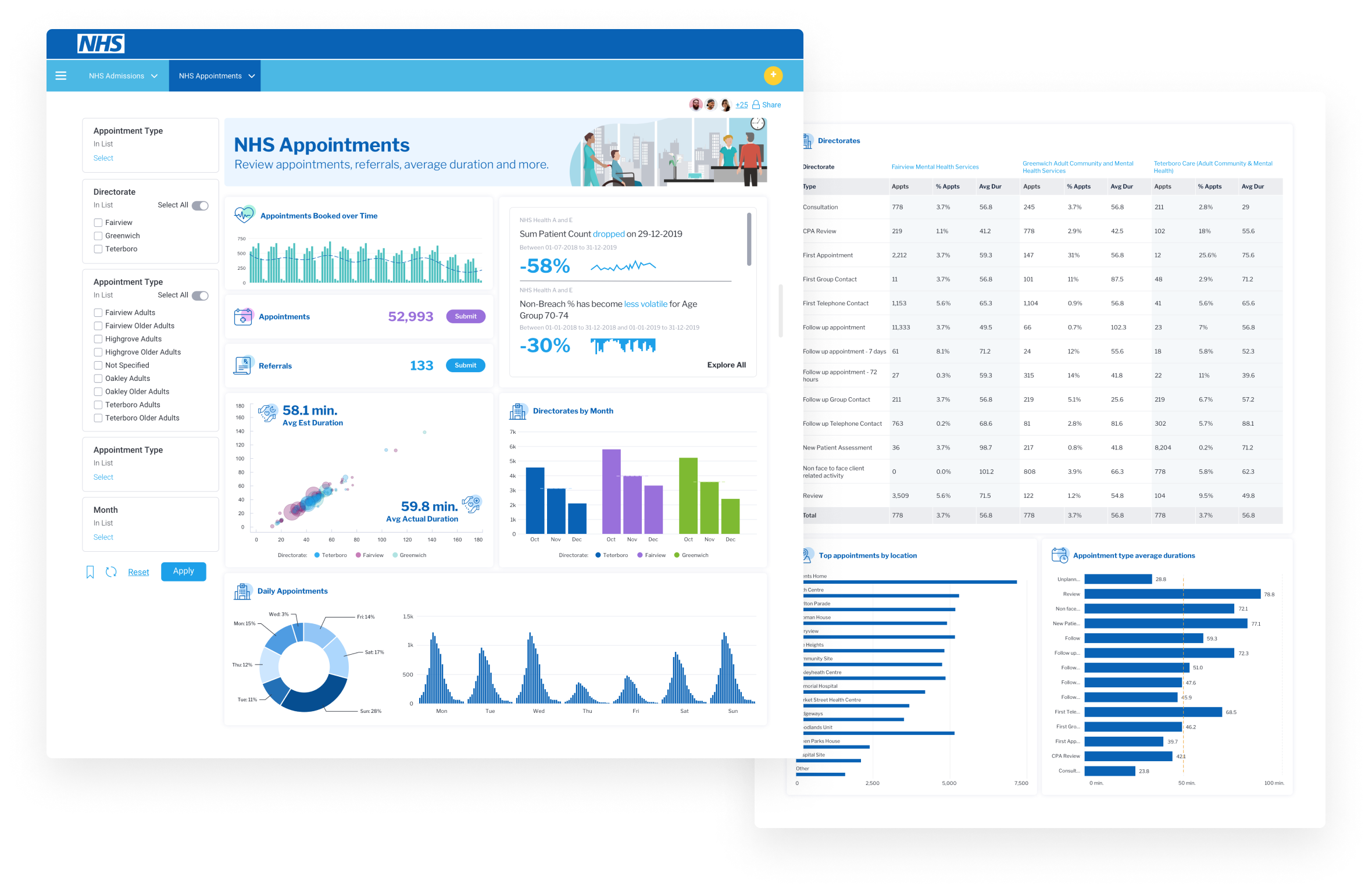
The healthcare sector uses business intelligence dashboards to track patient outcomes, resource allocation, and operational efficiency. Hospitals can monitor patient wait times, bed utilization, and readmission rates with the right BIdashboard set up, and even use them to analyze treatment effectiveness, enabling data-driven decisions for improved patient care. Real-time data access via dashboards can also help manage staffing, equipment, and supply chains, ensuring timely and efficient service delivery. One of Yellowfin’s healthcare customers, the North Tees and Hartlepool NHS Foundation Trust, uses BI dashboards to achieve just this.
Case study: Real-Time Patient Reporting Unlocked with Yellowfin at North Tees NHS
Manufacturing
Manufacturing organizations use BI dashboards to monitor production lines, inventory levels, and equipment performance. Having real-time data via dashboards allows them to identify bottlenecks and inefficiencies, enabling proactive adjustments, and track KPIs like production yield, downtime, and quality control. This allows for optimized resource allocation, reduced waste, and improved overall equipment effectiveness. One of Yellowfin’s manufacturing customers, DENSO, uses Yellowfin dashboards to collate product information and internal survey results in one easy-to-access place.
Case study: Yellowfin Boosts DENSO Data Platform, Engages 14K Users
Financial services
Financial institutions use BI dashboards to assess risk, detect fraud, and monitor compliance. They can use the real-time data that business intelligence dashboards provide to track market trends, portfolio performance, and customer transactions, and analyze factors such as risk exposure and potential fraud patterns to ensure regulatory compliance. Dashboards can also provide insights into customer profitability and operational efficiency, or simplify what is generally highly complex financial information in one tailored, summarized overview. One of Yellowfin’s financial services customers, 4apps Group, did just that using Yellowfin dashboards.
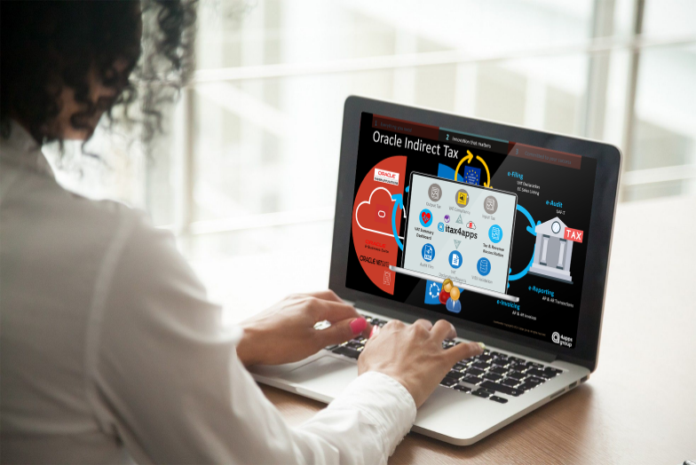
Case study: 4apps group simplifies VAT reporting, unlocks real-time data sourcing with Yellowfin BI
What is the difference between legacy and modern BI dashboards?
Ultimately, the best BI dashboard solutions today are ones that offer modern features that further streamline the usage of the dashboard for non-technical business people and extend the capability of the tool to provide real-time tracking of metrics and actionable insights. With the deeper integration of AI analytics, contextual analytics, data storytelling and automated business monitoring in today’s business intelligence dashboards (such as Yellowfin’s), selecting a vendor that provides these sophisticated technologies on top of their core dashboard component is crucial to providing your users with the best possible solution for their data requirements today.
Related reading: 4 Key Features of a Modern BI Dashboard
Next steps: Explore Yellowfin business intelligence dashboard software
Leverage the best business intelligence dashboard tools in 2025 with Yellowfin's comprehensive embedded analytics suite. Get a demo today.