

Choosing the Right Chart Type for Good Data Visualization
An effective dashboard requires careful design to present data in the best way, and to help more people (users, customers) find insights without feeling overwhelmed.
Yellowfin BI comes with a wide variety of chart types as part of its extensive data visualization tools, and while it is tempting to use a lot of eye-catching charts to make a dashboard that looks great, it is important to select the right chart for the right situation.
In this blog, the Yellowfin Japan team will go through some charts that should be used with care, to deliver more effective dashboards and reports for your customers and users.
Pie Charts
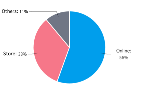
Pie charts are a very useful type of chart for showing the relationship of parts to the whole, and communicating percentages. For example, when showing the sales ratio of each sales channel, a pie chart is easier to grasp at a glance than a bar chart.
On the other hand, there are many situations where you should be careful how you use it.
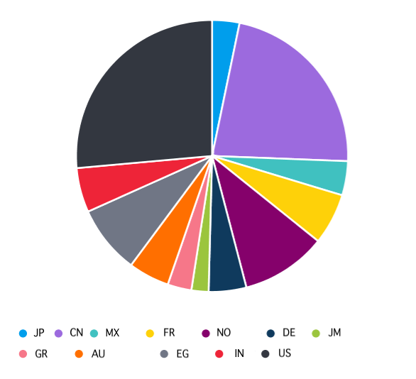
For example, if you try to display too many elements, the pie chart will be hard to read. It may be best to limit the number of items displayed in a pie chart to a maximum of five or six. Pie charts are also best when you want highlight proportions rather than actual values. If it's important to show actual values in a chart, the pie chart type is not best fit. Below is an example of a pie chart being used when another chart type would be better.
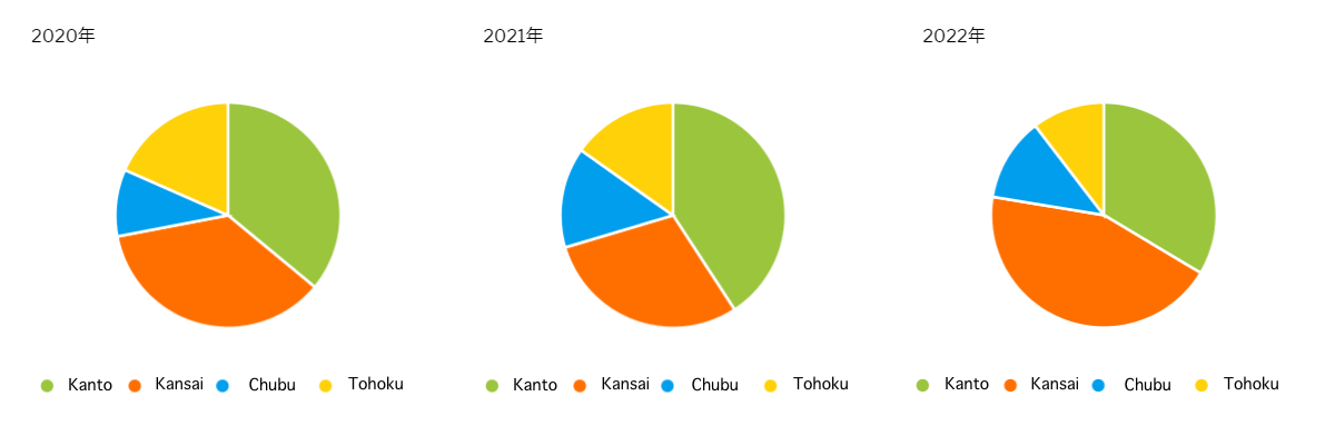
Attempting to compare multiple factors can be challenging. Below is a pie chart for the purpose of comparing changes in sales share over a three-year period. If we focus on the changes of the figures for the Kansai (West side of Japan) branch in orange, it is by no means easy to see visually how the figures have changed over the three years.
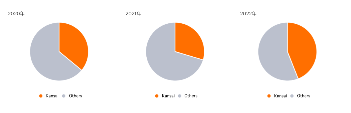
In this case, as shown below, grouping all but the Kansai branch under ‘Others’ will make it easier to see at a glance how the Kansai branch's sales share has changed. When multiple pie charts are placed side by side for numerical comparisons, limit the number of elements to two at most.
3D Charts
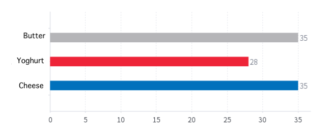
Although used less and less these days, 3D charts are known to make important figures more difficult to understand if you use it at the wrong time. For example, when analyzing the sales of three product categories, a bar chart shows that only yogurt sales are low.
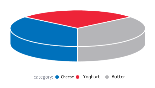
However, when the same thing is represented in a 3D pie chart, all three appear to have approximately the same proportions, as demonstrated below, making it difficult for your end-users consuming the report to ascertain the differences in sales at-a-glance.
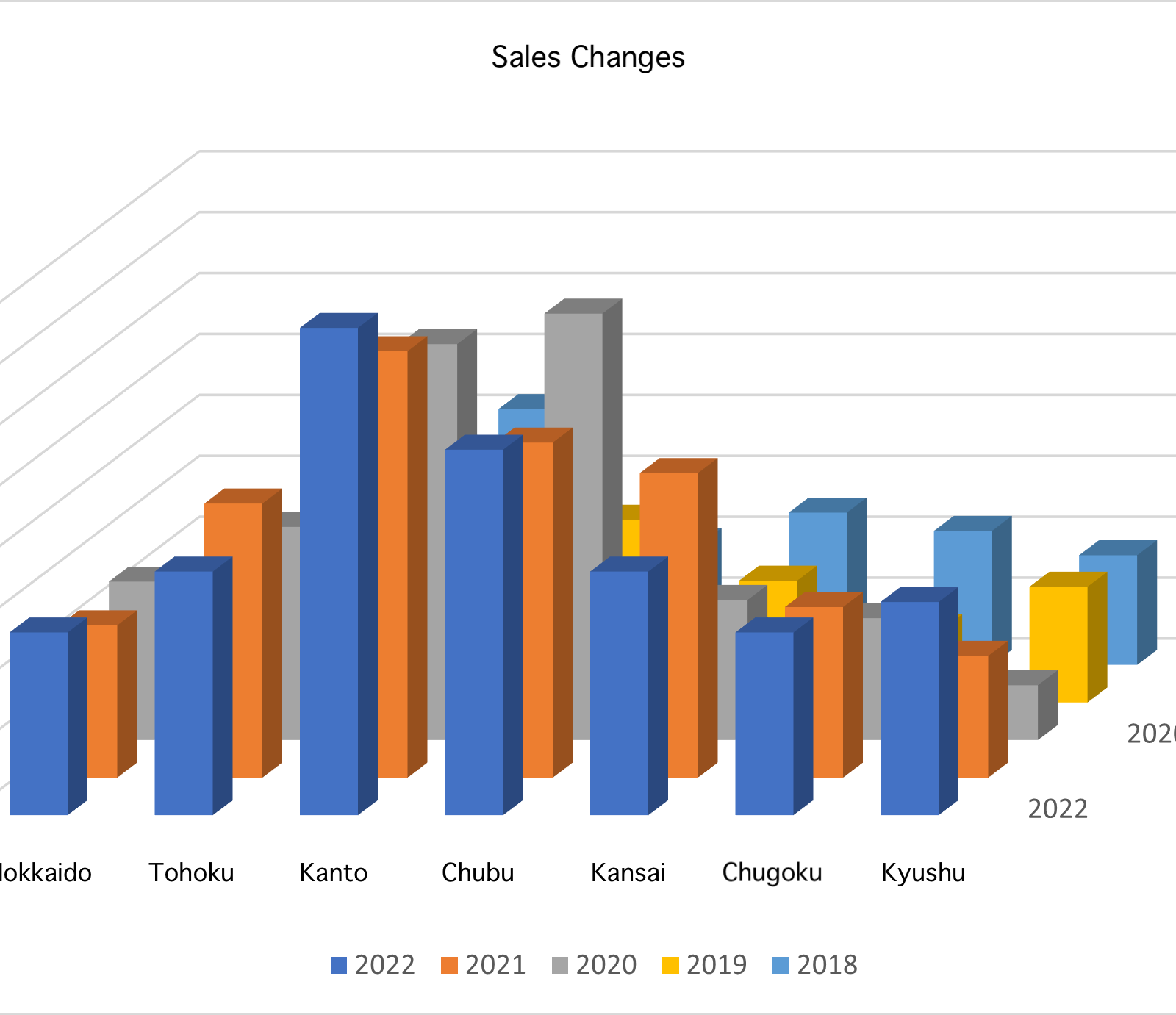
The same type of chart does not exist in Yellowfin, but if you create a 3D vertical bar chart in Excel or other software, the bars in the back may not be visible. This would make it meaningless to visualize numerical values. Here is an example to show you its complexity.
Although 3D charts may look good at first glance, it may be better to use alternative chart types in order to represent important metrics and the differences between categories.
Labels
When the number of characters in a label displayed on an axis is large, you may be tempted to tilt the characters to save the display area of the label. This is less of a problem when the number of elements is small.
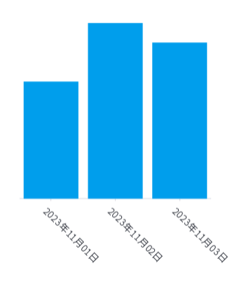
However, as the number of strings increases, it becomes difficult to determine which string is related to which element, as demonstrated in the chart below.
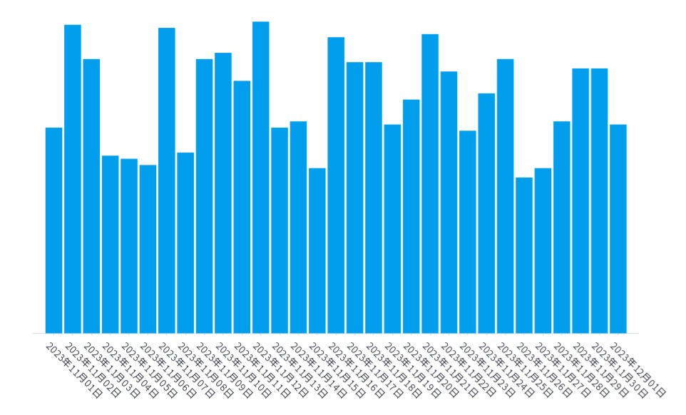
This is a good example of why it's important to prioritize other options, such as selecting a horizontal bar chart, before considering tilting the axis.
Related reading: Top 10 Essential Types of Data Visualization
Colors
Poor color recognition, also commonly referred to as color blindness, occurs in 1 in 20 men (5%) and 1 in 500 women (0.2%) among East Asian people. Color blindness varies widely by ethnic group, with 8% of Caucasian men and 4% of Black men reportedly affected. This is the reason why color blindness is considered important in universal design (source: Japan National Institute of Genetics).
For example, a table showing year-on-year sales growth with five levels of color representing good and bad can be inaccessible for certain users to analyze, as some people may not be able to recognize colors clearly.
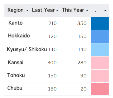
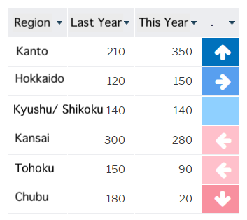
In consideration of cases where color differences are not clearly recognizable, it would be the ideal design practice to use icons together, for example - as shown below.
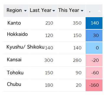
Alternatively, you can display a numerical value to assist those who consume the report further.
Ultimatetly, it is always important to be careful and considerate of accessibility in design when you want to provide a dashboard, chart or report that is easy for everyone to use.
Discover Yellowfin dashboards
Explore the vast charting library and data visualization capabilities of Yellowfin for your operational reporting. Try our demo today.