
Our Content Creation Canvas was introduced in Yellowfin 7.3 – almost overnight enabling data analysts to build enhanced visual representations of their data, and making it a captivating and informative experience for everyone to consume.
However, by providing chart widget enhancements, we were faced with an interesting conundrum soon after:
These widgets didn’t change with the data.
We knew how important this would be for our users to utilize widgets in improving cognition, so we went straight back into the labs and prototyped a few ideas.
The answer? Conditional Canvas Widgets.
Say again?
That’s right, we have now brought the concept of Conditional Formatting in reports to our Canvas – extending this functionality to Text, Shape, Image, and Icon Widgets.
What this means to our users is that the Canvas Widgets can now reflect the current status of their data, and depending on what goes into the Canvas, the next action to take.
How does it work?
In Yellowfin 7.3+, a new Conditional Formatting panel has been added to each Canvas Widget:
![]()
Since a Canvas can have many Widgets, users can now provide names in order to track them and the respective conditional formatting rules applied.
The process of adding a Conditional Formatting rule here is also very similar to the one in the Report with the ability to add multiple rules as well:
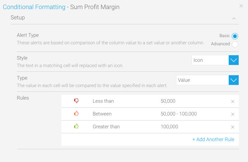
In Yellowfin 7.3+, we have also refreshed the Conditional Formatting set up menu:
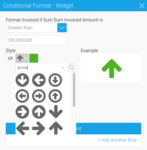
Depending on how users set these rules, data updates will now be able to affect Canvas Widgets stylistically which means changing colours, icons, and even hiding/presenting them as needed.
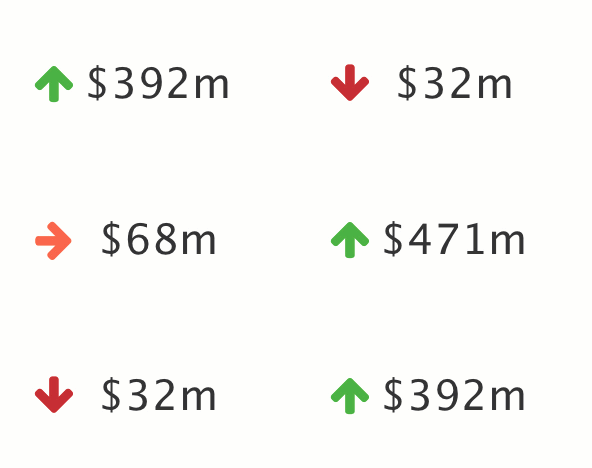
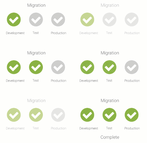
Here are a few examples of Conditional Canvas Widgets in action with Yellowfin 7.3+:
|
Streaming Financial KPIs |
Workflow Status Updates |
 |
 |
Imagine the possibilities that Yellowfin 7.3+ now brings to your analytic apps.
Excited? So are we!
Register for the official Webinar launch HERE