The Critical Elements of Effective BI Dashboards
A business intelligence (BI) dashboard is an essential tool for managing and monitoring your business data. Well-designed BI dashboards can help you quickly and easily understand your company’s performance, identify trends, and make informed decisions.
In this article, we will discuss seven key elements of an effective business intelligence dashboard. By understanding these elements, you can create a powerful tool that helps you manage your business data effectively.
What Makes a Good Business Intelligence Dashboard?
A business intelligence dashboard is a graphical representation of data that can be used to help analysts and decision-makers make informed decisions. BI dashboards are created using specialized analytics solutions, such as Yellowfin or Power BI, and can be used to monitor key performance indicators (KPIs), to track changes in key business metrics, and to monitor the overall effectiveness of your adopted BI solution.
A BI dashboard is different from a standard report in that a BI dashboard is designed to be interactive for its intended audience, who can use a BI dashboard to explore and analyze your data in a way that is easier and more in-depth than a static report or spreadsheet can allow.
Some elements of a modern BI dashboard include:
Clear and concise data visualizations
Easy-to-use navigation
Effective communication and collaboration tools
Data discovery and drill down features
Natural language query integration
Data storytelling integration
Read: 4 Key Features of a Modern BI Dashboard
The 7 Must-Haves for Successful BI Dashboards
Both enterprise and individual users of business intelligence (BI) applications require effective dashboards to make the most of their data.
A dashboard needs to be effective if it is to help users make informed decisions. The data contained in a BI dashboard can provide valuable insights into the business.
When used effectively, a BI dashboard can help managers make better decisions and improve their understanding of their company's performance.
1. Data Visualization
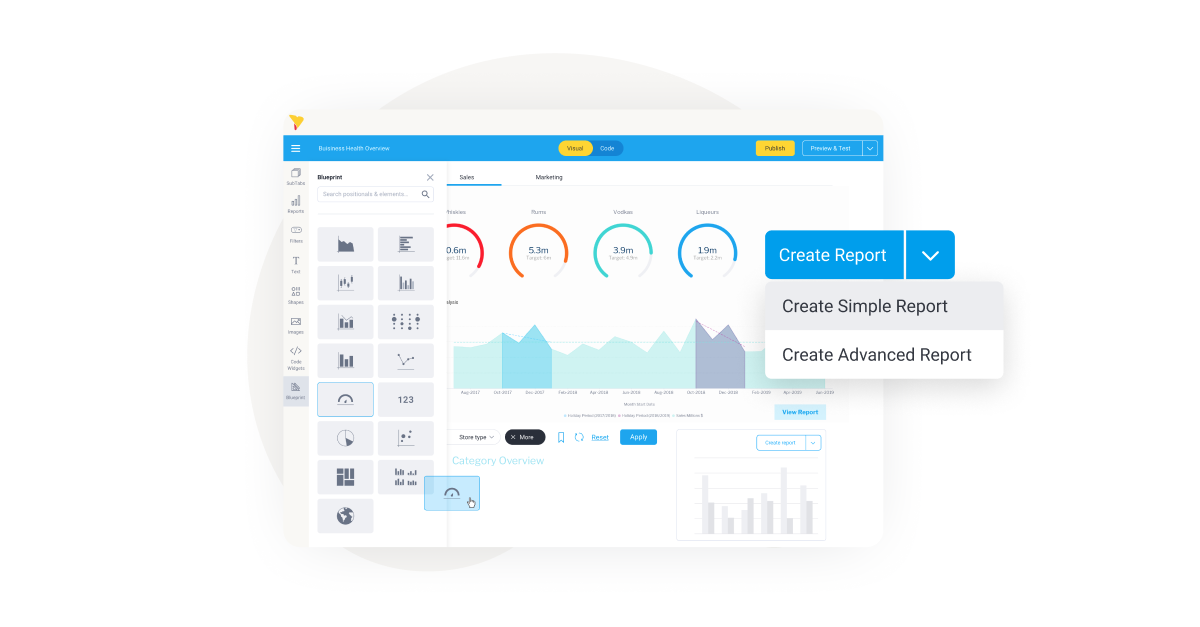
The first key element of an effective BI dashboard is data visualization. Data visualization allows you to quickly and easily understand your company’s performance and identify trends. Good data visualization can help you quickly identify problems and opportunities, and make informed decisions.
Some common data visualization techniques include bar charts, pie charts, line graphs, and radar charts. You can find many free tools that allow you to create functional BI dashboards using these techniques.
Read: 7 Key Benefits of Data Visualization Tools
2. Dashboard Layout
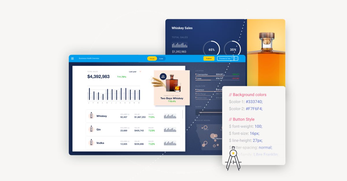
The second key element of an effective BI dashboard is the layout of the dashboard itself. The layout should be easy to use and navigate, and it should be designed to display the data in a way that is easy to understand.
Good layout techniques include using tabular data to organize the data on the dashboard, using large fonts to make the data easy to read, and using icons to indicate key data points.
3. Global Filters and Reporting
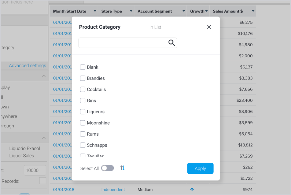
The third key element of an effective BI dashboard is global filters and reporting. Global filters allow you to view data from different perspectives, and reporting allows you to see the results of your analysis in a concise and easy-to-read format.
Global filters can include filters for performance indicators, business areas, or customers. Reporting can include reports on data trends, performance metrics, or customer insights.
4. Customizable Views
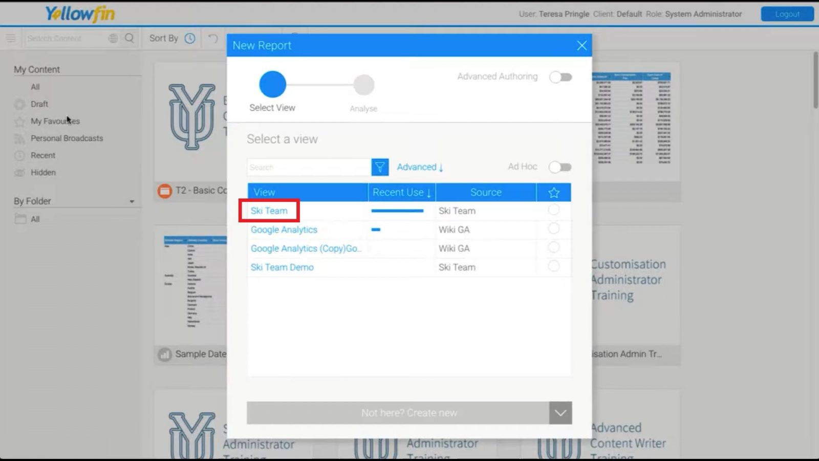
You can create custom views by using filters and reports to extract specific data sets from the overall data set. You can also create custom views to display data in a specific format or style. This makes it easy to find and analyze specific data sets.
5. Sharing Data Sets
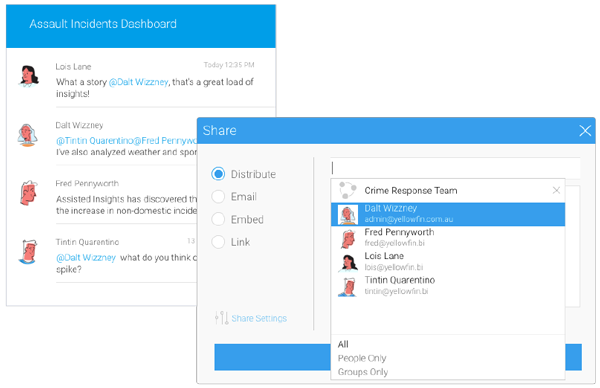
Sharing options for data sets is one of the most important aspects of BI dashboards. By sharing data sets, organizations can improve the quality and accuracy of their data. Additionally, by sharing data sets, organizations can help other organizations improve their understanding of their own data. Not all vendors support collaboration and share options, so be sure to vet solutions accordingly; pictured above is Yellowfin's share options for dashboards and reports.
6. Dashboard Tabs
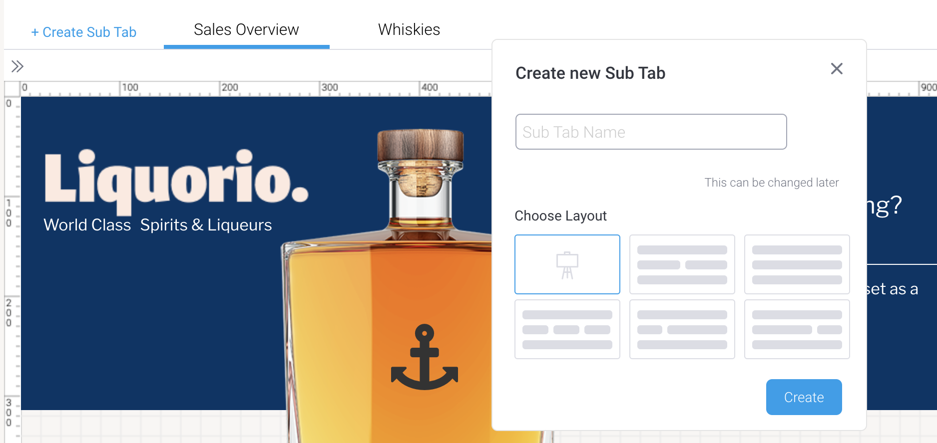
One of the most important features of good BI dashboards is the ability to easily navigate to different sections of the dashboard. Dashboard tabs allow users to quickly and easily access the dashboard. Only some solutions support this functionality; pictured above is the Yellowfin dashboard sub-tab interface.
Another important feature of effective BI dashboards is the ability to easily navigate the dashboard. As mentioned, navigation options also allow users to quickly and easily move between different sections of the dashboard.
BI Dashboard Best Practices, How Can You Improve Your Dashboard?
From reports to dashboards, effective BI implementations require a clear understanding of what constitutes an effective business intelligence tool. Here are some tips for creating effective BI dashboards:
1. Use Clear and Concise Data Visualization
A good way to make your data more understandable is to use clear and concise data visualization. This will help you to quickly and easily understand the data and make informed decisions.
Use charts and graphs to show the distribution of data, the relationships between different pieces of data, and the changes over time.
2. Make Use of Dashboard Components
Use reporting tools to generate actionable insights from data. This can include reports that show how customers are using your product, how your product is performing against your targets, and how your team is performing.
Enable alerts and notifications to notify you when important changes occur in the data. This can help you to quickly and easily take action.
3. Use Automated Reporting
Automated reporting can help you to quickly and easily generate reports that show how your data is performing. This can include reports that show how customers are using your product, how your product is performing against your targets, and how your team is performing.
Your target audience for automated reporting may vary, but it is important to have a clear understanding of what you are looking to achieve with your reports. Do you want to show how your product is performing against targets? Are you looking to identify areas where you need to improve? Automated reporting can help you to achieve these goals.
4. Take Advantage of Real Time Data
Real time data can be an important part of your business intelligence toolkit. This data can help you to identify changes in your data as they happen, and to make decisions based on this data. This data can also help you to identify trends and patterns in your data. This data can also be used to make decisions about how to improve your product.
5. Use Graphics to Communicate Data
Bar chart, pie chart, and line graph are all great ways to communicate data visually. Data visualizations can help users understand the data more easily and can help managers make better decisions.
Read: 10 Essential Types of Data Visualization
What Not to Include in a BI Dashboard
A BI dashboard should not include information that is not relevant to the data. For example, a BI dashboard should not include information about the organization's policies, if the data does not relate to the organization's operations.
You should also avoid including extraneous information in a BI dashboard, such as necessary text or graphics. If it's overcrowded, it will be more difficult to see the data.
Ready To Create A Good, Effective BI Dashboard?
From the criteria listed above, it is evident that a BI dashboard must support several capabilities in order to be effective.
Yellowfin BI offers powerful tools that make it easy to create an effective, modern business intelligence dashboard - from quick access to key data elements, to interactive charts and graphs, and stunning data visualization.
