In the previous blog, we initially discussed how Yellowfin Signals discovered a surprising website traffic spike hidden in our Google Analytics data.
So how did we set up Signals? And did we learn anything along the way?
Read on below for our learnings and suggested best practice (this is going to be a deep dive, so grab a coffee and enjoy!)
Data Preparation: extracting GA data from the API
Running Signals across live data is the default option but doing so for the GA API will not do as there’s a limitation of 10k rows per query. This makes it nearly impossible to go over historical data. Therefore, you'll need to first build a time series history then extract daily GA data and keep building that time series for Signals.
In our example, we created two reports (Page Title and Web Stats) off the pre-built view that comes with the GA connector. Page Title captures our web site pages and respective pageviews, while Web Stats provides more session data around a singe pageview.
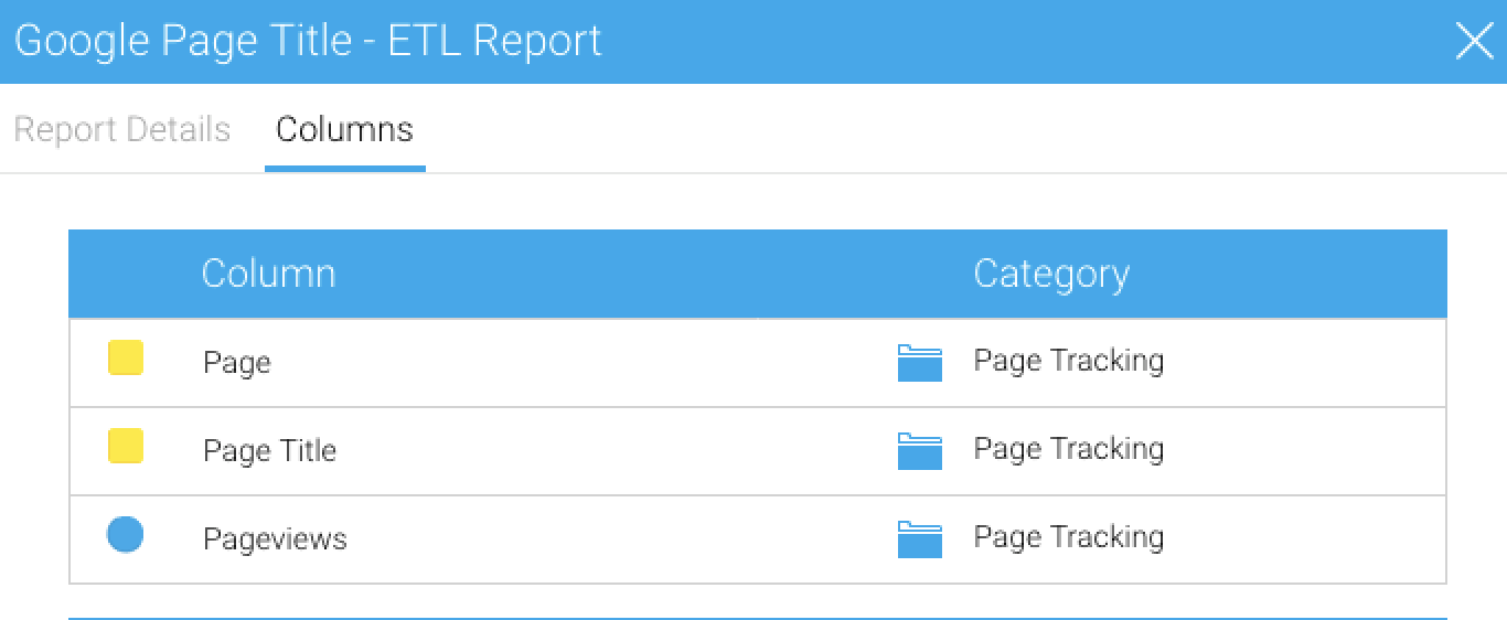
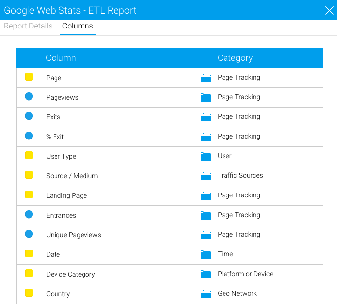
The great thing about Yellowfin Data Prep is that you can also use Yellowfin reports as Input Steps that pull data. Data modelling and prep that have been performed previously (or in this case, done for you via connector pre-built content) can be reused, rather than rebuilt from scratch.
To build the initial time series history, we used both reports with userprompt filters, as Input Steps and our resulting Transformation Flow looks like this:
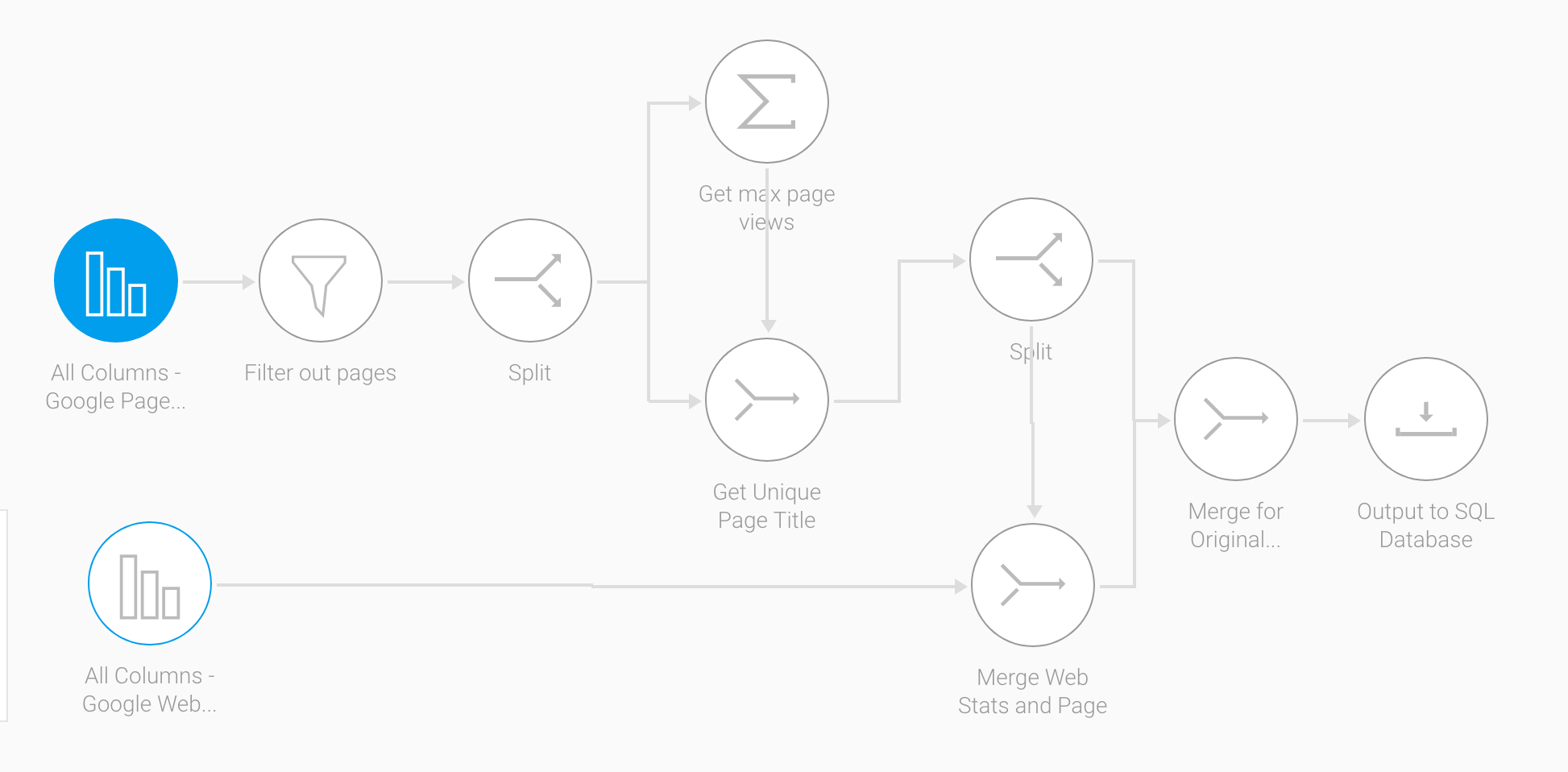
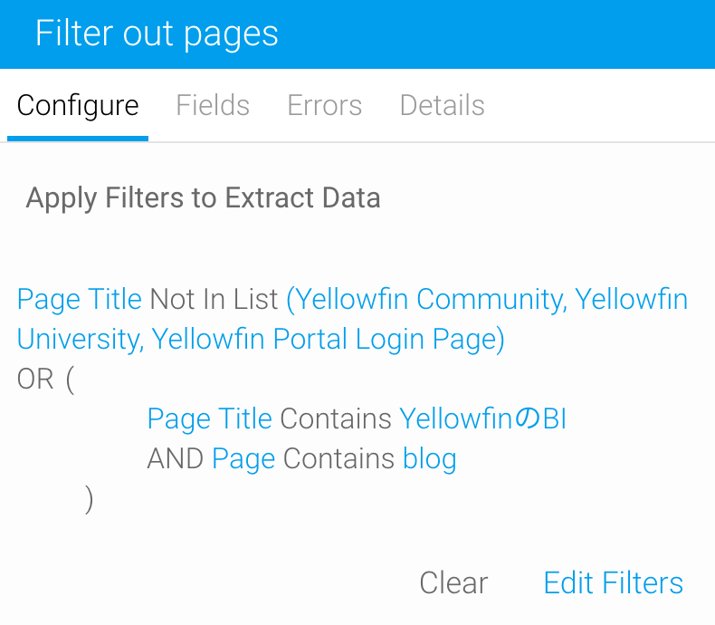
We added a few Transform Steps within the Flow including filtering out web pages that weren’t critical to the pageviews project:
We also split the original GA Source/Medium column into two. GA stores the value as "google / organic", so we used Find and Replace with Regular Expressions for value matching and piped the values into new Source ($1) and Medium ($2) columns respectively:
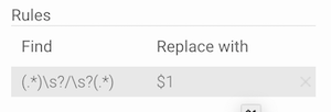
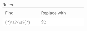
Besides running Signals from that point on, we also wanted to see how it'd perform on historical data. To look back into the past, we ran the Transformation Flow repeatedly for each day to build history with Run in Design Mode switched on. This was also to get around the 10k rows limit for GA queries.
Run In Design Mode allows the entire Flow to run to completion and insert the output data into your target table while you’re still designing the Flow. Once we were satisfied with the resulting historical data set, we set the report date filters and Flow schedule to run daily on a rolling window.
Not every metric needs a Signal
With our historical GA data freshly prepared into an output table, we created a Yellowfin view on it and started setting up Signals and Assisted Insights.
With the Pageviews metric capturing every user that visits the site, do you really need a separate signal on Entrances? Maybe not.
How about Exits? Again, maybe not as more people coming into the site will roughly match more people eventually leaving the site, but Exit Rate (Exits / Pageviews) might be useful.
For the initial Outlier Detection job, we ended up selecting the Pageviews metric for a signal. Unique Pageviews was selected as a Related metric which allowed us to overlay it on the chart later during signal exploration:
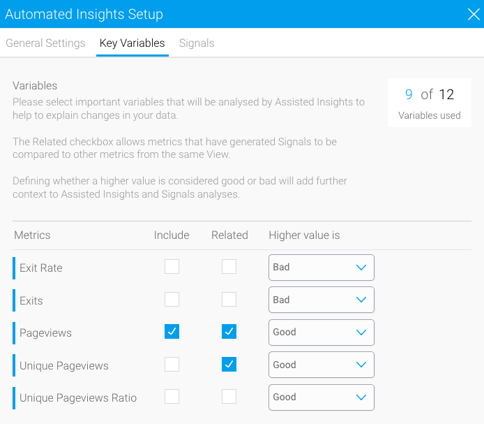
Again, not every dimension in GA needs to be included as you probably don’t want or need a separate signal generated for every unique combination. For example, we wanted to be alerted on any changes involving a combination of Pageviews by Page Title, Source, Medium, User Type, Device Category, and Country. Other dimensions, like Landing Page Title (website page where the user clicked from) weren’t as important for a signal because we could rely on Assisted Insights to explain the significance if it became a key contributor for a signal. Therefore, Landing Page Title was selected for Assisted Insights, but not for a Signal.
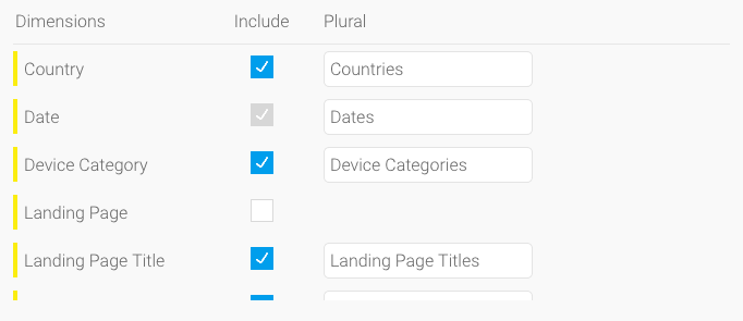
Remember, you can leverage Assisted Insights to analyze the rest of the schema and help explain statistically-significant drivers of a Signal.
Evaluating Signals on a sandbox environment
You’d want to initially set this up on a dev / test environment to allow running an end-to-end Signal process, evaluating the output and re-configuring algorithm parameters as necessary. Some settings that you'll want to think about:
General Settings
There are three things that you’ll need to set:

- Primary Date Field: the date used to plot time series data for a signal. For GA, this was the Date column for each website visit by a visitor.
- Scope of Analysis: the date period useful for analysis. This is a granularity setting and, since GA data is most useful on a per day basis, we set this to Day.
- Max Data Range: the entire data range of interest when viewing Signals on a chart. What you set here decides how far back the time slider goes on a Signal Chart. We set this to 3 months.

Important vs. Less Important Columns for Each Signal Job
Running and evaluating the initial Signals allowed us to drop certain columns from specific Signal jobs that ended up not being that important for the business, as well as creating additional Signal jobs to cover specific trending scenarios around pageviews.
Time Schedules for Signal Analysis Jobs
We knew that ultimately we wanted three types of Signal jobs: one to track daily outliers and breakouts, one to track a monthly trend, and another for weekly new/lost attributes. For the most optimized results, each job had slightly different settings:
- Outlier Detection and Breakouts: we ran this every day with a day granularity to discover outliers. A per-day scenario doesn’t need a large time period, so setting it to look at the last 30 days is sufficient. Note that the larger the period, the lower your Analysis Threshold needs to be (the size of one slice vs all slices - see section below)
- Trend Change: We were much more interested in a monthly trend i.e page views increasing or decreasing, faster or slower, every month. We ran this on the first day of every month with a day granularity, comparing the previous month against the one before.
- Period Compare: from a total pageviews perspective, it was important to know if a page disappeared (indicating potential website issues) or appeared (newly introduced page) in the results. We implemented a Period Compare with New/Lost attributes and ran this weekly with a day granularity.
With the Signal jobs above, we used Fixed Date Ranges in the evaluation phase to re-run/re-tune repeatedly, and changed them to Basic Compare (rolling time windows) for future runs before moving to production.
Advanced Mode: Analysis Threshold
At Step 5 of the signal setup, the analysis threshold helps to eliminate slices (and hence Signals) that are low value to the user. How this works is the total value of time slices that are equal to or greater than the defined analysis threshold % of the total baseline value will be considered important enough to analyze. The default analysis threshold is 0.025 (2.5%).
Using a typical sales example: if your analysis threshold is 2% and your baseline metric is Total Sales for Europe ($100,000), then Sales for Germany ($10,000 or 10% of baseline), or any country above $2000, will be analyzed. But Sales for Poland ($1,000 or 1% of baseline), or any country below, will not.
Because we’re looking at pageviews for each page, we decided to set the analysis threshold % to 0.01 (1%).
Advanced Mode: Baseline Period
In the initial run, a few similar Signals kept popping up for consecutive weeks. We forgot that there is an obvious, repeated 7-day trend for website visits (visitors ramping up from Monday onwards and dropping off during the weekend) and our default Baseline Period was 3 data points (the previous 3 days).
The Baseline Period is used to cover seasonality cycles, essentially telling Yellowfin the number of date time periods to create a moving average used in the analysis period.
To ensure Signals understood the seasonality present for pageviews, we changed the Baseline Period to 7.
Operationalizing Signals
After the validation phase, we exported the Yellowfin content and migrated to production.
Schedule Management
Once we migrated the Yellowfin content to production, the Signal jobs automatically ran according to the schedules set in the jobs. If you’re curious about the schedules, you can view them in the Schedule Management page and filter for “Signal Analysis”.
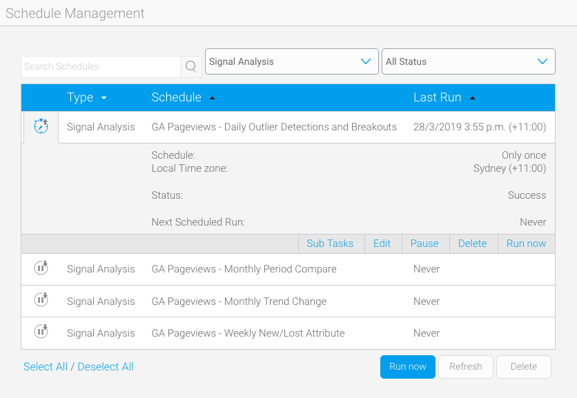
Here you can view the job schedule, last successful run, and click into the Sub Tasks tab. The Sub Tasks tab tracks all internal tasks for the Signal job including correlation analysis, job clean up, and their respective statuses.
Exploring a Signal
Once the job completes, Signals will surface the biggest changes to the Timeline and have other relevant Signals available in the Signal List.
Using the Bangladesh web traffic example from our previous blog, the main Signal page shows us a few things:
- main signal narrative showing the change
- detailed narrative showing metric changes compared to the moving average
- data set (view) the signal ran on and for which time period
Since we chose Unique Pageviews to be a Related metric for the Outlier job earlier, we see it appear in the Related tab.
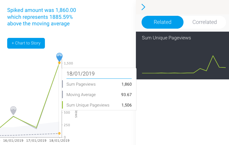
Overlaying that metric on the main chart, we see that Unique Pageviews increased accordingly.
The Correlated tab allows comparison between the Bangladesh spike against other discovered signals across all data sets. Correlation analysis is performed across similar signals for the same time period and the ones with the highest correlation factor populate this list. With this, we could see that a similar increase of overall page views through paid ads and mobile devices closely correlates to the main spike:
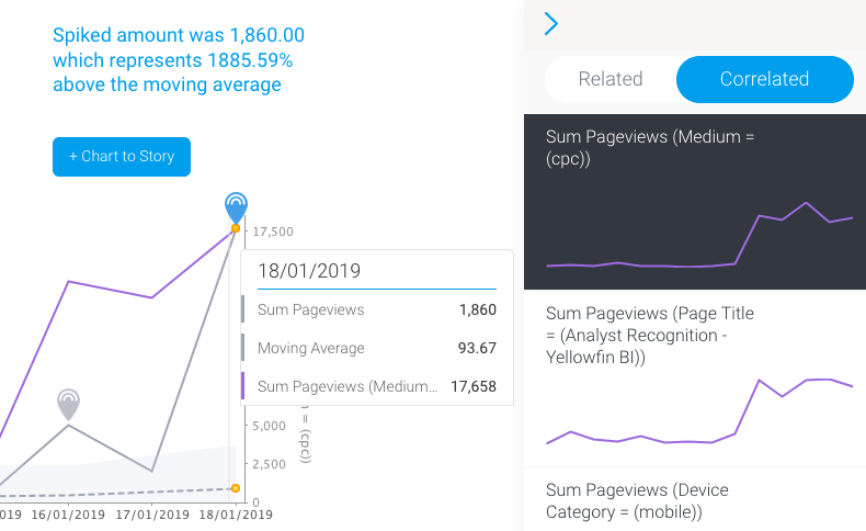
It’s important to note that correlation does not mean causation, but they can be meaningful in cases like this.
As seen in the previous blog, Assisted Insights also runs automatically against the Bangladesh spike on the 18th. Because we’re running an Outlier Detection job daily with day granularity, A.I knows to compare the date of the spike (18th) against the previous day (17th).
With this automated analysis, we could ascertain that the Bangladesh spike was caused by a paid ad that had been mistakenly run by our ad agency for a specific campaign on mobile devices.
Conclusion
In business, what you don’t know can hurt your bottom line.
Imagine having something that actually solves analytics problems within the business. Something that runs continuously in the background, automatically surfacing critical events as they happen, finding correlations across all of your data, and sending alerts that are personalized to you.
That’s the magic of automated analysis, and it's here with Yellowfin Signals.
Read the first part of the series: Part 1 >
View the step-by-step video guide on Youtube: Click Here >
