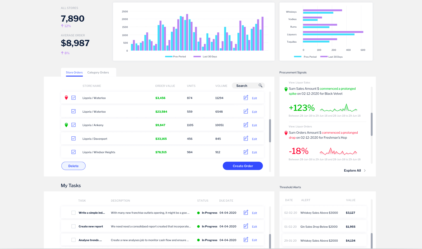
For our Head of Product Design and Creative Director, Tony Prysten, design is always top of mind. In analytics platforms, good design plays an important role in how people understand and use data. Here Tony shares how Yellowfin has been created with designers and developers in mind.
Why do companies need to consider design flexibility when assessing a BI platform?
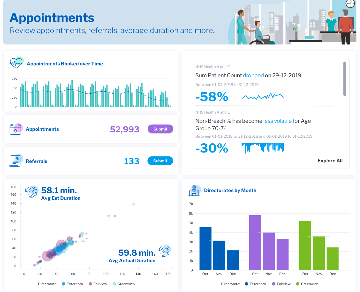
Many software companies embed Yellowfin to create an analytics experience within their own software, app, or platform. On top of world-class analytics, they’re looking for a seamless and contextual design experience and Yellowfin 9 was created with that in mind. While they can and probably have tried to build it themselves, many have grown to a point where their current analytics experience is not meeting the demands of their users.
What design features should a software company look for?
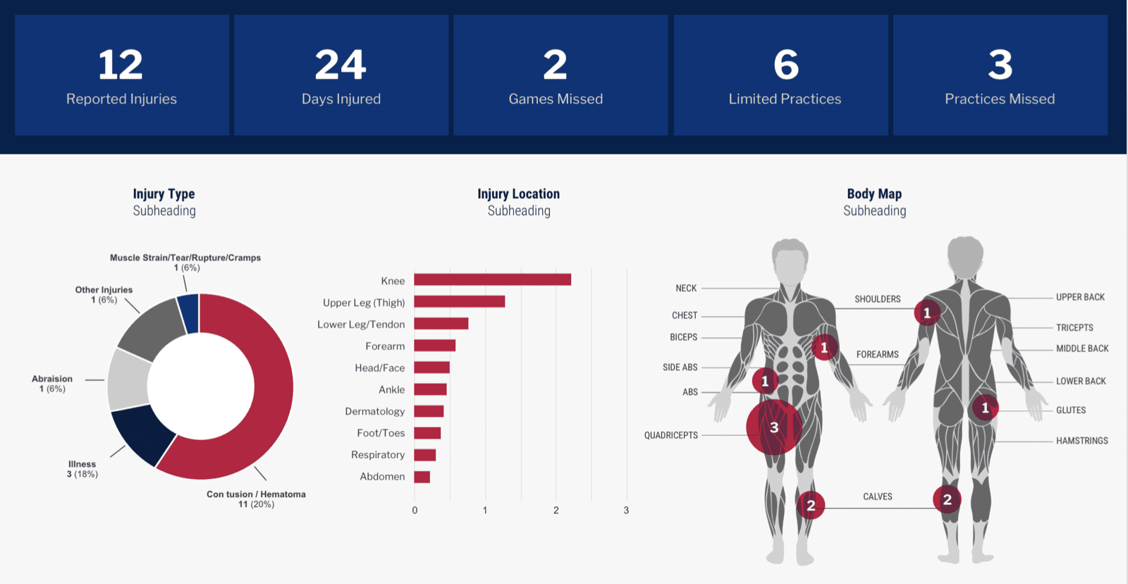
Software companies want something that they can integrate quickly and easily and that looks like it is part of their platform. It also needs to be cost-effective, fast to market, and flexible in terms of embedding options.
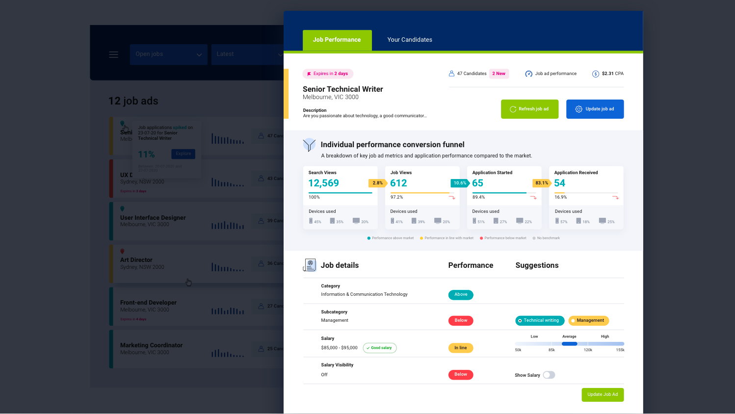
Product designers spend significant time creating a design language for their platform. Making it effortless to adapt their existing look to their analytics experience is valuable to an organization. From a product owner's perspective, this minimizes demand on resources from their probably already stretched design and UX team to create an embedded analytics experience that matches their current software.
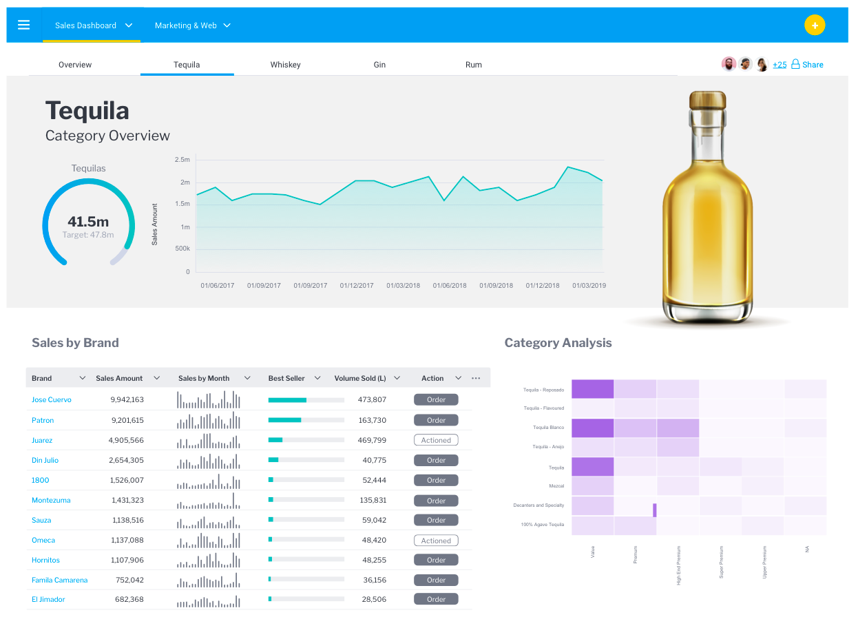
Yellowfin has a freeform design canvas. This allows the product designer to ‘break’ the grid and to use any fonts, colors, and layouts they need to ensure consistent alignment with their existing app. This differs from other vendors who guide you into predefined and often inflexible templates. Canvas has a wide range of property adjustment panels that allows the designer to adjust any element they wish in a familiar UI.
There is also a ‘blue print’ mode which allows collaboration on a dashboard design between a designer and say a data analyst. Designers like to work iteratively (rather than be brought in at the end to just color in). Allowing the designer to feed into the planning stage and concept with a data expert ensures the designer's wealth of knowledge around UX, UI design and user behavior can be combined with best-practice data visualization for extremely well-considered customer experience.
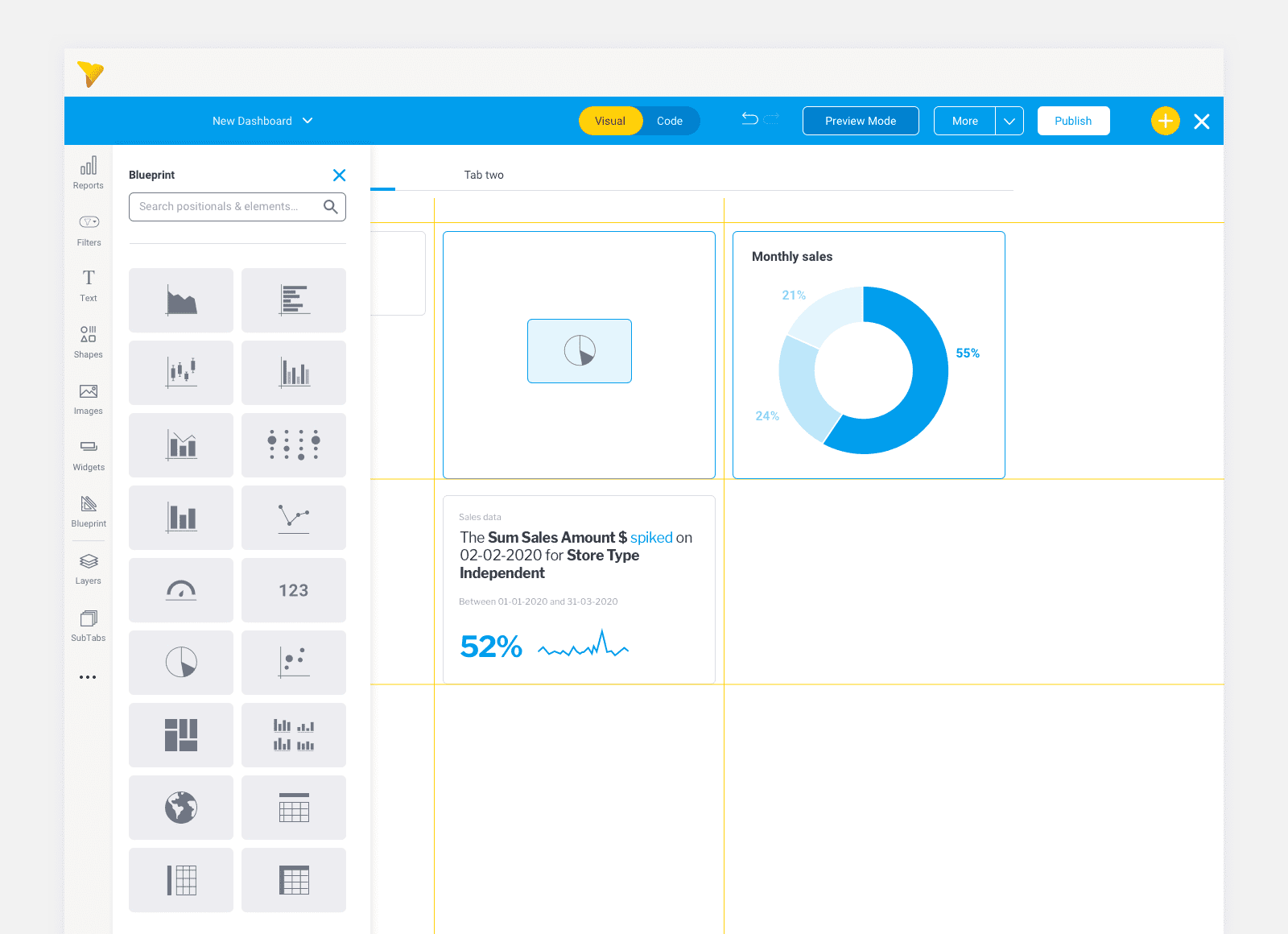
There is also a ‘code mode’ which allows developers to directly import CSS enabling immediate adaptation of any existing visual style guide straight into the dashboard designer. Code mode also enables the use of HTML and Javascript so a designer can really push functionality around visualizations without having to learn any new or bespoke coding languages. Literally any developer can work with Yellowfin.
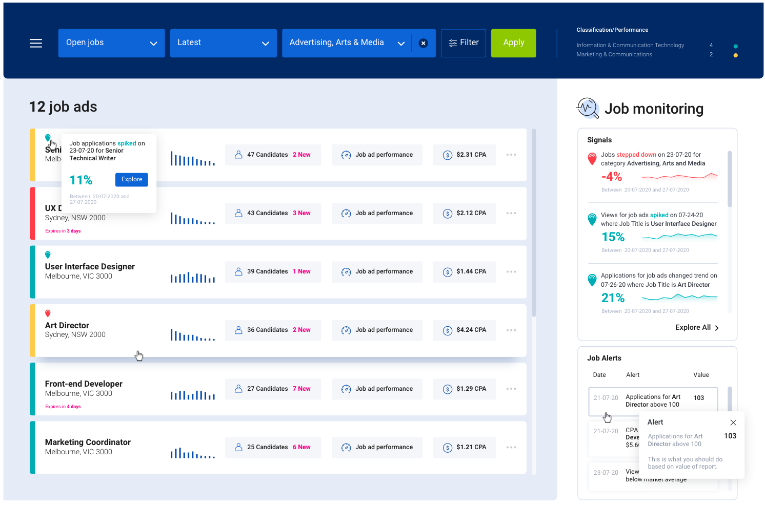
We've created something that really gives product designers infinite possibilities. There is no need to compromise on the look and feel, performance, or design of analytics within your app.
How design flexibility gives you a better dashboard experience
Good design is the intangible little things that leave you with a good feeling because you can do what you need to without thinking about.
