With so much packed into the latest Yellowfin 9 release, we figured it would be great to let you know about some of the coolest features (which will really transform your analytics experience) in this series of blog posts - Fresh Features.
At Yellowfin, we’re super excited that you will be benefiting from the huge amount of work our development team have been doing behind the scenes to complete revamp Yellowfin’s look, feel, and functionality.
First up, it’s the all-new chart features!
Charts are now awesome
Charts are the foundation of all your analytics so we’ve worked hard at making them exactly what you need.
The research
It is easy to get caught up in the JavaScript Chart story: being able to build custom, bouncy, and very cool charts. But do you really want dozens of unique ways to visualize your data? Or is the demand for JavaScript Charts a symptom of something else?
We did some research (we looked at over 2000 dashboards out in the wild) and discovered that there are only a hand full of visualization types that actually get used. The 80:20 rule (in this case the 95:5 rule) gives us our top five visualizations that get used pretty much all the time by dashboard designers. They are:
- Big numbers / Meters
- Line Charts
- Bar / Column Charts
- Pie Charts; and
- Tables
It’s a pretty small list. This showed us that we should focus our attention on improving what we have today rather than building out more fancy features for custom charts.
What’s the issue with charts?
We identified 3 areas of concern:
- Chart Defaults - how do charts look out of the box?
- The workflow to add charts to a dashboard
- Whether the charts bounce or not
Defaults
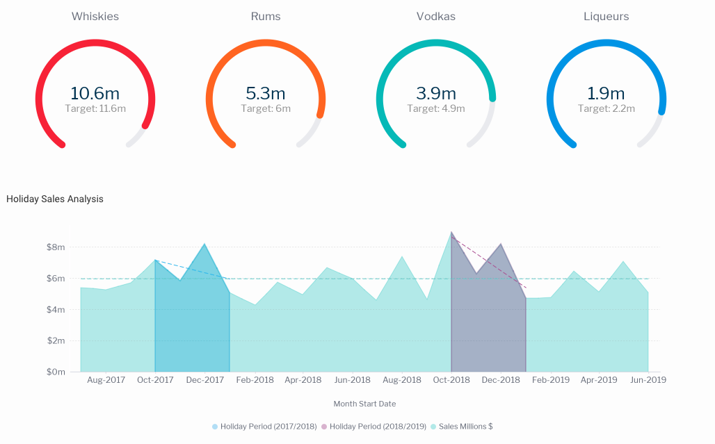
Fran and the rest of our dev team has done a huge amount of work in this area so we won’t cover it all. But rest assured it’s plenty. We have also improved all sorts of chart elements like padding, colours, line weights, gridlines, and fonts. All of these changes are intended to make any chart look great straight out of the box.


The impact
The huge benefit to you is that you will not have to format your charts because they look great out of the box. This means less time building content and less frustration with the workflow.
Auto-scaling and responsiveness
Auto-scaling and responsiveness has a bit to do with defaults but deserves to be called out on its own. When you resized a chart previously into very small sizes, it could end up looking slightly cluttered with everything turned on. So, we have added a bunch of smart logic into the charts that removes or moves elements as you shrink the chart. As an example, check out the improved legends on charts with lots of colour series.
The impact
Charts that scale and remain readable even though they are small is better for everyone. No trying to guess what the chart labels are showing. Again, you will not have to manually format them - it will just happen.


Fonts
Previously, with Yellowfin, if you wanted to have a consistent design across the entire platform, it required a few clicks to get there. The UI used a different font scheme to charts, which was different to tables etc.. This has all changed.
You can now use a set of great looking fonts (shipped thanks to Google fonts) to create an amazing first impression. The charts alone already pop thanks to this change and they look great as text widgets on a canvas. Best of all, you can add your own fonts into the app via the plugins manager.
The impact
With these new font capabilities you get design flexibility. Charts are visually impressive and it’s easy for you to set your preferred global fonts for all content.
Quick Charts
Thanks to Brad, our CTO, for seeding this idea and Elias and Jared for making it happen. Yellowfin’s all-new Quick Charts lets you create a chart directly from a dashboard. Yes, you read that correctly. Using the ‘widgets paradigm’, a user can simply drag on a chart widget and create the chart right there. There are some limitations in format options you can apply at the dashboard level but you will be able to simply open it up in the advanced builder and continue to edit it there.
The impact
Quick Charts gives you faster dashboard development. We believe that, now, 80% of dashboard builders will never leave the dashboard. It is going to be a great user experience when you get your hands on it in Yellowfin 9. Smiles all round!
And that is what is happening in chart land for Yellowfin 9. Here's the next post in the series...everything fresh in Signals.
Take a look at everything fresh in Yellowfin v9
Here's a run down of everything that's new in Yellowfin from charts to Signals to filter and more. See what you're missing out on and why you need an upgrade.
