It almost seems like eons ago now, but in this year’s Gartner Data and Analytics Sydney Summit, Yellowfin were excited to participate in the first-ever Analytics & BI Showfloor Showdown, alongside IBM and Oracle.
As a way of facilitating a side-by-side comparison - and in the spirit of an insightful and entertaining session - we were all invited to look at the WHO health indicators data set, understand the variables that drive life expectancy, and present them to the crowd.
Being the Sydney Summit, the Yellowfin team kicked off the demo and focused on our home ground. We presented that life expectancy has been increasing in Australia for the past decade, influenced by health indicators that include increased total and government expenditure on health, decreased smoking prevalence, big upward trends in access to antiretroviral therapy, and the most important driver - falling infant mortality rates.
It’s great to know this - but for a country like Australia, we’d almost expect these drivers. So the team looked at other interesting health indicators that could drive life expectancy and two came up: Avoidable deaths and preventable hospitalizations.
This is where we were led to some surprising insights.
Augmenting self-service analytics with automated insights
In the old days, I would have gone on a manual visual exploration marathon for a few hours to find the ‘nuggets of gold’. Fortunately, we can lean on automation these days in our BI solutions and save ourselves a lot of time and effort.
Just by right-clicking on the data and asking Yellowfin to auto-analyze the avoidable deaths metric, Assisted Insights (AI) quickly scanned the data with smart algorithms and returned the most important insights, accompanied by auto-generated visualizations and narratives.
All of this was delivered in seconds.
An intriguing insight surfaced from another part of the data model suggested an inverse correlation between avoidable deaths and weekly median income, and was shown across states and territories as follows:
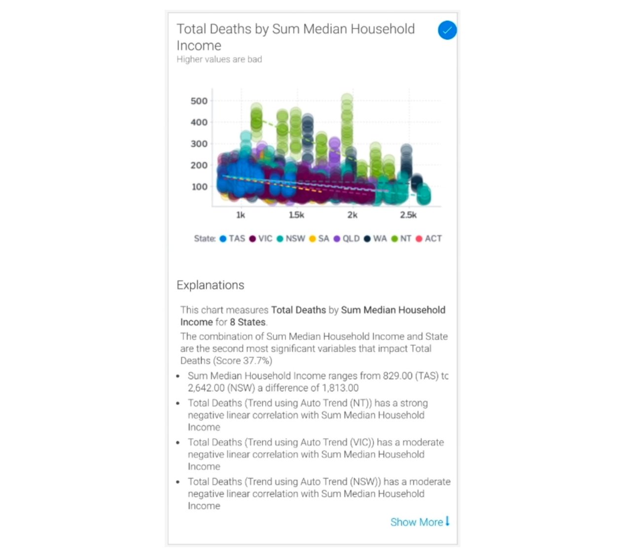
The lower the household income, the higher the death total - particularly in Northern Territory, a large and remote Australian region. From the chart, we can also see an increase of a thousand dollars in weekly median income made a huge difference to the death total.
Taking the wheel, we took the auto-generated data set, visualizations and narratives - with a single click - straight into the advanced report builder. Here, we performed further exploration by folding in the data for preventable hospitalizations and used Assisted Insights iteratively, making further discoveries such as:
- For avoidable deaths, the top 4 areas all came from Northern Territory, mainly Daly-Tiwi-West Arnhem, East Arnhem, Barkly and Katherine
- Nearly half of the top areas for avoidable deaths also appeared in the list of top areas for preventable hospitalizations
- The leading condition for preventable hospitalizations was chronic cases, with chronic obstructive pulmonary disease (COPD) being the #1 reason by far
Continuously monitoring data for the unknown unknowns
We asked the question against this health indicator data set and Assisted Insights drastically reduced the effort and time needed to find these insights.
But what if a data and analytics team that does this day in, day out had to look at ten other health indicators? Fifty? Hundreds? With dimensionality in data compounding the effort, it would be impossible to monitor everything and scale the analysis at the same time.
What if there was an automated business monitoring tool that could do that for them?
Such a tool would continuously monitor all of their health indicator datasets and immediately alert the team on critical changes in their data as it happened. We have that in Yellowfin Signals.
We pointed Yellowfin Signals at the data sets we were looking at - and what did we get? Alerts notifying us that chronic cases were on the rise in those time periods, in Northern Territory, particularly for COPD. Not only that, subsequent correlations unearthed that preventable hospitalizations were also increasing in the same areas we looked at previously.
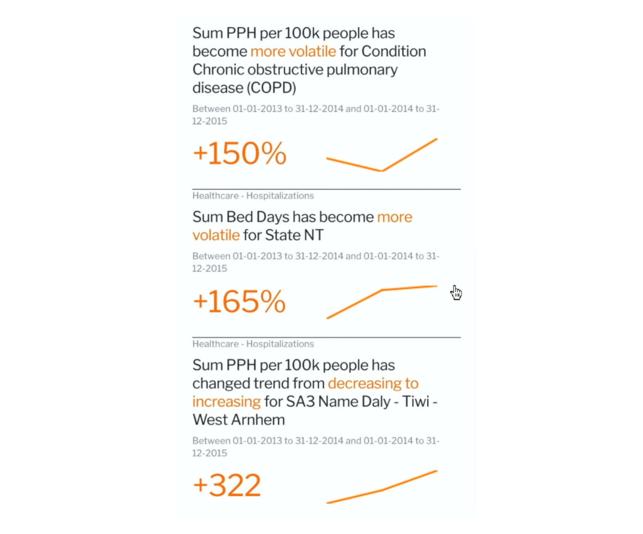
In hindsight, had we kicked off our process with Signals first, we would have reached the ‘end’ of our analysis even faster. But then again, we had ten minutes to fill in our demo slot.
Telling data stories with human context
Towards the end of our analysis, we had all these facts and insights from the data.
But what do they really mean? Why chronic cases? Why COPD? Why in Northern Territory? What’s the actual context here?
Rather than letting the audience interpret what it really means by just looking at a dashboard, we put context around the data with external research to tell what’s really happening in a story-like way with Yellowfin Stories.
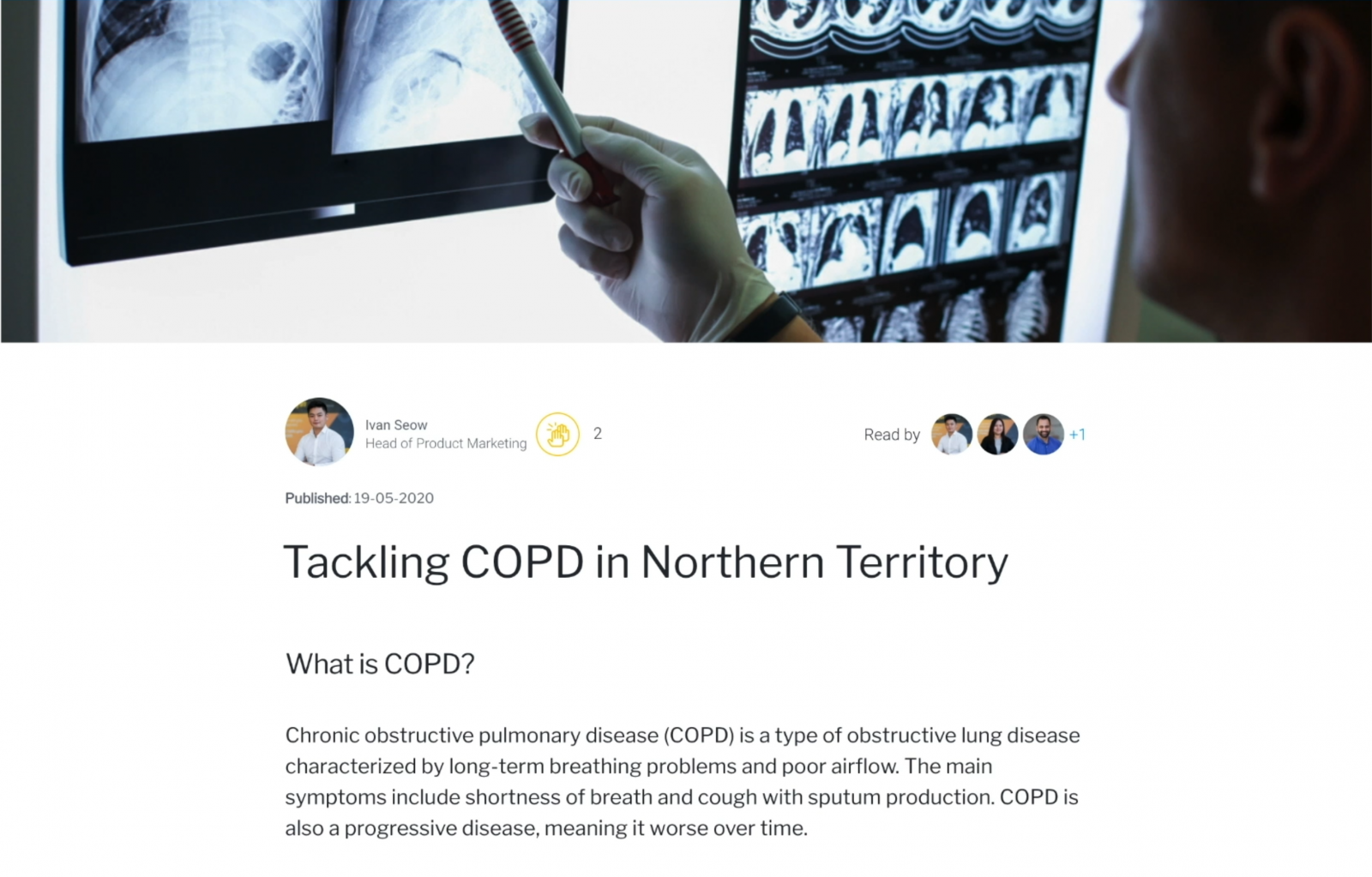
We go into detail in the video linked above, but essentially government research suggests that COPD is more common - about 2.5x as high - in some of these areas and demographics and is affected by existing health inequalities there. In these same areas, the most significant risk factor for COPD was found to be cigarette smoking - again, higher in regional and remote areas - particularly among people with socioeconomic disadvantage.
Conclusion
It’s always hard to show everything in ten minutes, but we not only demonstrated innovative Yellowfin products, we also showed how easy it was to wield augmented analytics, leveraging automation where it made the most sense and bringing in human context when necessary.
We’re glad to have participated in the Showfloor Showdown during the Gartner Data & Analytics Summit. It’s a great opportunity to show the analytics industry how we continue to innovate and help organizations transform through data. Learn more about what we released with Yellowfin 9.2 and if you’re interested in the latest innovations in augmented analytics and data storytelling from Yellowfin, talk with a Gartner expert.
Earlier this year, we were recognized as a Visionary in the Gartner Magic Quadrant for Analytics & BI Platforms - and we reflected on the journey to this placement.
