

The History of BI Dashboards
Technology is always evolving, and so is the way we use it to collect and analyze data. From humble spreadsheet beginnings to fully automated business monitoring and AI-powered analysis, the range of analytics tools on offer today is astounding to consider.
Business intelligence dashboard software software is one such option. BI dashboards have existed for decades as a helpful tool for organizations to monitor and analyze operational data - and it's not quite dead yet, despite what many companies proclaim.
Decision-making based on data analysis is becoming increasingly important, and BI dashboards are a great way to help make that happen, providing real-time data that can help companies understand their performance, identify trends, and know what to do next.
The humble origins of BI dashboards
Since the 1970s, dashboards have been used to help businesses make better decisions.
Early business intelligence dashboards required business analysts to analyze and interpret data, as the vendors who made the software specially tailored these powerful tools only for those with specialized knowledge around data transformation and analysis.
Extract, Transform, and Load (ETL) tools were used to load data into the business system, and the analyst within a business would then collate and interpret that data to make conclusions.
However, with the advent of big data, dashboards have evolved to become far more user-friendly, and include several other data analytics tools in one package.
In the past, data was only used for research and analysis. However, as the world becomes more complex, data is becoming a key factor in decision making. These tools can help you collect and analyze data in a way that makes it easy to see patterns and trends.
Related: The History and Evolution of Business Intelligence (BI) Platforms
The evolution of dashboards: Static to dynamic
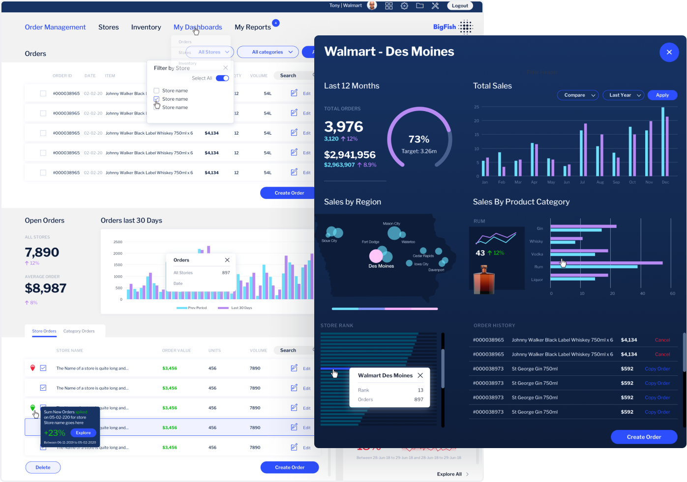
Today's analytics and business dashboard software allow you to easily collect and analyze data from a variety of sources. This makes it possible for more people in the organization to access important metrics, such as key performance indicators (KPI dashboards are one such popular option) to make informed decisions based on data analysis.
Analytics platforms collect, process, and analyze data, and are now used to create interactive dashboards that allow users to see the data in a way that makes sense.
Dedicated BI solutions have evolved dashboard design considerably to help more people use dashboards rather than defer to experts to analyze it for them, encouraging self service analytics. No longer are graphs and metrics presented haphazardly or without explanation; there are powerful automation and visualization options available from today's BI vendors to better communicate what's on-screen for more people.
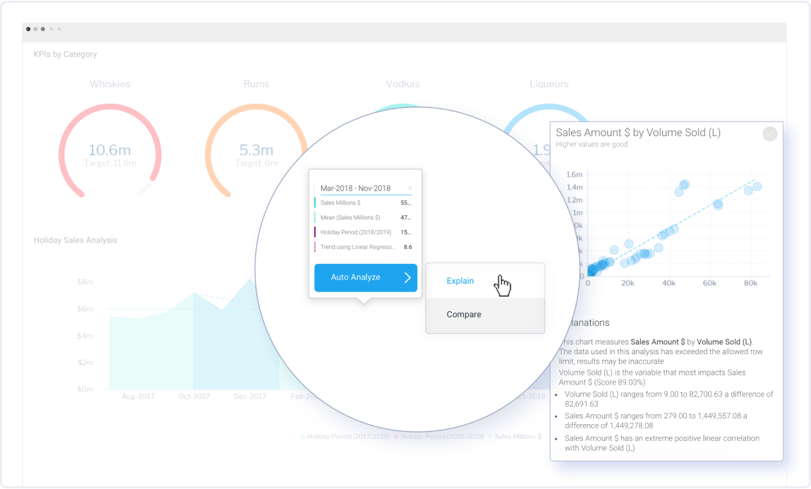
Metrics and visualizations on dashboards have also evolved from static tables and charts to fully interactable elements that can be clicked on to drill down further into specific sub-categories of data, or lead to automatically generated explanations and comparisons for further context - one such example is Yellowfin Assisted Insights and Signals.
Business intelligence dashboards: An overview
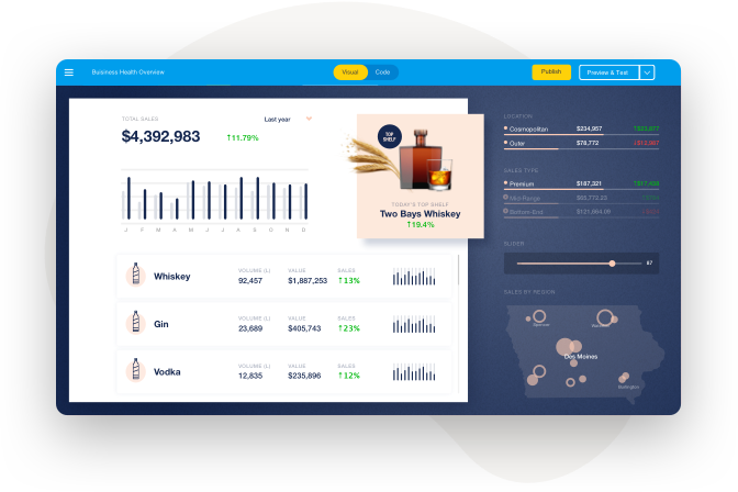
Today, a business intelligence dashboard, or BI dashboard, refers to an analytics tool that provides a consolidated view of relevant business data, such as key performance metrics and operational data.
A BI dashboard allows business owners to quickly and easily view, explore and break down data from different sources, at a glance, on one screen.
Sales dashboards and marketing dashboards are two very common use cases/BI dashboard examples. A sales dashboard shows data about sales activity, such as orders, sales leads, and sales revenue. A marketing dashboard shows data about marketing activity, such as website visits, email subscribers, and social media followers. Most use cases of dashboards fall under three categories of dashboards: operational dashboards, strategic dashboards or analytical dashboards.
Whatever the type of dashboard or its use case, there are many benefits of using business intelligence dashboard tools as part of business processes, which you can read about in our guide on the top benefits of dashboard reporting.
How a business intelligence dashboard Works
A business intelligence dashboard collects key metrics and data visualizations that allow you to see the big picture. It can be used to understand trends, and track operational progress to help drive decision-making.
Metrics and key performance indicators (KPIs), can also be displayed on a BI platform. This allows you to track your progress and see how you're performing against your goals.
There are many different types of data visualizations you can use on a dashboard, including charts, graphs, and tables, that can be used to make complex or other large volumes of data much more digestible for audiences. You can use them to analyze different aspects of your business quickly, and modern BI dashboards even provides automated insights and monitoring that further help you make better decisions.
Essentially, dashboard are a visual overview of your most important data, so you can see how it's changing over time as it happens, and understand how it affects your business.
What's next for BI dashboards?
Dashboards continue to become even more interactive as analytics solutions further tailor their dashboard tool-sets for both expert analysts and regular business users, using the power of automation and AI to create a new class of analytics user, called augmented consumers.
What this means is everyone will be able to do more with dashboards than just look and drill down through the data presented - with Yellowfin's data storytelling and automated monitoring suite, Stories and Signals, for example, users can access and explore contextual narratives and generated alerts to guide them toward the most relevant data.
Additionally, the dashboards are going to become even more customizable. This means that you'll be able to create them to fit your specific needs perfectly.
Are dashboards really dead?
There is a common misconception that BI dashboards are dead, and that they no longer have any use. However, this is not the case. In fact, BI dashboards are still very important, and can be used to improve business efficiency and performance - in combination with several newer, modern analytics tools, such as augmented analytics and AI analytics.
Today, dashboards continue to help make data analysis more digestible and easier to explore, and provide users with the most accessible graphical representation of data possible to identify trends and patterns and monitor performance, and they aren't going anywhere yet.
Read: What the 'Death' of the Dashboard Really Means
Next steps: Finding the right BI dashboard solution
If you're ready to take your business to the next level, then you need the help of a professional data management and analytics tool.
Yellowfin can help you make the most of your data by providing you with the tools you need to manage it effectively. We understand that data can be complex and difficult to act on without significant expertise.
That's why we focus on contextual data analysis and automated data visualization in combination with our stunning business intelligence dashboard software suite, so that you can more easily understand your data and make informed decisions.
Get started with modern BI dashboard software
Find out why a Yellowfin dashboard is the best way to visualize, monitor and understand your data to drive action and discover better quality insights.