

How to Create a Line Chart in Yellowfin Dashboards
Welcome to the latest entry in Yellowfin Japan’s ‘How to?’ blog series!
This series of blogs aims to provide your team with another hands-on example of adding data visualization to your Yellowfin dashboards, using our array of chart and graph types.
In our previous blog, we created a heat grid by aggregating on the basis of Day of Week and Time of Day. By sorting the axes of the chart, we were able to create an easy-to-read chart lined up from Sunday to Saturday and from 0:00 to 23:00.
In this blog, we will create a report that aggregates on the basis of Year and Month, and create a Line Chart. Since we want to display both the Invoiced Amount and the Number of Items ordered, the type of chart we will create will be a Combination Chart.
Note: Throughout this series, field names will be written in [square brackets], Yellowfin settings and selections will be written in "double quotations", and parameters that must be entered manually will be written in enclosing lines and shadings. No specific rules are defined for (rounded brackets) or ‘single quotations’, so please read them as normal punctuation marks.
Let's quickly break down what a line chart is before we head into our walkthrough.
What is the purpose of a line chart?
A line chart, also referred to as a line plot or line graph, is a type of data visualization that uses data points connected by straight lines to visually show trends over time or continuous intervals, and effectively highlight changes and patterns in data values. Think of a line chart as a simple picture that shows how something changes over time. It's like drawing dots and then connecting them with a line to see if something (key metrics) goes up, down, or stays the same.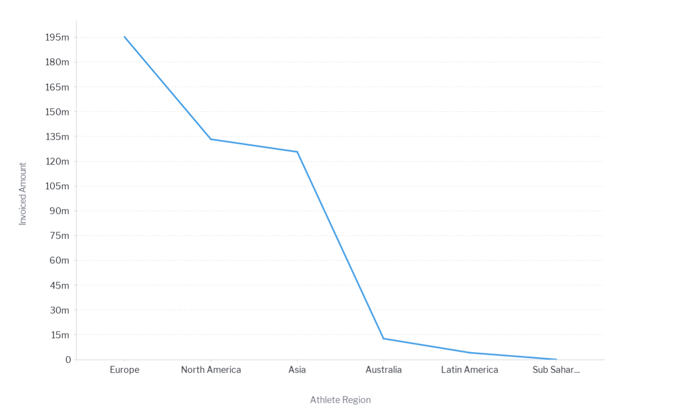 Example of a basic line chart created in Yellowfin.
Line graphs are best used to visualize how data changes over time or across categories.
They help direct your dashboard user's attention to trends, patterns, and fluctuations within the dataset. Line graphs are highly effective for communicating insights quickly, as their interpretation is straightforward and accessible to users of all skill levels. The upward or downward slope of the line clearly indicates increases or decreases in the data.
Example of a basic line chart created in Yellowfin.
Line graphs are best used to visualize how data changes over time or across categories.
They help direct your dashboard user's attention to trends, patterns, and fluctuations within the dataset. Line graphs are highly effective for communicating insights quickly, as their interpretation is straightforward and accessible to users of all skill levels. The upward or downward slope of the line clearly indicates increases or decreases in the data.
Step #1: Creating a table
As we stated previously, in this article we will be creating a Combination Chart as part of a report that will aggregate on the basis of Year and Month, displaying both the Invoiced Amount and the Number of Items ordered. A Combination Chart superimposes one chart type above or below another (typically bar charts and line charts) and are used to improve clarity and highlight relationships between data sets. Here is an example, shown below. First, we will again create a report by using the order history view created in the third blog of the series, How To Capture Data using Yellowfin Data Transformation Flow.
Let's create a table that aggregates the Invoiced Amount and the Number of Items ordered based on the Order Year and Month. The fields to be used are [Order Year/ Month], [Invoiced Amount], and [ASIN]. Add each of these fields to the Column. The [Invoiced Amount] will be aggregated into "Sum". [ASIN] should be aggregated with “Count” to get the Number of Items ordered. This should give you the Invoiced Amount and the Number of Items ordered by Order Year and Month. The table is completed by renaming the columns [Sum Invoiced Amount] to Invoiced Amount and [Count ASIN] to Number of Items.
First, we will again create a report by using the order history view created in the third blog of the series, How To Capture Data using Yellowfin Data Transformation Flow.
Let's create a table that aggregates the Invoiced Amount and the Number of Items ordered based on the Order Year and Month. The fields to be used are [Order Year/ Month], [Invoiced Amount], and [ASIN]. Add each of these fields to the Column. The [Invoiced Amount] will be aggregated into "Sum". [ASIN] should be aggregated with “Count” to get the Number of Items ordered. This should give you the Invoiced Amount and the Number of Items ordered by Order Year and Month. The table is completed by renaming the columns [Sum Invoiced Amount] to Invoiced Amount and [Count ASIN] to Number of Items.
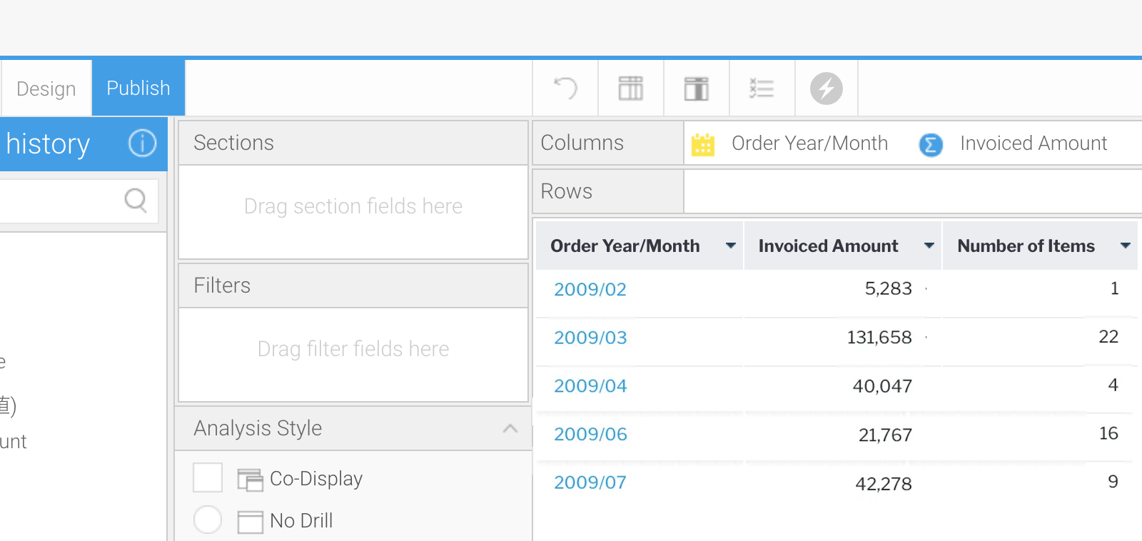 Pictured above is an image of the completed example table.
Step #2: Creating a chart
Once the table is created, we will create a chart. After selecting the Chart Type to "Vertical Combined", set [Order Year/ Month] on the Horizontal Axis and [Invoiced Amount] and [Number of Items] on the Vertical Axis. The Number of Items is not visible because the units for the Invoiced Amount and the Number of Items are far apart.
Since the unit of Vertical Axis is too far apart, we will represent them as separated charts. Click "Add Sub chart" in the "Combination Charts" settings to increase the number of Vertical Axes, and then set the "Chart Type" for each to "Line".
The Number of Items is not visible because the units for the Invoiced Amount and the Number of Items are far apart.
Since the unit of Vertical Axis is too far apart, we will represent them as separated charts. Click "Add Sub chart" in the "Combination Charts" settings to increase the number of Vertical Axes, and then set the "Chart Type" for each to "Line".
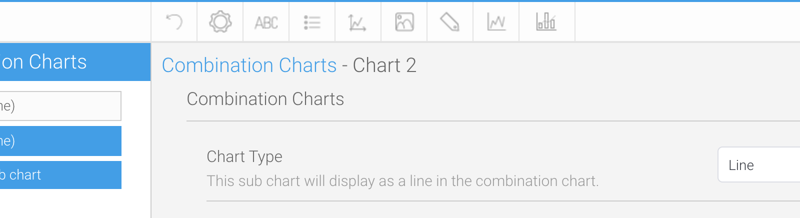 Set "Chart Type" to "Line" for both "Chart 1" and "Chart 2”.
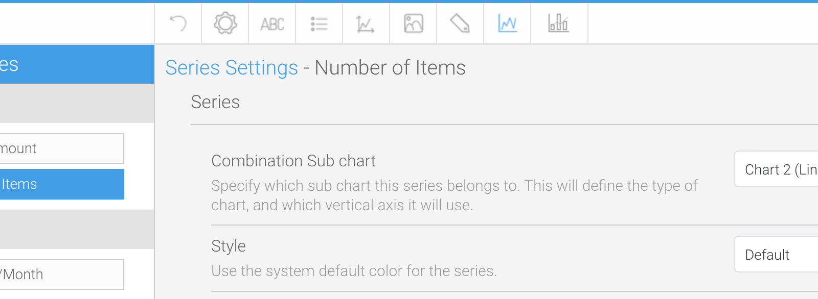
The added Sub chart can be assigned in "Combination Sub chart" under "Series Settings”. Set "Combination Sub chart" for " Invoiced Amount" to "Chart 1 (Line)" and "Combination Sub chart" for "Number of Items" to "Chart 2 (Line)".
Set "Chart Type" to "Line" for both "Chart 1" and "Chart 2”.
The added Sub chart can be assigned in "Combination Sub chart" under "Series Settings”. Set "Combination Sub chart" for " Invoiced Amount" to "Chart 1 (Line)" and "Combination Sub chart" for "Number of Items" to "Chart 2 (Line)".
 Specify whether "Invoiced Amount" or "Number of Items" should be displayed on Charts 1 or 2.
Now, the Invoiced Amount and the Number of Items are represented on separate Vertical Axes. The charts are arranged in descending order of chart number. In the case of this setting, the Invoiced Amount set in Chart 1 will be displayed on top, and the Number of Items set in Chart 2 will be displayed below it.
Specify whether "Invoiced Amount" or "Number of Items" should be displayed on Charts 1 or 2.
Now, the Invoiced Amount and the Number of Items are represented on separate Vertical Axes. The charts are arranged in descending order of chart number. In the case of this setting, the Invoiced Amount set in Chart 1 will be displayed on top, and the Number of Items set in Chart 2 will be displayed below it.
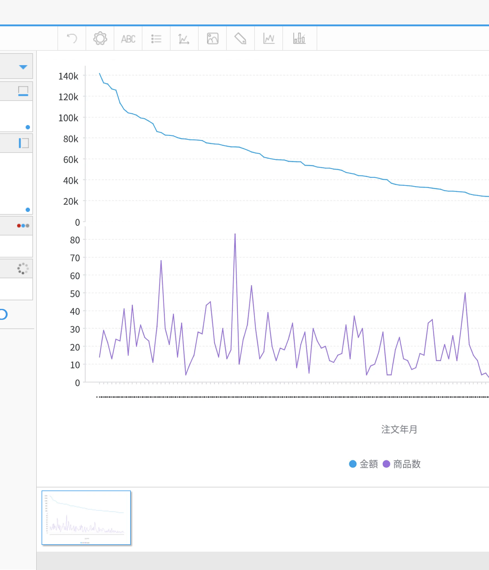 The upper chart shows the Invoiced Amount and the lower chart shows the Number of Items.
Although the charts appear to be complete, the Horizontal Axis (Order Year/ Month) is not in date order, so it must be sorted in "Ascending" “Alphanumeric” order.
The upper chart shows the Invoiced Amount and the lower chart shows the Number of Items.
Although the charts appear to be complete, the Horizontal Axis (Order Year/ Month) is not in date order, so it must be sorted in "Ascending" “Alphanumeric” order.
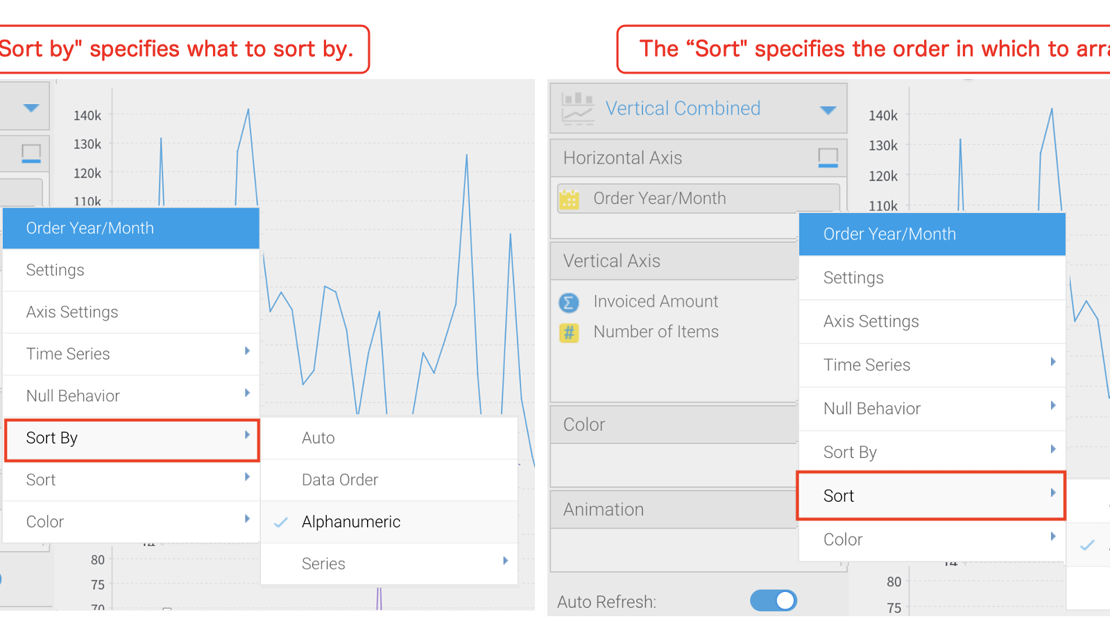 We did the "Sorting" in the previous blog.
The Titles of the Horizontal and Vertical axes are not needed, so we will set them to be “Hide”. For the Titles of the Horizontal and Vertical axes, select "Vertical Axis" or "Horizontal Axis" from "Axis Settings" and set "Title" > "Show/Hide Axis Title" to "Hide”.
As for the Legend, it is better to show it this time since it is hard to tell at a glance which is the Invoiced Amount and which is the Number of Items. However, the height of the chart when displayed on the dashboard is limited, so we will change "Legend" > "Position" > "Legend Position" to "Right".
Also, let’s change "Legend" > "Style" > "Legend Item Shape" to "Line" for a better appearance.
We did the "Sorting" in the previous blog.
The Titles of the Horizontal and Vertical axes are not needed, so we will set them to be “Hide”. For the Titles of the Horizontal and Vertical axes, select "Vertical Axis" or "Horizontal Axis" from "Axis Settings" and set "Title" > "Show/Hide Axis Title" to "Hide”.
As for the Legend, it is better to show it this time since it is hard to tell at a glance which is the Invoiced Amount and which is the Number of Items. However, the height of the chart when displayed on the dashboard is limited, so we will change "Legend" > "Position" > "Legend Position" to "Right".
Also, let’s change "Legend" > "Style" > "Legend Item Shape" to "Line" for a better appearance.
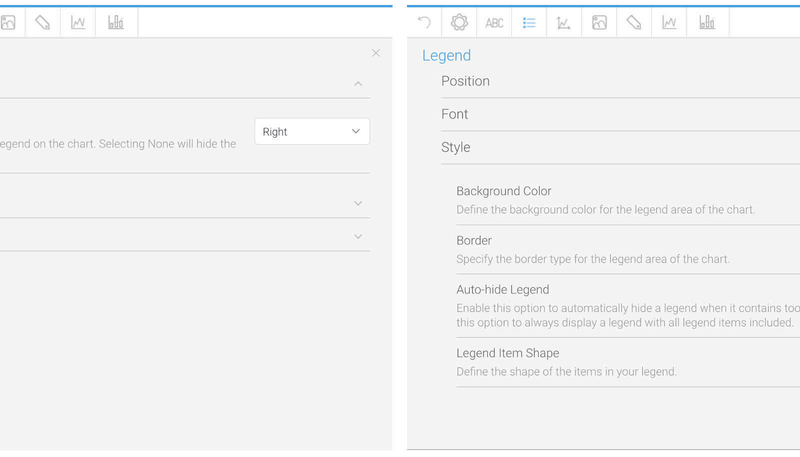 When "Legend Item Shape" is set to "Default", the shape changes depending on the type of chart.
Since the Tick Labels on the Horizontal Axis are crushed and unreadable, we will hide them so that the chart can be displayed as large as possible. "Axis Settings - Horizontal" > "Style" and disable "Show Tick Labels".
When "Legend Item Shape" is set to "Default", the shape changes depending on the type of chart.
Since the Tick Labels on the Horizontal Axis are crushed and unreadable, we will hide them so that the chart can be displayed as large as possible. "Axis Settings - Horizontal" > "Style" and disable "Show Tick Labels".
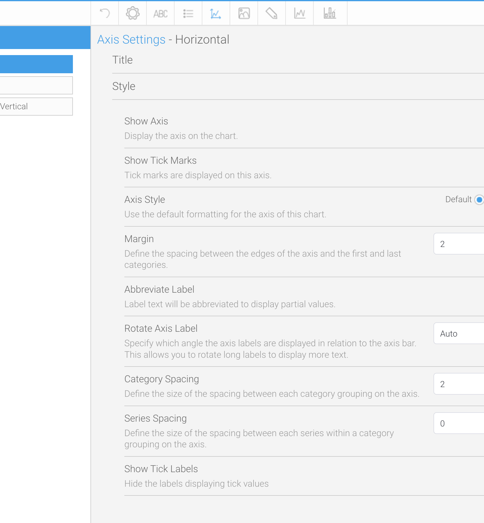 Sometimes it is possible to make the Labels visible by changing the "Rotate Axis Label”, but this is not the case for this time.
We now have created a Combination Chart. Click the Publish button to save the report.
Sometimes it is possible to make the Labels visible by changing the "Rotate Axis Label”, but this is not the case for this time.
We now have created a Combination Chart. Click the Publish button to save the report.
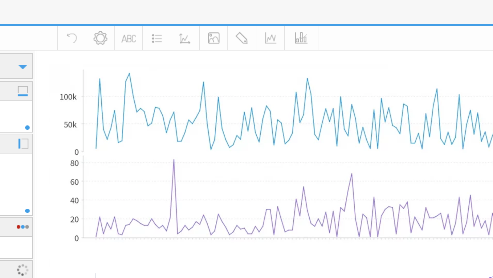 Here is an image of the completed Combination Chart, which features multiple line charts together for use in our Yellowfin report.
In the next blog, we will create a report of the order details and set up a Drill Through, and continue to show off the extensive data visualization tools that Yellowfin BI provides.
Stay tuned!