Welcome to the final entry in Yellowfin Japan’s long-running ‘How to?’ blog series!
This series of blogs has aimed to to provide your team with a step-by-step guide of how to create your own Yellowfin dashboard, starting from the design and data transformation flow, all the way to creating rich data visualizations and using the right report filters:
1. How To Design a Dashboard in Yellowfin: Part One
2. How To Design a Dashboard in Yellowfin: Part Two
3. How To Capture Data using Yellowfin Data Transformation Flow
4. How to Add a ‘Back to Top’ Button to Your Yellowfin Dashboard
5. How to Create Big Number and Vertical Column Charts in Yellowfin
6. How to Create a Pie Chart in Yellowfin Dashboards
7. How to Create a Heat Grid in Yellowfin Dashboards
8. How to Create a Line Chart in Yellowfin Dashboards
9. How to Drill Through in Yellowfin Dashboards
This final article will use all of the graphs, charts and design lessons we have covered in our previous guides to complete your journey to creating your first Yellowfin dashboard.
Note: Throughout this series, field names will be written in [square brackets], Yellowfin settings and selections will be written in "double quotations", and parameters that must be entered manually will be written in enclosing lines and shadings. No specific rules are defined for (rounded brackets) or ‘single quotations’, so please read them as normal punctuation marks.
Before we get into the technical break down of creating a dashboard, let's go over what a BI dashboard actually is, in the context of data analysis and business reporting.
Why are we creating a BI dashboard?
A business intelligence dashboard is a visual display of key business metrics and data. Typically, a dashboard provides an overview of critical operational information on a single screen, with multiple dashboards separated by tabs. The aim of a dashboard is to present data in a clear and concise way, often through charts, graphs, and other interactive elements, to allow businesses to quickly understand their performance, identify trends, and make data-driven decisions. Dashboards are often referred to under numerous terms, such as as business intelligence dashboards, BI dashboard software, or interactive dashboards. Ultimately, all forms of BI dashboards aim to provide valuable insights into various aspects of a business.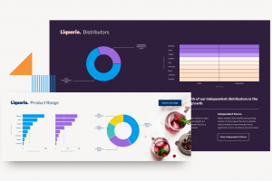 The exact capabilities of a dashboard, such as graphs, charts, tables and interactive elements, are determined by the BI solution you choose. Certain vendors focus on operational-style dashboards, while others, such as Yellowfin, aim to provide embedded dashboards with capabilities that further extend their use cases, such as through the implementation of generative AI analytics and automated business monitoring (ABM).
With the term now defined, let's move onto creating a fresh example dashboard, for the purposes of demonstrating the extensive dashboard creation capabilities in Yellowfin.
Learn more: Dashboard vs Report: Which is better for BI?
Step #1: Placing the charts
Before we start, here is a diagram of the placement positions of all the charts we created in each previous 'How-to' blog, in preparation for our final dashboard: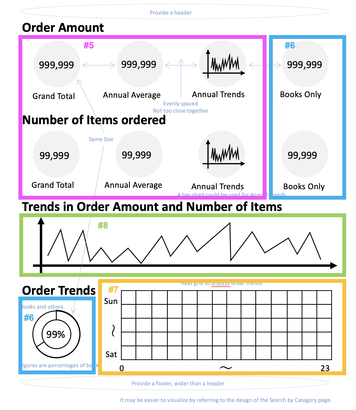 Since the approximate placement positions of our data visualizations have already been decided for this dashboard in our previous walk-through blogs, let's start from the upper left corner and place them in order.
First, we will place the "Big Number and Vertical Column Charts" created in blog #5 (How to Create Big Number and Vertical Column Charts in Yellowfin). It may be hard to tell which chart represents the Total Invoiced Amount, but we will select one of the Charts for now. In Yellowfin, this is what it looks like when selecting a data visualization to insert:
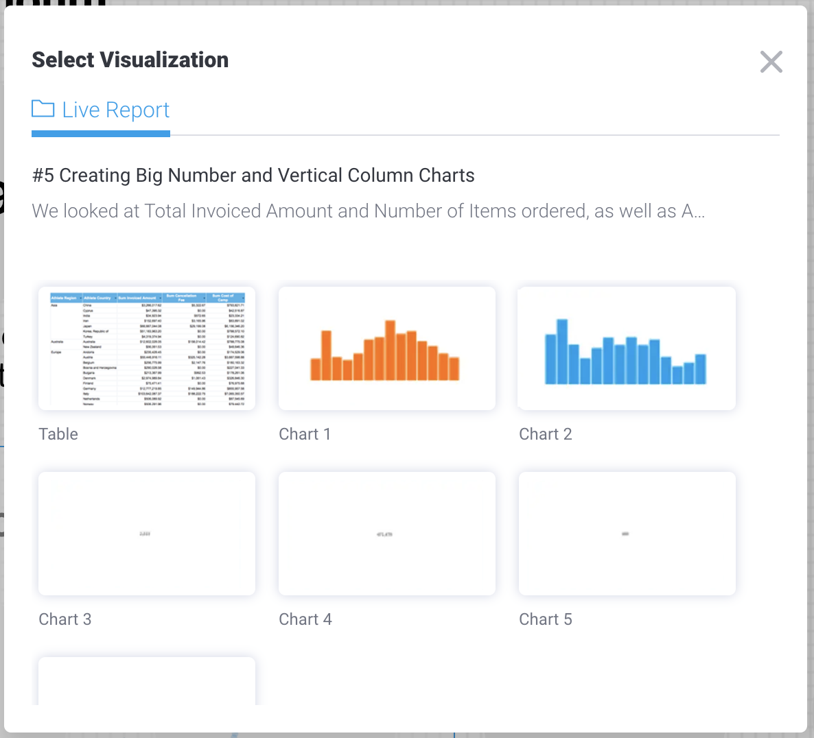 Since we are sure that it is a Numeric Display, we will choose "Chart 3" for now.
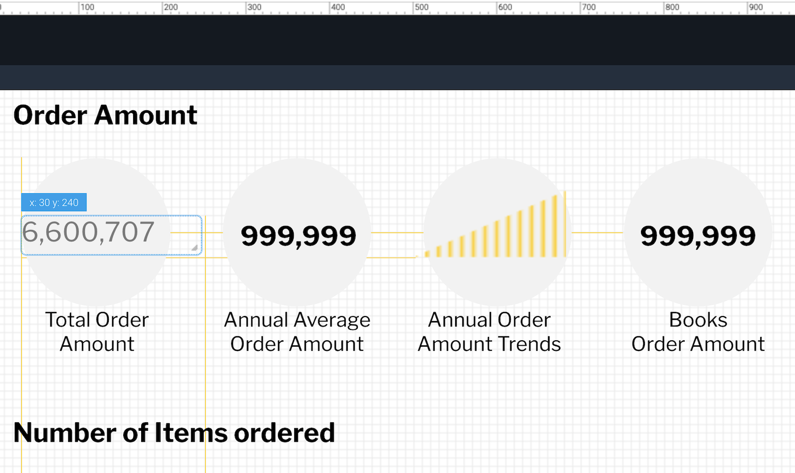
Replace the Numerical Display with the same size as the text object. When you drag the Numeric Display, a guide (yellow line) will appear to help you align it with the charts above, below, left, and right. In the dashboard we will create this time, the chart is aligned with the other charts, so replacing the object can be done smoothly by aligning it with the guide, as shown below:
Step #2: Creating a Branch report
From the ‘Big Number and Vertical Column Charts’ report, we will place a total of six Charts, but instead of placing six identical Charts, you can create "Branch Report". A Branch Report can be inserted by right clicking a Numeric Display on the Yellowfin Canvas and selecting the option, as pictured below: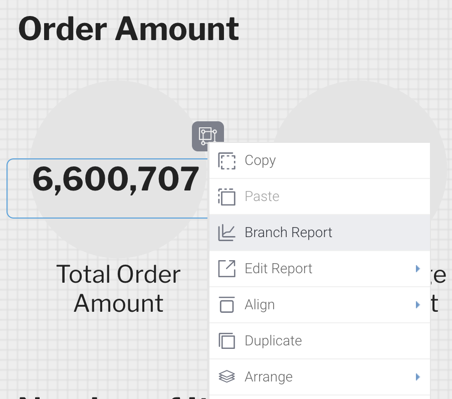 A Branch Report differs from a Duplicate Report in certain ways. Both allow you to duplicate a copy of a chart on a dashboard, but “Duplicate” allows you to duplicate an object other than a report (chart). Branch Report is only available as an option when duplicating a report (chart). It cannot be used with objects such as shapes or text.
In addition, the report behavior when a dashboard is displayed is different. “Duplicate” is the same as “Copy” and “Paste” in the menu that appears when you Right click, and the number of reports on the dashboard will increase by the amount of duplication. If you duplicate to six, the six reports will run on the dashboard individually. You can also set up a dashboard filter to link to only four of the six reports.
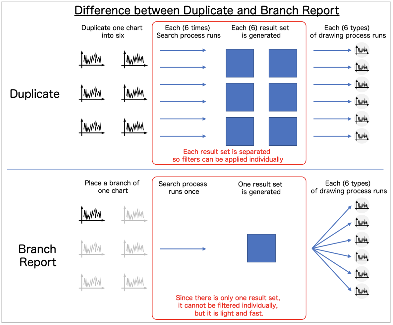 In contrast, Branch Report is a branch of one report. If you use Branch Report to duplicate one report into six, only one report will be run. You cannot link dashboard filters to only four of the six reports as you can in ‘Duplicate’.
While Duplicate has the advantage of being able to link filters individually, Branch Report has the advantage of being a lighter report execution process - each of which has its own advantages.
Step #3: Placing the charts again
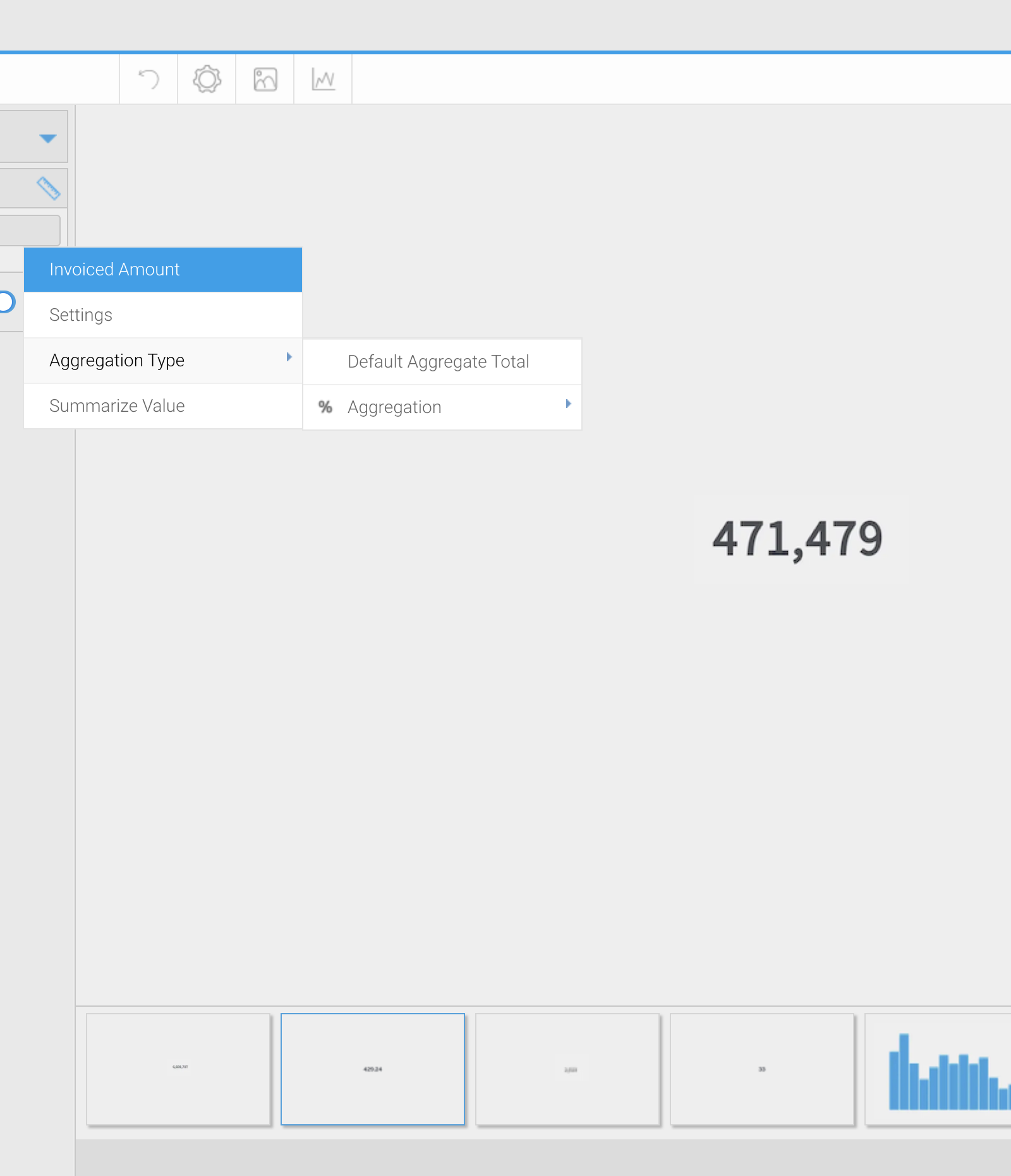
After you have placed the branches you created in their respective chart positions, click on "Select Visualization" in the respective "Report Properties" to change the charts. Since there are many Numeric Displays, it may be hard to tell which chart is which. In such a case, you can set the dashboard to "Preview Mode" to display tool-tips to help you identify each individual chart, as shown below: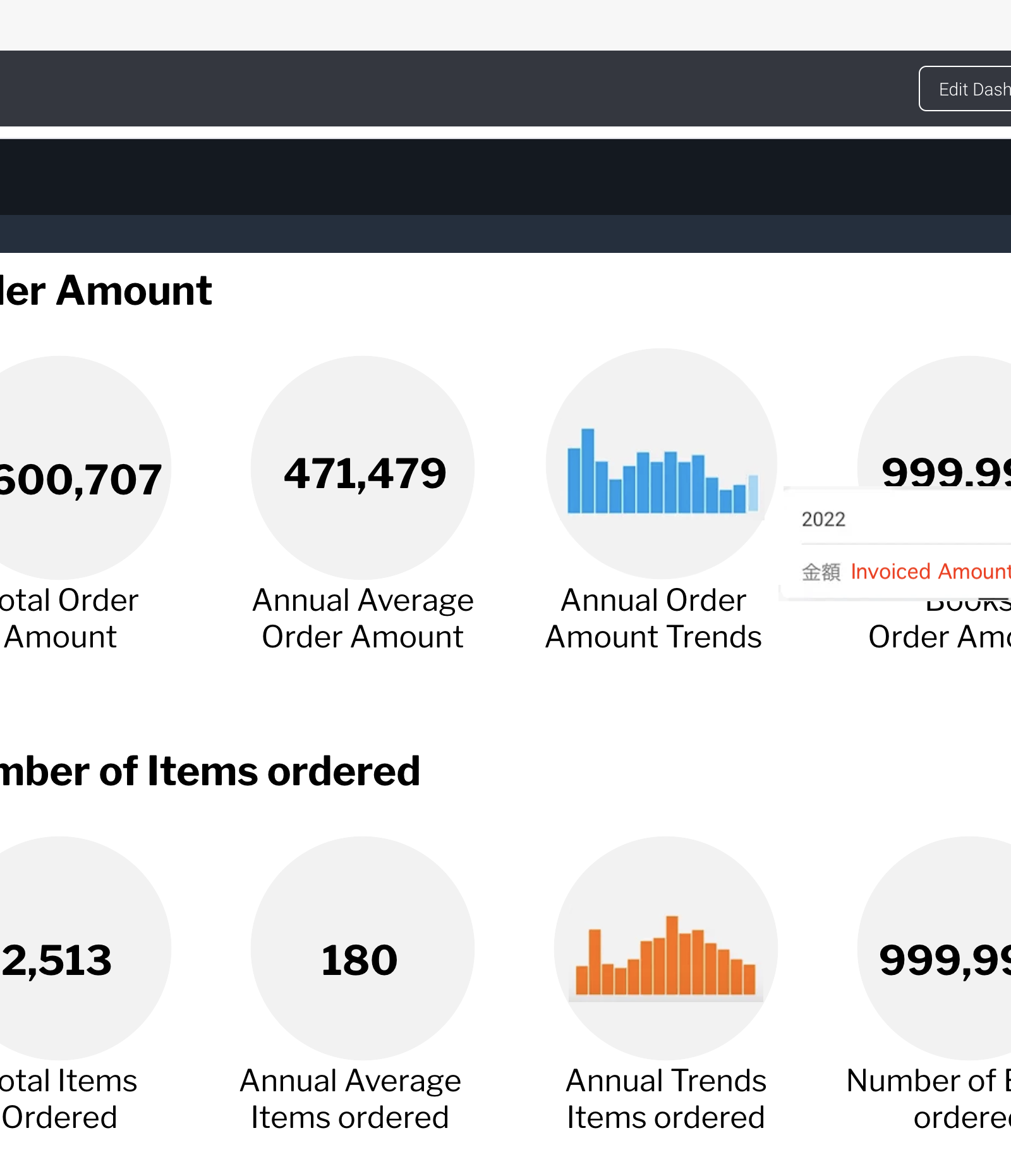 In some cases, it can be determined by checking the tool-tip in Preview Mode. If it is still hard to identify the chart, edit the report directly in Yellowfin Canvas, and check it from the chart edit screen.
 Next, we will place the ‘Pie and Numeric Display’ report created in blog #6 of the 'how-to' series (How to Create a Pie Chart in Yellowfin Dashboards). After duplicating the Pie and Numeric Display in four branches, we will place the charts in the same way as for the ‘Big Number and Vertical Column Chart’. For the Pie chart, we will adjust the size by dragging the edge of the chart to fit the gray circle, as shown below:
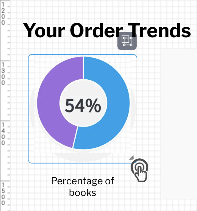 Proceed to adjust the size and position so that it overlaps the gray circle in the background. It is recommended that the Numeric Display showing the Percentage be displayed in front of the Ring Chart and sized to fit inside the Ring Chart's circle.
This is because when the mouse cursor is hovered over the chart, the tool-tip for the chart displayed on the back will not be visible. If the Ring Chart is placed in front, the tool-tips for the Numeric Display will not be displayed, so we recommend placing the Numeric Display in front and sizing it to fit inside the Ring Chart, so that the tooltips for both charts can be displayed.
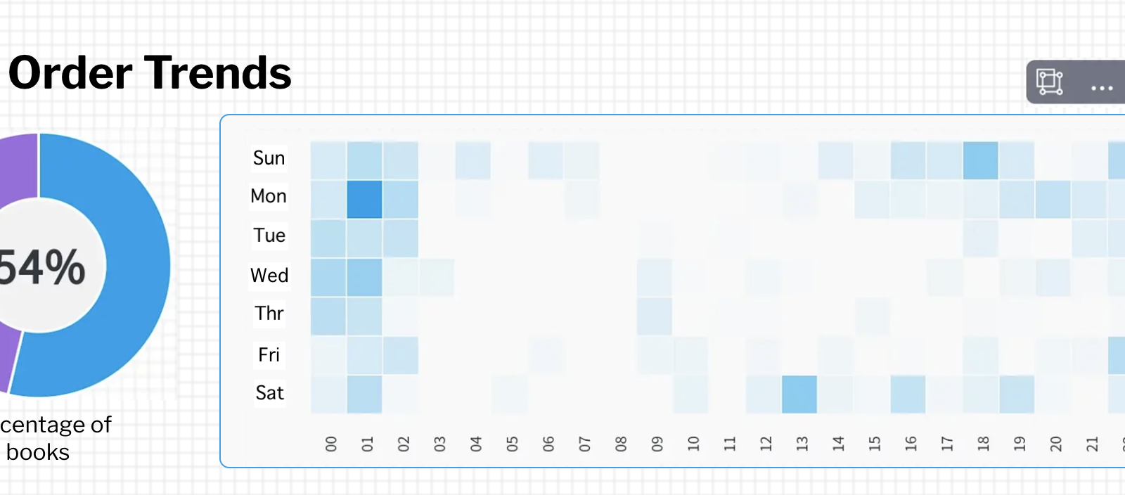 The ‘Heat Grid’ created in blog #7 (How to Create a Heat Grid in Yellowfin Dashboards) and the ‘Line Chart’ created in blog #8 (How to Create a Line Chart in Yellowfin Dashboards) are also ready to be placed.
Upon placement, the Heat Grid can be displayed larger than the size of the chart we had originally envisioned. In this case, you can adjust the size of the chart to the extent that the chart labels fit into the gray rectangle in the background.
With all of your previously created charts now placed in the final dashboard, check the appearance in Preview Mode, and if everything looks good, click the 'Publish' button to save the dashboard. Congratulations - you've made your first dashboard in Yellowfin!
