Yellowfin provide extensive customization for the design of dashboard content so you can achieve the exact look and feel required for your unique business audience and use case. Out-of-the-box, our drag-and-drop design canvas (Yellowfin Canvas) and low-code, no-code user interface enables non-developers to easily access many handy features.
However, sometimes, you may want to extend Yellowfin further, or control the design and layout of your dashboard in a more specific way. For these intermediate and advanced use cases, Yellowfin dashboards natively provide Code Mode, which utilizes CSS, HTML and JavaScript and can be toggled in an instant, so you can get the look just right.
In this blog, we will provide an example walkthrough of how Yellowfin Code Mode can be used based on a common customer use case - displaying charts side-by-side on a dashboard in catalog form - using CSS and Yellowfin's extensive design options.
Overview
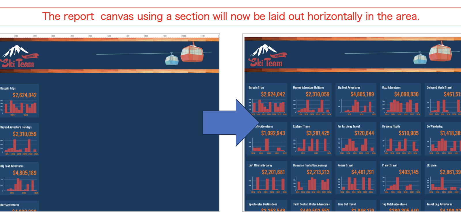
For this walkthrough blog, we will be using Yellowfin's Ski Team sample dataset, which is installed with Yellowfin and available to use as a data source for testing Yellowfin's various dashboard and report creation and design options. For more detailed information on how to access this sample data-set, please read our Getting Started with Dashboards tutorial.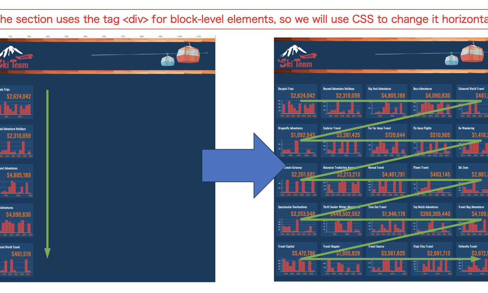 The canvas of a report split by sections displays charts vertically, as seen below with the canvas of our starting example Sales report using the Ski Team data. Each individual chart represents different Sales departments and their annual performance. Because the default design uses the <div> tag for block-level elements, our dashboard displays our charts vertically. But what if we want the charts to be displayed horizontally? For this, we will need to use CSS (Code Mode).
First, we will create a report. There are three points to keep in mind when creating it:
- Use Section in a report
- Use Canvas layout to design the charts
- Calculate the report canvas size (do so backward from the size of the area where the charts will be laid out on the dashboard)
1. Use Section in a report
First, we will define what we should set in a section to split the charts by and display them side by side. In this case, we want to create a report that shows the sales of each distributor, so we set the distributor (Company Name) as a section.2. Use Canvas layout to design the charts
Charts should be designed using the Canvas layout of the report. Without using it, charts split by a section will not line up on the dashboard.3. Calculate the report canvas size
Set the canvas size of the report by calculating backward from the area where the charts will be laid out on the dashboard. The canvas size of the dashboard to be created this time is 1,200px wide by 1,300px high (1200 x 1330), but the size of the area where the charts can be laid out is about 1,200px wide by 1,050px high (1200 x 1050) if banners and other images are placed at the top of the dashboard. There are 25 distributors (Company Name) used in the section, so it would be great to be able to display them in a 5x5 format. The width of the report canvas should be 240px. As for the height, we would like to set it at 210px, but we will need a 30px margin at the bottom of the canvas, so we will subtract the margin and create it at 180px.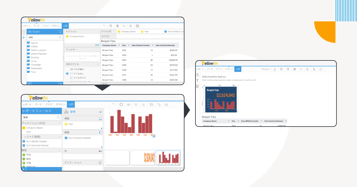
Step #2 - Create the Dashboard
Once the report is complete, it's time to create a dashboard. Place the report canvas and set the size to 1,200px wide by 1,050px high. There appears to be a blank space on the right side, but we will lay out the charts in this blank space by writing CSS, so this is no problem.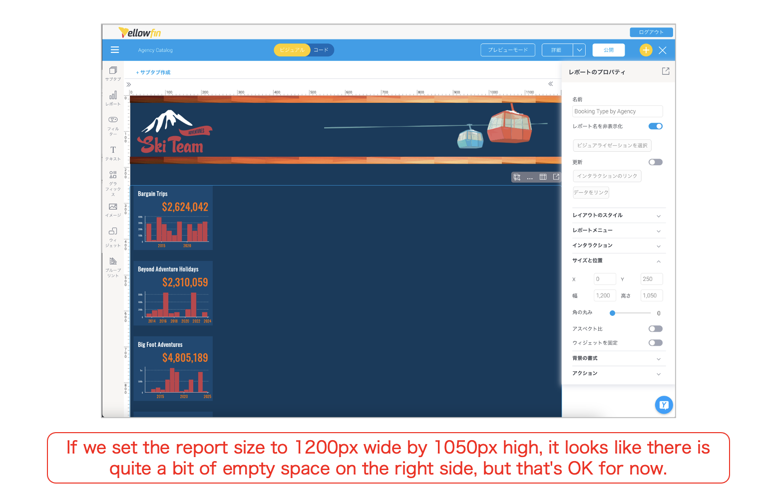 To write the CSS, we will see how the report section is represented in HTML. View the dashboard in preview mode and use the browser's developer tools to verify the elements.
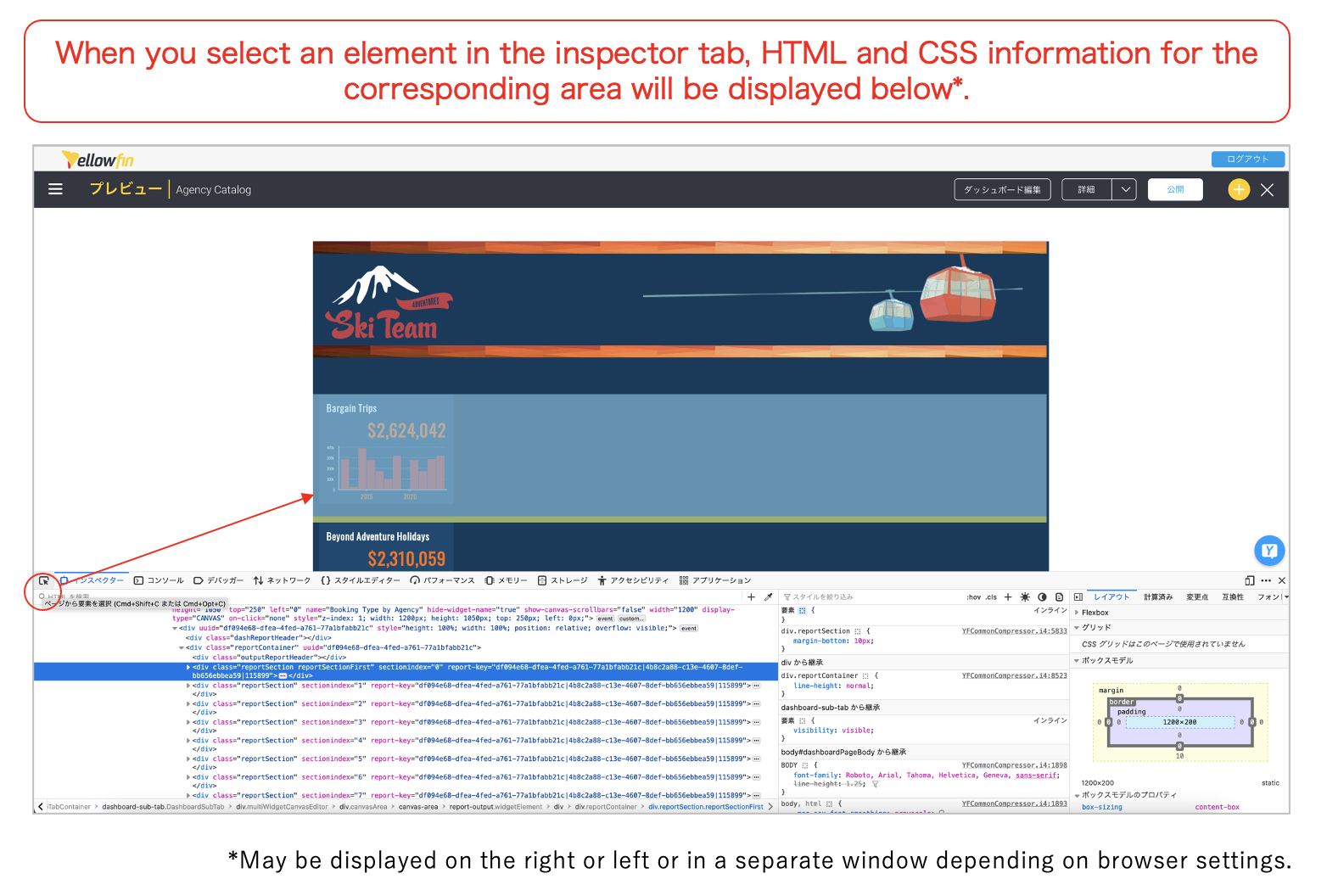
 The figure above is an example using Firefox. Selecting the elements in the section, we can see that the section is separated by a <div> and that the class name reportSection is specified. Now that we have identified the tag and class name, all we need to do is specify the style.
Switch to the Dashboard Code Mode and write the CSS. The following three lines of CSS are to be written to make the <div> reportSection horizontally aligned. This will allow the vertical sections to be laid out horizontally in the area:
| div.reportSection { display: inline flex; } |
