How Yellowfin Provides True Data Storytelling
Being able to create and share insightful data-led stories to support your dashboards and reports is a critical capability in today’s modern workplace. You want your data to be accessible for more people, and ensure everyone gets value from your investments.
Data storytelling tools bring valuable context to the ‘why’ behind the results, while inspiring your audience to care about and act on insights. However, to ensure it is effective, you need a business intelligence (BI) solution that fully accommodates data-led stories as a built-in feature.
Many BI vendors today talk about the value of data storytelling and having it as part of your analytics. However, often-times, data storytelling is not as deeply integrated into their product, compared to what Yellowfin has accomplished with Stories and Present.
The role of data storytelling in modern business
Traditionally, conveying important business results and interesting trends is accomplished through the use of operational reports and dashboards, which help collate and present the most critical business data in a visual format that can be consumed by many people at-a-glance. However, the reality is these numbers still have to be analyzed to fully convey their significance, how it occurred, and why it happened. Not to mention that gleaning meaningful insights at-a-glance can be complex for non-technical people. So, how do you provide that additional context to make the numbers more meaningful? This is where data storytelling comes in. It is a skill used to create a narrative, supported by data, to contextualize and break down the numbers, using storytelling tools such as domain expertise and visual aids to present an insightful summary of the true value of your metrics and results. In the context of modern BI and analytics solutions, data storytelling is provided as a specific analytic capability that allows you to build short and long-form narratives within your analytics solution that provide a deeper analysis of the numbers, using text, rich media, and your data-sets to help explain the importance of the results, and open up understanding to more people. Yellowfin Stories and Present is one such example of data storytelling as a feature within a BI platform. Both tools bring the creation and sharing of your data stories directly into the analytic workflow, with your narrative sitting alongside dashboards and reports in the same user experience (UX), rather than as a separately accessed application/experience. Data storytelling’s role in modern business is growing in importance rapidly - so much so that by 2025, research advisory firms such as Gartner predict data stories will be the most widespread way of consuming analytics - even more so than the dashboard. If you are still wondering why so many BI vendors, including Yellowfin, are making a big deal about data storytelling as a feature, it’s time to brush up on the role of data storytelling today with our free guide, linked below. Read more: What is data storytelling? The value of context & narrative in BIThe role of Yellowfin Stories
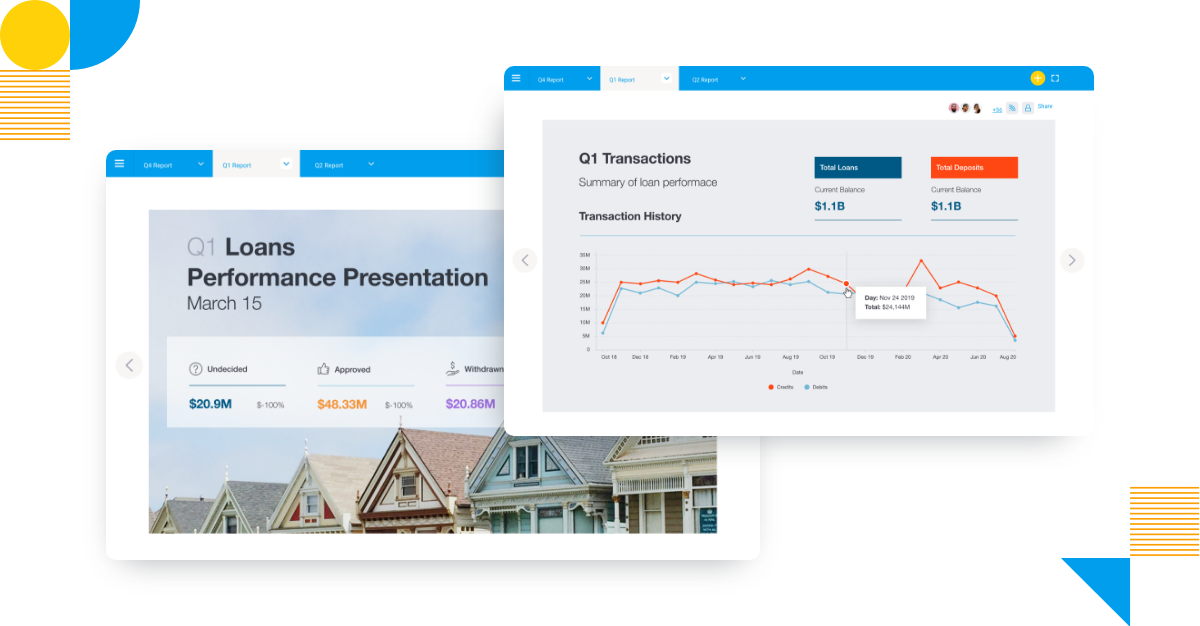
Yellowfin Stories is a distinct data storytelling module in the Yellowfin software suite that allows your users to create narrative-driven stories in a blog-style format that accompany their dashboards and reports. This provides more granular control over the storytelling process, as users can build both short-form and long-form articles that provide deeper context behind the numbers, rather than be limited by what can fit within a regular dashboard or report layout. In addition, Stories created in Yellowfin can import live data or a snapshot (data preserved as it was at a specific point-in-time) from existing dashboards and reports in Yellowfin to create dynamic, up-to-date narratives that aren’t outdated the moment they are shared. This is in addition to the ability to add descriptive text, rich media such as videos and images, icons and shapes, filters, and interactive action buttons that can lead to more related resources or data. If what Yellowfin offers natively is not enough, one unique aspect about Stories is that users can also embed data visualizations and reports from other reporting tools into their Stories, if that is something they desire, to support their narrative and objective for providing further context on the ‘why’ behind the numbers, making it one of the most flexible data storytelling tools on the market. Read more: What is Yellowfin Stories?