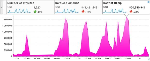
As usual, we’ve been hard at work improving old features, and developing great new ones, of Yellowfin’s Business Intelligence solution. One of the new improvements that I’ve been developing personally – due out in May’s release of Yellowfin 6.3 – relates to Series Selection. Specifically, the way in which you’re able to set colors, and how they’re shown within a chart.
Current color settings functionality for Series Selection in Yellowfin works like this: You create a Series Selection chart, and are then able to set the colors for each series. So, you’re able to set the color for a series (“Cost of Camp” in the instance below) to a shade of pink, for example. When selected, the chart color will be displayed as pink. However, in the Series Selection list, it will appear blue – which can be a bit deceiving.

However, in Yellowfin 6.3, this deception will be no more!

As you can see, the “Cost of Camp” Series Select will now also be a lovely matching shade of pink!
This change will bring more consistency to the creation process whenever you’re building a Series Selection chart.
In addition to this colorful update, there are many more enhancements and new features to be included in Yellowfin 6.3 – especially relating to Collaborative BI. So keep you ears tuned, or eyes peeled (although seriously now, why would anyone peel their eyes – it sounds painful), for more info in the coming months.
