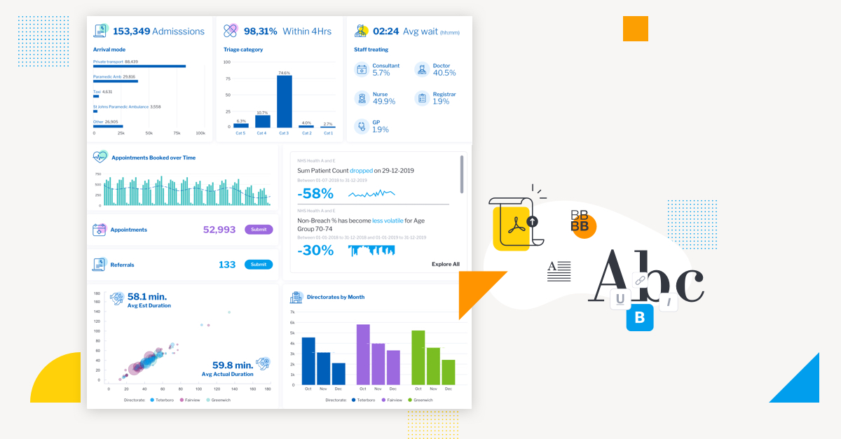
For many organizations, achieving effective dashboard design is a recurring problem. However, it's a problem that can be easily remedied following a few core principles.
Simply put, a lot of effort is going into creating dashboards the intended audience don’t even look at.
The main purpose of a dashboard is to communicate business data in a visual form that highlights to the reader what is important, arranges it for clarity and leads them through a sequence that tells the story best so they can make better data-led decisions. Design and an understanding of how humans make decisions exist to assist this purpose.
Unfortunately, we often see the best ideas come undone by poor design execution and bad decisions that put users under cognitive overload and render dashboards unusable.
The challenge is highlighted by the fact leading organizations continue to face difficulty in becoming data-driven, with reports finding 72% have yet to forge a data culture, and 69% have not yet created a data-driven business (Big Data and AI Executive Survey).
Part of the problem is a lack of follow-through with core dashboard design principles, which before your designers can even move to specific design tips such as colors, imagery and layout, must be considered to properly follow analytics best practice.
In this blog, we explore 5 key principles that exist to ensure you create a relevant dashboard that guides and simplifies the user experience, makes it as easy as possible to interpret what is presented no matter its complexity, and increases the adoption of BI.
The challenges of dashboard design today
But first - where does the problem stem from?
Dashboards often communicate complex scenarios, with a lot of different elements for the user to take on board: visualizations, metrics, dimensions, descriptions, colors...
Then there are emerging features such as automated business monitoring and assisted insights, which have become an increasingly expected part of the dashboard experience and which now have to be considered when accounting for necessary visual elements.
Understandably, this all makes conveying data in an engaging, clear way a challenge.
It is therefore essential dashboard designers guide and simplify the experience for the end-user and make it as easy as possible for them to interpret what is being presented with. Put simply, design should never complicate the experience and get in the way of gaining information, but be an effective vehicle by which the story is best communicated.
Read More: Why design matters in BI
You can significantly increase the adoption of your dashboards by incorporating the right design and usability principles, in addition to leveraging the design flexibility of analytics platforms like Yellowfin. Our Head of Product Design and Creative Director, Tony Prysten, shares his thoughts on the 5 main principles that underpin dashboard design below.
#1 - Effective information presentation
Always begin with a clear understanding of the end-users the dashboard is intended for.
Consider each user’s analytics capability and their needs in terms of how data can better inform their decisions and actions. This is then delivered using an appropriate dashboard interface, designed in a way that guides the user through the data journey needed to deliver the insights they need. There are five main types of dashboards to consider:
- Strategic: For users monitoring the overall business, or a specific functional or operational area to understand its trends, benchmarks and relative performance.
- Operational: For users managing day-to-day operations of the business; mainly used for transactional decision making, and tend to be very subject area specific.
- Analytical: Leveraged by more experienced users such as analysts to slice and dice data in search of anomalies, insights and exceptions to drive decision-making.
- Informational: Used primarily to educate about a certain topic, often represented visually as infographics.
- Contextual: A unique form of operational dashboards that are tightly embedded into third party applications and support or trigger workflows and transactions for users.
Understanding the types of dashboards and choosing the right dashboard type for the user in question is critical as a foundation for implementing all other design principles.
#2 - Visual consistency
Clear dashboard design is ensured and delivered through consistent adherence to and use of typography, colors and graphic elements.
Dashboard design exists to aid the end-user and should be used as a subtle, almost sub-conscious tool to guide them through the intended analytics experience.

Not over-designing the dashboard is as important as conveying the right information clearly. Limit the number and size of fonts, keep headings consistent in terms of size, and ensure the colors used are consistent throughout. If you use a specific color to highlight a certain key dimension or metric, use that same color for it across all dashboards.
A common mistake we see are dashboards using the same color for different fields. The viewer has to spend more time to interpret it properly, potentially causing confusion. But when color is used correctly, it can enhance the importance of metrics all the better. Looking at the example above, at a top level, the dimension of aggravated crime is consistently highlighted in orange, catching the eye toward the most important figures.
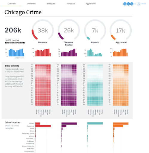
Finally, there should be an orderly hierarchy and method to presenting all the visual elements on a dashboard. Without one, you risk over-complicating the data, confusing viewers on where to look, or failing to convey information in a clear or engaging way.
In this follow-up example of the same dashboard, the most important information is clearly structured from top down and concisely divided into rows and columns, making it easy to quickly reference the metrics needed from each distinct dimension.
#3 - Efficient interactions
Yellowfin see many dashboards built with multiple graphical and interactable elements that aren’t necessarily needed at all. It’s important to remember just because you have access to a particular report or visualization, it doesn’t mean you have to use it.
To ensure the user's time interacting with the information on the dashboard is efficient, any visualizations superfluous to the needs of the user should be removed. Filters, actions or interactions need to be clear and logically align with the end-users’ workflow.
For instance, in Yellowfin, designers can add actions into tables via low-code, no-code mode, which enables the integration of workflows at the right moment when someone is looking at a chart. Instead of a user looking at a sales chart on which ads are working and aren’t working and having to go somewhere else to then advise or change it, you can just add buttons within the dashboard to send the user the relevant additional context. This sort of functionality allows for more efficient interactions to have around a dashboard.
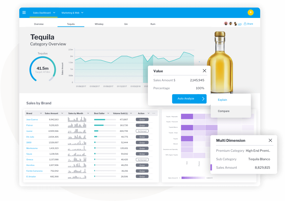
An efficient dashboard will not try to cram everything onto a page because it is available, but space elements out appropriately to avoid information overload.
- Show only the data the user needs to make the decisions they need to make
- Don’t cram information in for the sake of it
- Understand the context of how someone is looking at a dashboard
- Understand decisions and actions they need to take
- Provide them the data they need to do that
Anything superfluous to this general flow of dashboard interactions becomes an overload on the viewer and unnecessary. It can even make people potentially disengage with the dashboard. Ultimately, it’s about having a good understanding of the end-user and their needs and collaborating with them to understand how best to create a suitable dashboard that allows them to do what they need to do as efficiently as possible.
#4 - Effective use of language
Language is as much a design or user experience tool as color, font and style.
Using clear and considered labeling, notes, and explanations is essential to ‘speak to’ and guide your end-users through complex visualizations and layouts.
Be descriptive when you label a chart and don’t assume the person you’re building the dashboard for knows what’s going on - this is a big problem we see a lot of at Yellowfin.
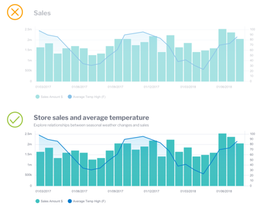
Using the example above - instead of just labeling part of the dashboard ‘Sales’ and leaving it to the user to work out its place in the overall narrative, describe the dashboard’s specific focus using typographic tools for better and detailed labeling - for example, store sales and average temperature for the main header and a brief, expanded description beneath to make it clear to the viewer what metrics they're analyzing.
Following this simple principle means any user looking at a dashboard for the first time understands what is being conveyed quickly, easily and ultimately has a really good experience with it overall.
Yellowfin offers many canvas type options that allow your designers to be very descriptive in how they label a chart for users, as well as tabs that you can add in your dashboard to break up dashboard layouts into more manageable chunks, such as having an overview and additional tabs focusing on sales performance of specific products.
#5 - Minimize the cognitive load
Studies show people love the idea of choosing something, but are quickly overwhelmed by their options. Without meaning to, many people avoid interfaces or situations that are mentally straining. Adding too many can quickly lead to people choosing nothing, and leads to using the slow thinking part of the brain, which often drives people towards the safe and familiar. This is what’s called choice paradox, and it is highly relevant here.
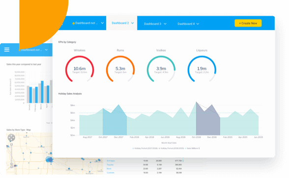
Whilst design is often described as something to be visually pleasing, it’s primary aim is to really be mentally pleasing. Yes, it should look good, but it must also ‘feel’ good to be considered ‘good design’. That means a following the others principles closely, and:
- Limiting what visual elements you choose to share
- Limiting actions you enable on the dashboard
- Getting design down to what’s essential and removing what’s superfluous.
Overall, good dashboard design is successful when it reduces the effort required by the end user to be as minimal as possible when they attempt to interpret and use the data presented in front of them to make decisions. We recommend establishing a hierarchy - more important things at the top, less at the below, so the viewer’s eye naturally goes on a journey. If they can’t engage without feeling overwhelmed, they’ll probably move away from your dashboard - which definitely isn’t ideal after all the effort you put into it.
Read: How design flexibility gives you a better dashboard experience
Learn more from Yellowfin Head of Product Design and Creative Director, Tony Prysten, as he shares insight into how design flexibility improves the dashboard experience - and how you can ensure data is always accessible.
