They’re “pathetic”; according to CEO of analyst firm Ventana Research, Mark Smith.
Last year, Smith proclaimed that the primary Business Intelligence (BI) mechanism used to visually communicate the key insights garnered from business analytics – the dashboard – was broken.
“The Pathetic State of Dashboards”: Supplementing the dashboard
Smith argued that current BI dashboards had remained essentially unchanged since their emergence as a primary method for displaying BI content in the 1980s. His contention was that something needed to change to reflect contemporary BI users, uses, communication demands and expectations.
Yellowfin responded by releasing Storyboard – a fully integrated and interactive PowerPoint-like module for presenting BI content and analysis to boost information understanding and drive action.
But this innovation was never intended to replace the dashboard – just supplement it.
“The Pathetic State of Dashboards”: Enhancing the dashboard
We know that BI dashboards will remain a vital tool for communicating and sharing data analysis for many years to come – that’s why we’ve always offered our customers tips on dashboard best practice.
BI dashboard best practices webinar recording and slides >
Top Business Intelligence dashboard design best practices (Part One) >
Top Business Intelligence dashboard design best practices (Part Two) >
And, that’s why we’ve been working hard to make dashboards even more visually intuitive, and even more accessible for business users.
Since my last entry into the world of writing viral developer blogs, we’ve released Yellowfin 6.3, and started preparations for the next amazing version. I’ve spent a lot of time improving our dashboards. In particular, we’ve enhanced the dashboard editing process and the use of chart colors within dashboards to create visual consistency for quicker, easy analysis. While the back-end functionality of the dashboard has remained quite similar to what it was in Yellowfin 6.2, we also overhauled the dashboard builder UI to make creating and modifying dashboards a much more streamlined process.
Ref Code Colors
One of the new features introduced in Yellowfin 6.3 is the ability to set Reference Code Colors, which can be set via the new Reference Code Manager. Being able to set a color to a Reference Code means that this color setting will apply to all reports in which that code appears.
For more on Ref Code Colors, and other major enhancements included in Yellowfin 6.3, download the official Release Notes, HERE >
Assigning colors and symbols to Ref Code values – within filters, legends and section titles – makes it easier to track, analyze and understand key dashboard metrics. Allocated color codes also feed into individual charts within a dashboard – providing you’ve linked your filters. This consistent appearance – where each metric is always displayed in the same color within each individual report – promotes quick data interpretation and analysis, making it easier to pinpoint important trends. This way, colors won’t get all ‘mixed up’ like they used to in the ‘good ol’ days’.
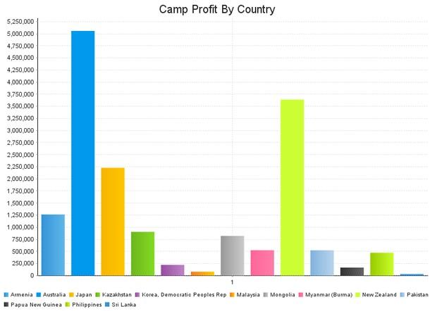
For instance, as with the below example, you could set the color of Australia to blue via the Ref Code Manager. This would mean that all charts, which draw from the same dataset used in this example, would display the dimension ‘Australia’ in that same delightful Yellowfin-esc blue hue.


Where to next?
And, as always, the development team has been hard at work formulating great new features for the next release of Yellowfin. So, stay tuned for more updates!
