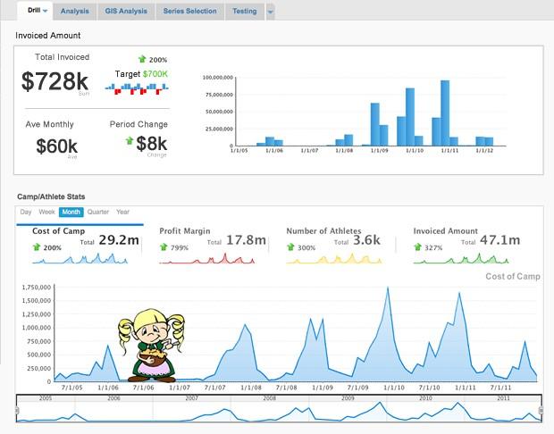
Ever wanted to highlight the key metrics in a report but were frustrated by the ‘Big Number’ chart? Well, thanks to Jake, your troubles are almost over – Report Summaries are here to help.
The Report Summary is a simple way to highlight key metrics in a report and indicate how you are travelling compared to your desired outcomes.
There is a lot of best practice dashboard design out there that crams many metrics onto a dashboard but we find that these are too complex to be understood easily – as in the example below.

On the other hand a dashboard that contains just reports can be too sparse and fail to give you the information you need to run your business. Here is one from our demo site.

So we think we have come up with an awesome middle ground. A fine balance between way too much data and just the right amount. Sounds like a fairytale doesn’t it!

So what do you need to do to access this Goldilocks goodness?, Simply build your report like you always did, then add in a summary and pop that on your dashboard. The only downside is you’ll have to wait till the May launch of 6.3 to get your hands on this one!
