

The Fascinating History of Data Visualization: From Basic Maps to BI
Data visualization is an elementary component of human learning and understanding. It's also a significant capability of business intelligence (BI) and analytics solutions today.
So, how did data visualization first come to be? The humble origins and gradual evolution of data visualization tools has led to an interesting timeline. From ancient cave drawings demonstrating the accomplishment of a hunt, to complex dashboards propped up by the computer revolution, this blog is a primer to the fascinating history of data visualization.
An introduction to data visualization history
In earlier times, humans engraved information into stones. However, over time, inventions such as the compass and the sextant led to accurate maps with precise measurements.
In our modern times, we have data visualization built into business intelligence dashboards that help report builders convey deep meaning behind metrics and numbers, and tell impactful stories visually that are far more exceptional than ever witnessed in our recorded history.
Most visual representations of data fall into two categories: presentations and visualizations. When creating fantastic visualizations, both are incredibly significant. Still, they each have certain needs that must be met.
Presentation: It uses information visuals to communicate. A presenter and an audience are required for this visual representation to function well.
Visualization: This is a relatively new concept, and the goal behind it is to think via visuals. People are encouraged to participate in this interactive experience by being asked questions and providing answers.
Professionals today are expected to make data-driven decisions using huge volumes of data. In this context, we expect more advancement in data visualization. Ultimately, the real strength of humans lies in our imagination and ability to convey important data in a way everyone understands - and information visualization helps make that happen.
Recommended: What is Data Visualization and its Importance in Business Intelligence?
A whirlwind tour of data visualization history
Now, let us take you through a whirlwind tour of data visualization history. We'll discuss the following historical time periods below:
Pre-Historic Data Visualization
366-335 BC Roman Maps
950-1092 AD Celestial Bodies
17th Century Michael Florent Van Langren
18th Century William Playfair
19th Century John Snow
20th Century Advancements
The Information Age
Pre-historic data visualization

Scratching on rocks and drawings in the sand are more likely the first graphical illustrations. Experts believe the famous Lascaux cave paintings dating back to 40,000 years were guides to hunting and directions to the spirit world. These paintings were likely astronomical illustrations of the constellations.
The early Babylonian world map dating back to 600 BC also shows that ancient civilizations initially drew on clay. Nevertheless, ancient civilizations such as Egyptians, Chinese, Greek, and others also developed maps to aid navigation. These early maps demonstrate how historical data visualization played a crucial role in organizing and communicating geographical knowledge. They were also used to devise plans for planting crops.
366-335 BC Roman maps

The desire to effectively manage the army's movement and smoothly control trade made the Romans famous as mapmakers. Beginning in Britain to ending in India, it illustrates the road system of the empire.
While icons showed destinations, the routes were drawn as lines. The map is comparable to a schematic diagram -- the one designed by Henry Beck for the London Underground map in 1931.
950-1092 AD celestial bodies
In Europe, 800 years earlier than the first time plotted graphics emerged on the scene. The incredible diagram was discovered that displays the location and time of planetary bodies by using a grid system.
Although it is near-impossible to find the precise meaning. However, time-frames were shown on the horizontal grid, and planetary positions and trajectories were demonstrated on the right-hand side.
This method represents an early form of timeline data visualization, where events and celestial movements were plotted over time. Such visual techniques helped ancient astronomers track and predict planetary alignments. Over the centuries, timeline data visualization has evolved, becoming a crucial tool for mapping historical events and scientific progress.
Meanwhile, during the Chinese Song Dynasty, celestial bodies were projected using unique techniques unknown to Europe until the sixteenth century. They designed tremendously sophisticated visualizations of the stars. However, the above-described chart by Europeans came before this Chinese chart.
17th century Michael Florent Van Langren
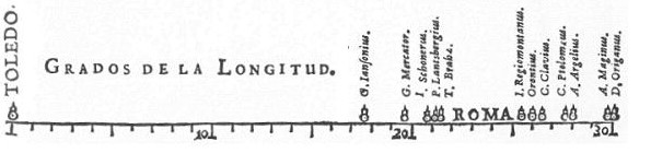
In 1644, the idea of statistical data presented in the form of graphical representation was attributed to Flemish astronomer Michael Florent Van Langren. It was a one-dimensional line graph. This marked a significant step in the evolution of data visualization, paving the way for more complex graphical techniques. Over time, these advancements have enabled better interpretation and communication of statistical information.
What is fascinating is that Van used the graph and chart to demonstrate the wide variations in estimates - even though he could have presented the information in tabular format.
18th Century William Playfair
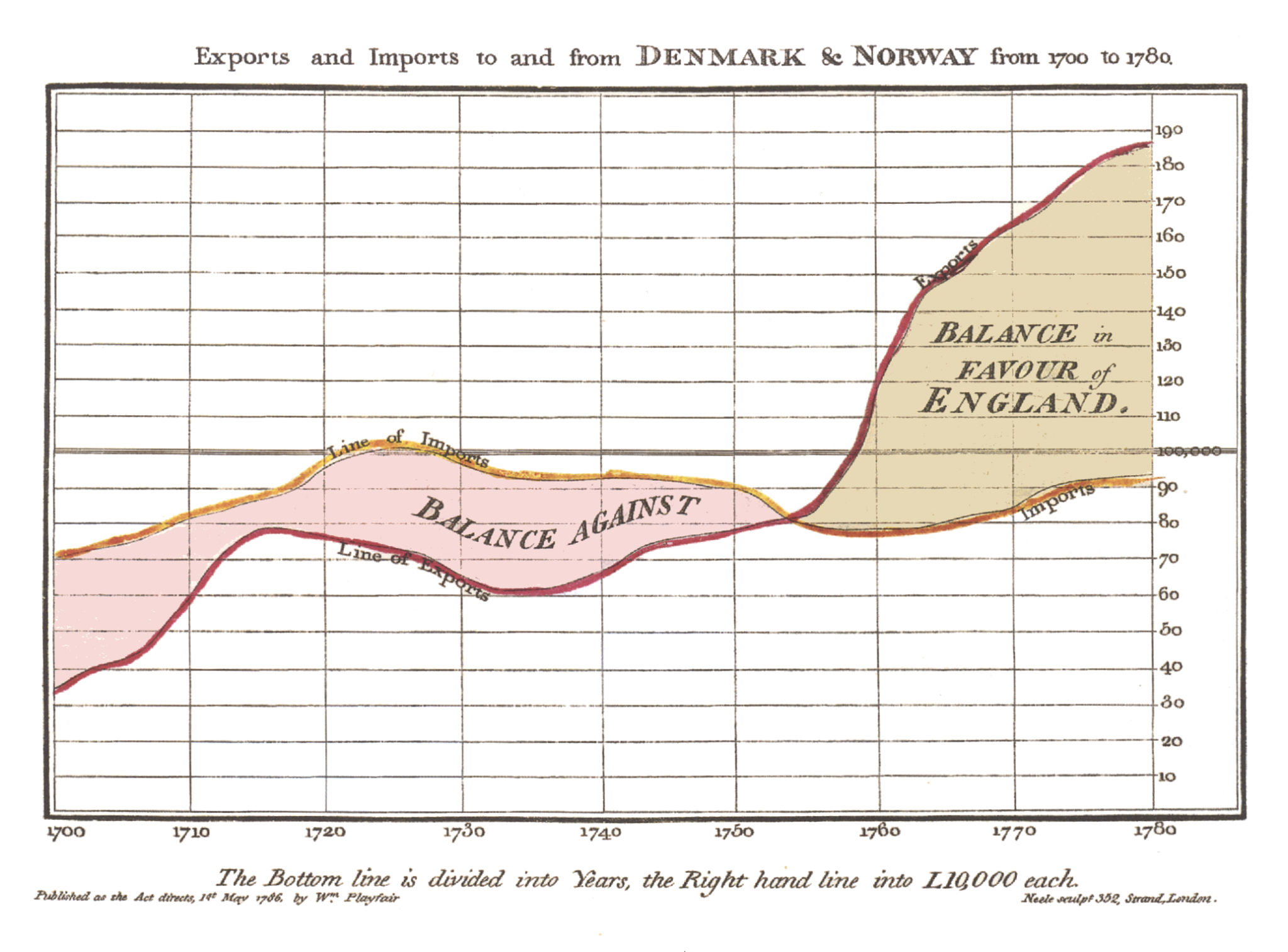
Scottish political economist and engineer William Playfair is the father of statistical graphics. In 1786, He published a book that incorporated graphical representations of data. He introduced a variety of graphs and charts in his book Commercial and Political Atlas.
The book demonstrated the balance of trade in England using graphs. To your surprise, people still use several cutting-edge data visualizations used by Playfair. However, it is worth mentioning that data was generally shown in dry tables without considering its potential interpretation during those days. By introducing graphical methods, Playfair revolutionized the way data over time was analyzed, making trends and patterns more accessible.
19th century John Snow
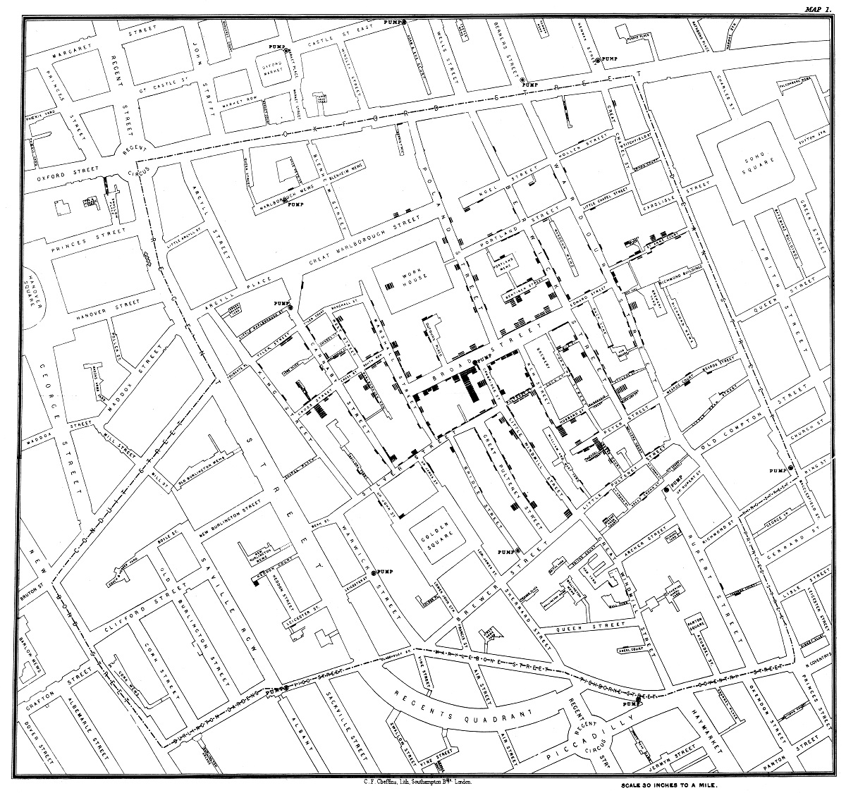
In 1855, British physician John Snow (no, not that Jon Snow from Game of Thrones) leveraged the graphics based on statistical data to tackle cholera epidemic. On the London map, he used dots to refer to each case of cholera. These dots led to the cholera origins, a water pump on Broad Street.
Those dots showed that most cases were traceable to a Broad Street pump. The ensuing investigation proved that cholera cases had a link with the Broad Street pump. The map used by Snow also works for the presentation style.
20th century advancements
The popularity of statistical graphics went through the roof by the mid-20th century. However, the widespread use also gave birth to the use of statistics for exploitation. For this reason, in 1955, Darrel Huff, an American writer, had to write a book, How to Lie with Statistics, to highlight the abuse. It sheds light on how a visual representation of data could be distorted to mislead audiences. His work remains relevant today, as the advancement of data continues to influence how information is presented and perceived.
He also published another book called Semiology of Graphics a decade later, but this time around, by French theorist Jacques Bertin. It was a statistical mapping that drew the attention of Bertin. According to his observation, data views involved three chart types of marks: lines, points, and areas.
The Information Age
Data visualization reached new heights after the advent of computers. Humans witnessed the first commercial graphical user interface in 1981. Among other things, spreadsheets changed the information visualization format entirely. They generated graphics and charts, such as scatter plots and pie charts, from information tables - without manual labor. Before and after data visualization comparisons highlight how technology streamlined data interpretation, making it more efficient and accessible. Essentially, they provided the ability to visualize data using pre-generated graphs and charts, making the whole process faster and easier.
One could draw anything by a few clicks. Unlike in the past when people used to invest hours in making slick drawings. Besides, updating, formatting, and editing were the additional features of the spreadsheet application. Various enterprise data visualization software solutions soon hit the market, introducing new charting techniques and styles.
21st century business intelligence (BI) dashboards
Business intelligence dashboards, or BI dashboards, are reporting tools that enable users across an organization to comprehend and interact with data conveniently. BI dashboards benefits and helps organizations answer several questions and uncover insights to make data-driven decisions. In other words, it shows critical metrics and key performance indicators on a single screen. For this reason, different industries rely increasingly on BI dashboards to make informed decisions. As technology advances, future trends in data visualization will likely enhance BI dashboards with AI-driven analytics, real-time data streaming, and more interactive features. These innovations will further improve decision-making by providing deeper insights and predictive capabilities.
Are you wondering why organizations prefer to use BI dashboards? First and foremost, it advances a data-driven culture at all levels of an organization. On top of that, it communicates how a business performs along the lines of defined targets. Not to mention, visualizing complex relationships in a simple format is always preferable for organizations.
How to outsmart competition with data visualization analytics software
Data visualization of quantitative information clearly has deep roots in human history. However, data visualization as a business capability is a relatively modern development. The evolution from maps showing visual analysis and depiction to thematic cartography to graphics based on numerical data and statistical information is a lot to take in.
The ever-increasing popularity of graphics together with technological development, empirical observation, and mathematical theories by the mid-20th century makes the history of visualization incredibly interesting - but also helpful to learn about and know. Understanding the history of graph development provides valuable insights into how data representation has evolved over time. These advancements have not only improved data interpretation but also shaped modern analytical applications across various fields.
Why? Now, in the wake of complex information everywhere, our daily lives have become inundated with graphics. In the real-world scenario, we see charts and graphs, like:
A bar chart or pie chart
Communication of stock market trends
Real-time navigation apps
Color-coded exit poll maps revealing election balloting
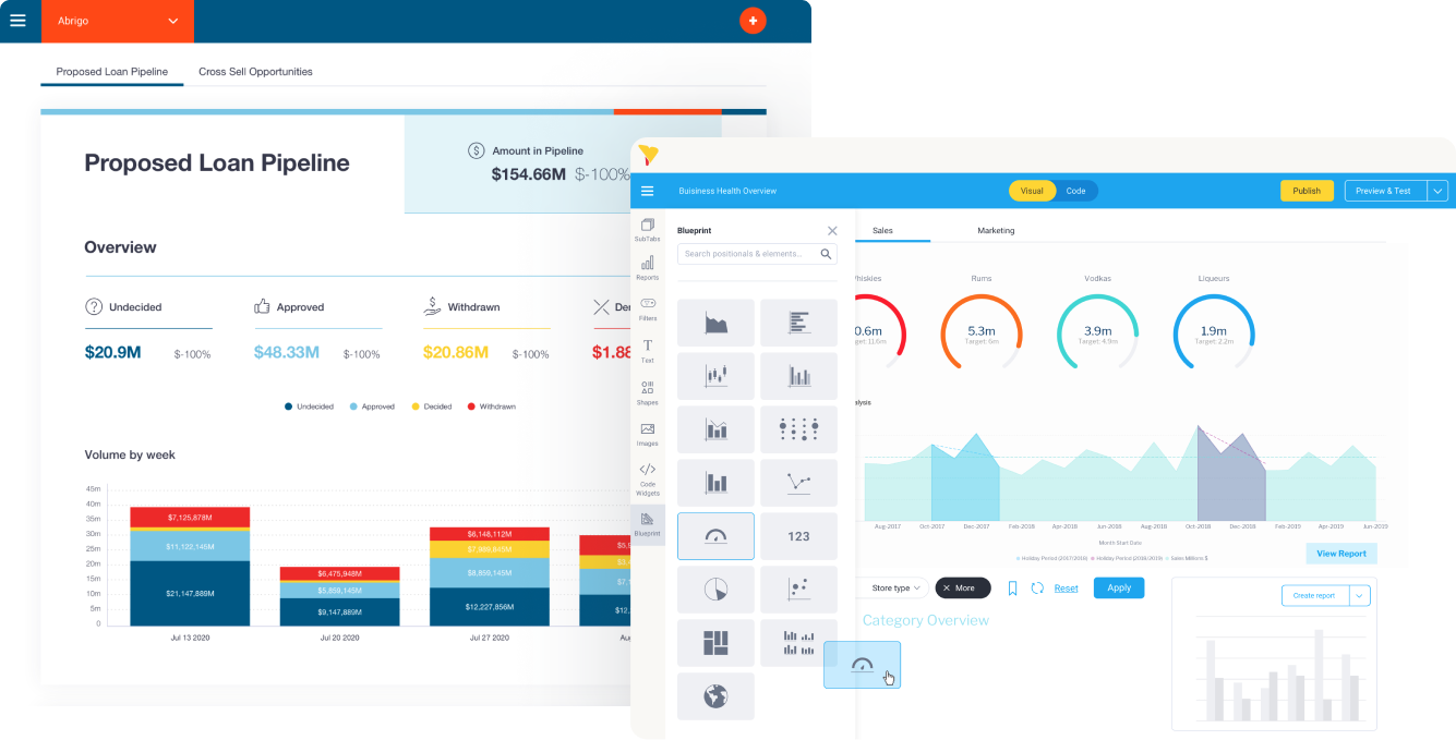
With time, visualization tools have become integral to communicating information, whether in a business context or something more personal. While in the past these same analytics tools have been too complex for non-technical people to use, modern solutions such as Yellowfin have made various types of data visualization easier to operate, helping more people use it to consume, share and discover data insights.
Modern data visualization tools have revolutionized the way organizations interpret complex datasets, making insights more accessible than ever. With interactive dashboards and AI-driven analytics provided by vendors like Yellowfin, these tools empower users to make data-driven decisions efficiently.
Ethical considerations in data visualization
Data visualization is a powerful tool for communicating complex information in an accessible and engaging way. However, with this power comes significant ethical responsibilities. Below are key ethical considerations in data visualization,
Responsibility of accurate representation
One of the most critical ethical considerations in data visualization is the responsibility to represent data accurately. Misleading visualizations, whether intentional or unintentional, can distort the truth and lead to incorrect conclusions. For example, manipulating axis scales, omitting key data points, or using inappropriate chart types can exaggerate trends or hide important details. Designers must ensure that their visualizations are truthful and provide a clear, honest representation of the data. In the context of a competitive intelligence solution, accurate visualizations are essential for organizations to analyze market trends and make informed strategic decisions. This includes using proper labeling, scaling, and context to help viewers interpret the information correctly.
Avoid bias
Bias in data visualization can arise from various sources, including the data itself, the design choices, or the personal perspectives of the creator. To avoid bias, it’s essential to critically examine the data for any inherent prejudices or imbalances. Additionally, designers should be mindful of how their choices—such as color schemes, chart types, or framing—might influence the viewer’s interpretation. A visual representation of data should present information accurately and objectively to prevent misleading conclusions. For instance, using red to highlight negative trends and green for positive ones can unintentionally reinforce certain biases.
Transparency and context
Transparency is a cornerstone of ethical data visualization. Viewers should be able to understand where the data comes from, how it was processed, and what limitations it might have. Providing context is equally important; without it, data can be easily misinterpreted. For example, a graph showing a sudden spike in sales might seem impressive, but without context—such as a seasonal promotion or external event—the data could be misleading. Including clear explanations, sources, and footnotes helps build trust and ensures that the audience can make informed decisions.
Frequently Asked Questions (FAQs)
Who is the father of data visualization?
The father of data visualization is William Playfair, an 18th-century Scottish engineer and economist. He pioneered several graphical methods, including bar charts, line graphs, and pie charts. His work laid the foundation for modern data visualization techniques.
What are the big three of data visualization?
The big three of data visualization are bar charts, line graphs, and pie charts. These fundamental visual tools help represent categorical, time-series, and proportional data effectively. They are widely used due to their simplicity and ease of interpretation.
What are the 3 C’s of data visualization?
The 3 C’s of data visualization are Clarity, Consistency, and Context. Clarity ensures the visualization is easy to understand, Consistency maintains uniform design principles, and Context provides necessary background information for accurate interpretation. These principles help create meaningful and effective visual representations.
Who is the father of modern-day data visualization?
The father of modern day data visualization is Edward Tufte, an American statistician and professor. He revolutionized the field with his work on data design, emphasizing clarity, minimalism, and truthful representation. His books, such as The Visual Display of Quantitative Information, set new standards for effective data visualization.
Conclusion
The history of data visualization is a fascinating journey that highlights humanity's relentless drive to communicate complex ideas in simple, impactful ways. From the earliest cave paintings to today’s sophisticated BI dashboards, we have continually evolved how we tell stories with data.
Along the way, modern data visualization tools like Yellowfin have emerged, making it easier for everyone to create clear, meaningful visualizations that drive smarter decisions.
As we move forward, ethical practices—like ensuring accuracy, avoiding bias, and being transparent—remain at the heart of responsible data storytelling. After all, the true power of data lies not just in the numbers but in how we present and interpret them.
Get demo: Yellowfin data visualization
Speak to the team at Yellowfin today and get a free demo showcasing Yellowfin's rich, interactive data visualization tools - and learn how our data viz library can fit your unique analytical use cases.