In the competitive analytics and data visualization landscape, Grafana has carved out a niche with its open-source flexibility and powerful data visualization features.
However, Grafana faces certain limitations in terms of advanced analytics functionalities and less seamless integration with your software product compared to analytics and data visualization tools sourced from broader business intelligence (BI) ecosystems, such as:
- Dashboard and data visualization types and design options are limited
- The primary use case is monitoring rather than data exploration or reporting
- It is not as effective for line-of-business users (non-data experts) to view data
Grafana is a great tool for compiling specific operational metrics from multiple databases into one dashboard for easy monitoring, but it is not an Online Analytical Processing (OLAP) tool, a type of software technology used to extract and query business metrics to analyze in-depth insights. Rather, Grafana’s main use case is for monitoring workload metrics such as server up-time or total traffic by DevOps teams or software developers.
These shortcomings present a pressing challenge for Independent Software Vendors (ISVs) tasked with delivering cutting-edge analytics solutions across the business and for end-users, leaving ISVs at a critical juncture where the need to explore alternatives to Grafana becomes imperative - not just for supplementing Grafana's gaps, but for securing a continuing competitive edge in the analytics space.
This article will help you on your journey to identifying superior alternatives to meet the evolving demands of the market by covering the top 5 Grafana alternatives for analytics and data visualization in 2025.
1. Yellowfin BI
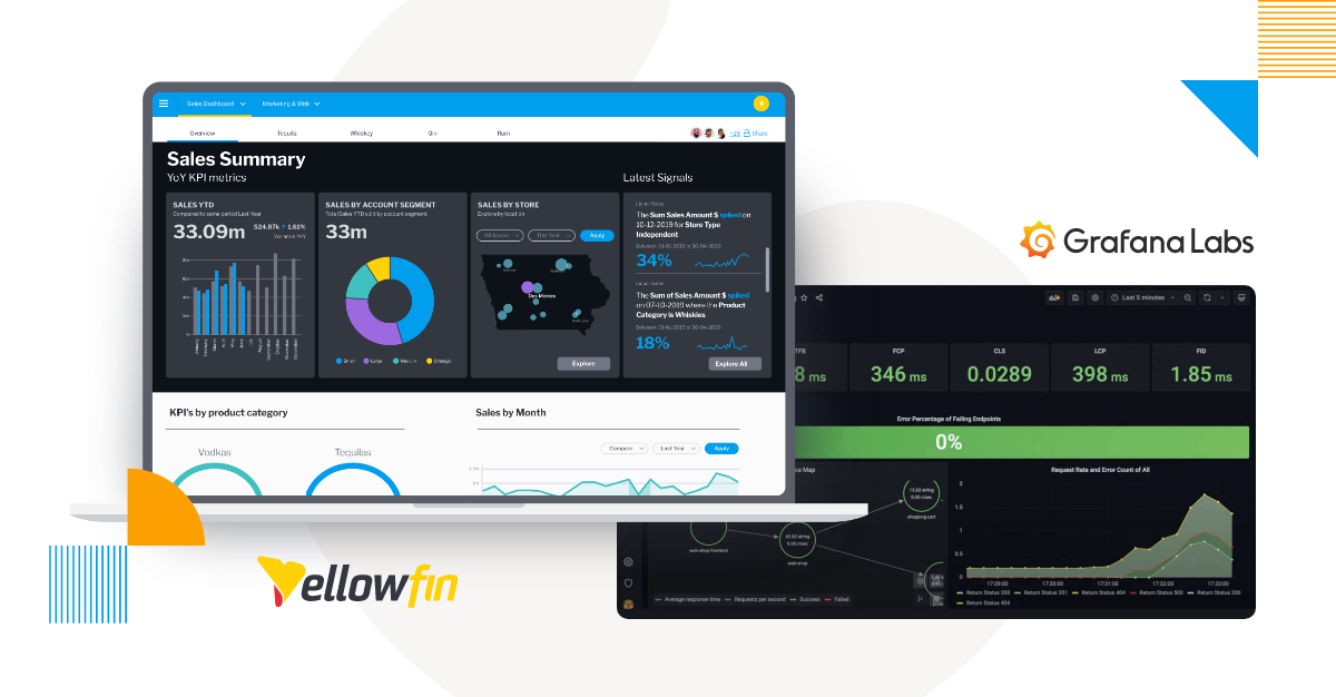
Yellowfin BI secures its position as the premier choice among analytics and data visualization alternatives to Grafana due to its comprehensive capabilities, including its open-source dashboard tools. This platform caters to a broad spectrum of analytics requirements. Its core distinction lies in its ability to be seamlessly integrated and embedded into various software applications, offering ISVs the ability to enhance their products with action-based dashboards, data visualization and more sophisticated features such as automation and data storytelling quickly, and deliver a seamless user experience where analytics becomes a far more integral part of the application workflow, rather than an external addition.
Moreover, Yellowfin BI's purpose-built implementation of artificial intelligence (AI) across several of its core features sets it apart.
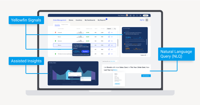
Assisted Insights provide automated analysis, offering users not just data but actionable insights derived from detailed auto-analysis generated through advanced AI algorithms. Signals continuously monitors and alerts users to critical changes in their data, ensuring opportunities and threats are identified promptly without constant manual oversight.
Additionally, Yellowfin’s Guided Natural Language Query (NLQ) feature enables users to explore their data using everyday language, making data analytics accessible to a wider audience (i.e. non-experts or line-of-business users) without requiring specialized knowledge to use it.
Finally, all Yellowfin’s functionality, from its dashboard and reporting capabilities to sophisticated AI analytics features, are built with self-service analytics in-mind.
This means every feature in Yellowfin is built for and usable by both regular business users and data experts, including the AI-powered tools, which aim to streamline the analysis process for non-technical people, while acting as a helpful starting point for advanced users that are familiar with analytics. This is all part of Yellowfin’s continuing efforts for data democratization (making analytics accessible for everyone, not just experts) and empowering regular analytics users to become augmented consumers.
Yellowfin’s AI-driven functionalities, combined with its self-service BI approach and comprehensive embedded analytics (with hundreds of connectors, REST API, JavaScript support, etc) and data visualization suites, position Yellowfin BI as a leader for ISVs. It is an optimal solution if you are seeking a BI platform that addresses current market demands and anticipates future trends.
Key Features of Yellowfin BI vs Grafana
- Supports diverse analytics needs, including dashboards, data visualization, and automation.
- Makes analytics accessible and empowers business users with augmented insights.
- Future-ready solutions for ISVs focused on scalability and innovation.
- User-friendly for beginners and advanced users, streamlining analysis for all.
- Delivers actionable insights through advanced AI-powered automation.
Read more: Yellowfin vs Grafana Helix: Which is Best for BMC Smart Reporting Users?
2. FusionCharts
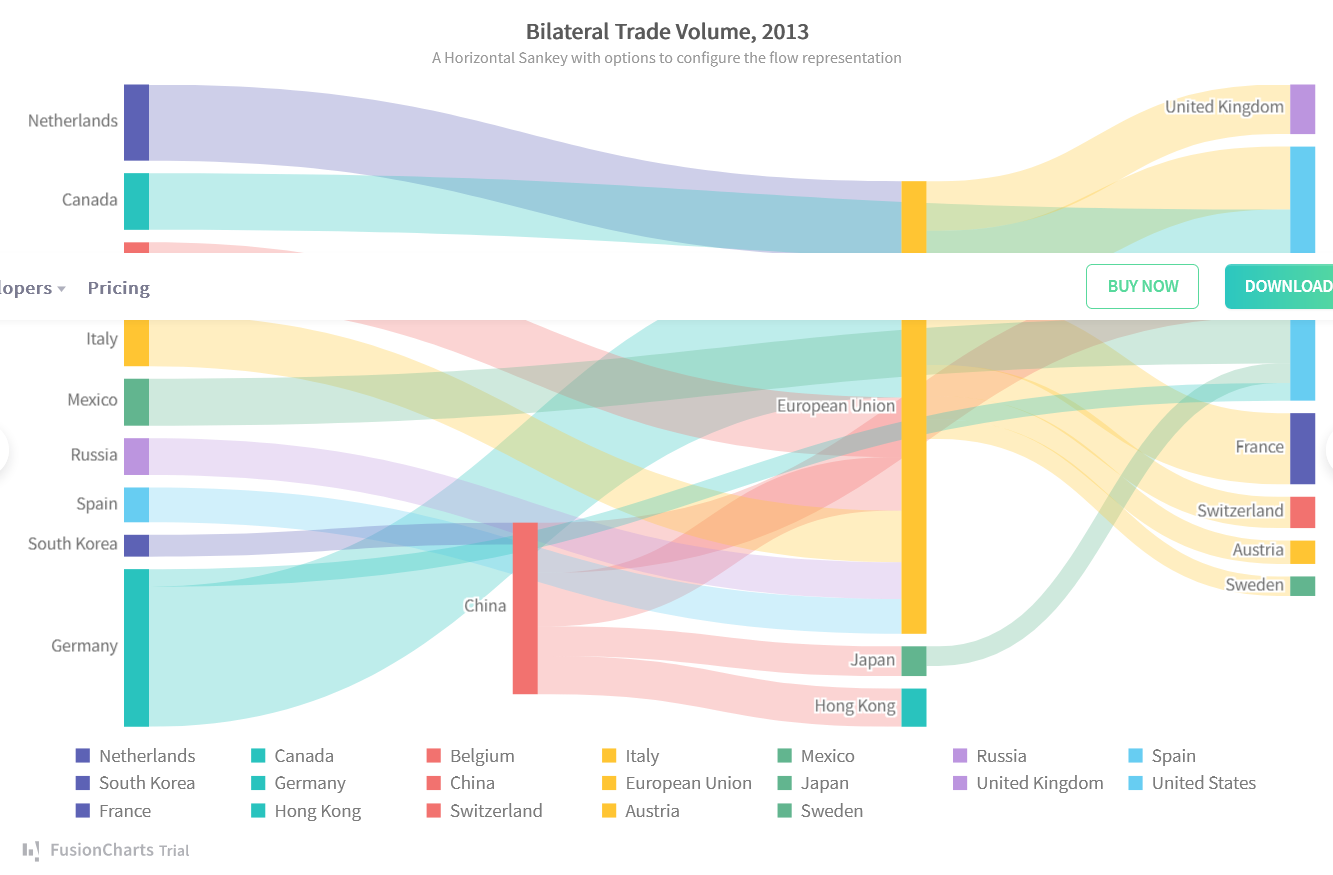
FusionCharts stands out as a versatile and powerful data visualization library that has earned its place as one of the top Grafana alternatives, especially for developers and ISVs focusing on embedding rich, interactive charts and graphs into their applications. One of FusionCharts' strengths lies in its extensive collection of chart types, encompassing over 90 variations that range from basic line charts to complex hierarchical treemaps that can be customized in appearance and interactable elements. This diversity allows developers to choose the perfect visualization for any data set, ensuring that insights are presented in the most intuitive and impactful way.
Beyond its wide array of chart options, FusionCharts is renowned for its ease of integration. It supports a broad spectrum of development environments and frameworks, making it a flexible choice for projects of any size, from small Web applications to large enterprise solutions. Developers can quickly implement FusionCharts using simple JavaScript and JSON configurations, significantly reducing development time and effort.
Real-time data updates are another critical feature that FusionCharts offers, enabling dynamic and interactive dashboards that reflect changes in data without requiring page reloads. This capability is crucial for applications requiring up-to-the-minute data presentations, such as financial dashboards, performance monitoring tools, and analytics platforms.
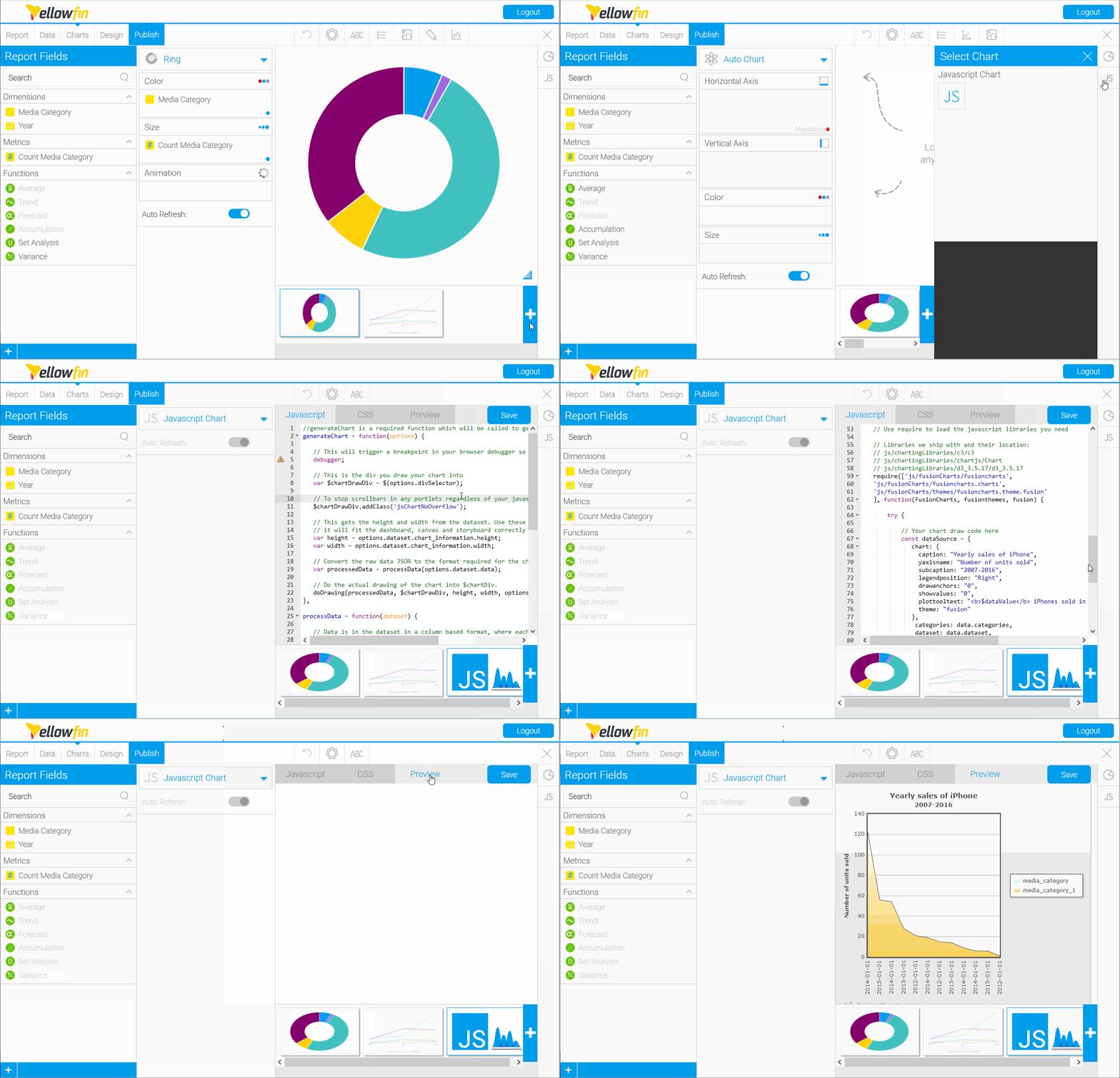
Finally, FusionCharts has extensibility with Yellowfin BI for further use cases of both BI platforms, such as being able to embed FusionCharts (via JavaScript) directly into Yellowfin dashboards, as shown in the GIF above.
Key Features of FusionCharts vs Grafana
- Provides 90+ chart types, from basic to advanced, for diverse visualization needs.
- Works with various frameworks, offering flexibility for projects of any size.
- Supports live data updates for dynamic dashboards in real-time applications.
- Seamlessly integrates with Yellowfin BI for embedded dashboard capabilities.
Read more: Supercharging Yellowfin with 100+ Interactive Charts from FusionCharts
3. Power BI
Microsoft's Power BI is a powerful analytics tool that offers deep integration with other Microsoft products, making it a good fit for larger scale enterprises and ISVs already invested in the Microsoft software ecosystem. It also has great complimentary features with Yellowfin BI, which we cover in the linked comparison below.
Power BI provides advanced data analytics, AI capabilities, and decent data visualization options, enabling users to create and share insights across an organization, making it one of the best Grafana alternatives, amongst others. With the security and scalability afforded by its integration with the Microsoft Azure cloud computing platform, Power BI has become a popular choice. However, its high pricing plans per-user or per-capacity and licensing can be prohibitive for more minor ISV use cases.
Key Features of Power BI vs Grafana
- Offers customizable visualizations for impactful dashboards and reports.
- Enables dashboard creation, sharing, and collaboration across organizations.
- Pricing suits enterprises, but may be costly for smaller ISVs.
4. Tableau
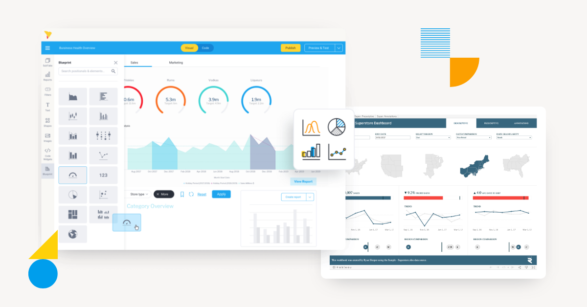
Pictured: A comparison of Yellowfin BI dashboards (left) and Tableau dashboards (right).
Known for its intuitive interface and data visualizations, Tableau stands out for its ability to handle large datasets and perform complex data analysis, making it suitable for larger-scale enterprises or ISVs. It supports a collaborative environment that encourages sharing insights and visualizations, making data-driven decision-making accessible to all users.
Its VizQL visual query language for databases acts as a translator for SQL queries for more visual-based, drag-and-drop analysis. Due to its salesforce connection, Tableau is an SF product that best suits those looking for specific integration between analytics and Salesforce CRM usage. However, Tableau is slightly more complex to get started with compared to other options on this list. Still, it is considered a potentially good Grafana alternative.
Key features of Tableau vs Grafana
- More complex setup, but valuable for advanced users.
- Seamless Salesforce CRM integration for Salesforce users.
- Customizable, interactive dashboards for complex datasets.
- Drag-and-drop functionality for easy data visualization.
- Translates SQL queries into visual formats for better data exploration.
Read more: How Yellowfin Complements Tableau to Expand Analytics Use Cases
5. Sisense
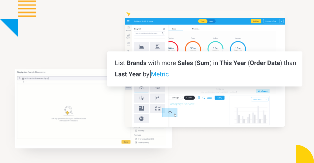
Pictured: A comparison of Sisense NLQ (left) and Yellowfin Guided NLQ (right).
Sisense's proprietary technology is designed for deep integrations, enabling the creation of customized and interactive analytics experiences within third-party applications. This provides an advantage over Grafana for ISVs seeking more in-depth analytics beyond operational dashboards.
It also offers several AI-powered features, such as Sisense Simply Ask. However, many ISVs report a significant need for training and expertise to utilize the platform effectively for their specific use cases due to the complexity of its customization options, especially when comparing Sisense to Yellowfin.
ISVs aim to offer their clients not just data visualization but also predictive analytics and actionable intelligence, so Sisense offers a good, albeit potentially costlier, solution.
Key Features of Sisense vs Grafana
- Includes tools like Sisense Simply Ask for AI-driven insights.
- A comprehensive but potentially expensive platform for ISVs looking for advanced features.
- Offers in-depth analytics, predictive capabilities, and actionable intelligence.
- Enables customized and interactive analytics experiences within third-party applications.
Read more: Not All NLQ Models Are Created Equal: Part 2 - Sisense Simply Ask vs Yellowfin
6. Prometheus
Among most open-source dashboard tools, Prometheus is considered a good alternative to Grafana for analytics and data visualization, particularly for monitoring and time-series data in cloud-native environments. It excels in gathering, storing, and querying time-series data, especially in dynamic environments like microservices and containers. Its seamless integration with Kubernetes makes it ideal for modern applications. Combined with Grafana, Prometheus allows users to create rich visualizations while benefiting from its data collection and alerting capabilities.
Key Features of Prometheus vs Grafana
- Scales well in dynamic environments and large infrastructures.
- Provides alerting tools for proactive monitoring.
- Uses PromQL for advanced time-series querying.
- Natively integrates with Kubernetes for cloud-native environments
Read more: Prometheus signs Business Intelligence partnership agreement with Yellowfin
7. Datadog
Datadog is a robust monitoring and analytics platform designed for cloud-scale applications. It seamlessly integrates metrics, logs, and traces, enabling real-time visibility into application performance and infrastructure health. Its user-friendly open-source dashboard tools provide rich data visualization, making troubleshooting faster and more efficient. Datadog supports over 600 integrations, making it a versatile tool for diverse tech stacks. Additionally, it offers AI-driven alerts and anomaly detection.
Key Features of Datadog vs Grafana
- Unified metrics, logs, and traces in one platform.
- Over 600 integrations for seamless deployment.
- AI-driven anomaly detection and alerts.
- Real-time data visualization with customizable dashboards.
8. New Relic
New Relic is an advanced observability platform that empowers businesses to monitor and optimize application performance. It offers full-stack visibility, from frontend user experience to backend systems. New Relic's APM (Application Performance Monitoring) tool delivers deep insights into application behavior, helping identify bottlenecks quickly. Its unified observability model makes it ideal for DevOps and engineering teams, though less suitable for general non-technical business users. New Relic's interface does provide a simplified set up for alerts and tracking key performance metrics.
Key Features of New Relic vs Grafana
- Full-stack observability.
- APM for detailed application performance insights.
- AI-based anomaly detection and alerts.
- Interactive and customizable dashboards.
9. Kibana
Kibana, part of the Elastic Stack, is an open-source data visualization and exploration tool tailored for Elasticsearch users. It excels in log analysis, enabling users to discover real-time trends and anomalies. Its simplified interface allows for the creation of open-source dashboard tools with data visualizations like pie charts, heatmaps, and timelines. Kibana's machine-learning capabilities enhance its utility for detecting patterns in massive datasets. Additionally, its security integrations ensure data protection during analysis.
Key Features of Kibana vs Grafana
- Seamless integration with Elasticsearch.
- Customizable dashboards with rich visualizations.
- Real-time data analysis and log exploration.
- Machine learning capabilities for anomaly detection.
10. Splunk
Splunk has centered its platform on searching, monitoring, and analyzing machine-generated data. It is widely used for log management, security analytics, and IT operations, making it best suited for DevOps and technical teams rather than line-of-business users. Splunk's ability to handle unstructured data makes it ideal for troubleshooting complex systems, and its AI and machine learning features provide predictive analytics for proactive issue resolution. The platform supports various integrations, offering scalability.
Key Features of Splunk vs Grafana
- Efficient log management and security analytics.
- AI and machine learning for predictive insights.
- Scalable data handling for structured and unstructured data.
- Supports integration with third-party tools and platforms.
Conclusion
It's clear each of these listed analytics and data visualization solutions, as Grafana alternatives, brings unique strengths to the table, from advanced AI capabilities and seamless embeddability to rich data visualization options and customization options, offering ISVs a wealth of options to meet their specific analytics and data visualization needs should Grafana not be enough for long-term use cases. Discover why Yellowfin is the ultimate Grafana alternative for advanced analytics and data visualization.
Top Analytics and Data Visualization Alternatives for Grafana: Next steps
Yellowfin is a highly extensible, customizable and feature-rich analytics suite made for executives and business users alike. Learn more about how it can improve upon your end-users' experience with Grafana with deeper BI.
