Charting libraries are in great demand, and their creation and use are becoming increasingly popular in languages such as JavaScript. As evidence, several JavaScript charting libraries are available, both commercial and open-source, with a wide range of functionalities to meet the demands of users.
But how can a developer make an informed decision and choose the best JavaScript charting library? It's a difficult question, but we're here to assist!
We created a comprehensive guide on JavaScript charts to help you learn more about them and the best JavaScript charting library. Without further ado, let’s jump right in!
What are JavaScript charts?
A charting library becomes necessary when examining a huge number of data points is deemed advantageous for an organization, a purpose, or a goal. The primary goal of data visualization is to aid various stakeholders in developing insights and comprehending their data, which will ultimately be translated into valuable information. But when does JavaScript come into play when designing charts, and what exactly are JavaScript charts? Let's take a deeper look.
JavaScript charts are a blend of many chart styles, such as 2D (also known as XY charts) and 3D charts, line charts, bar charts, or polar charts that are easy to grasp (eliminating all of the complexity behind data analysis) while providing a highly visual interface that allows for smooth client-side interaction.
Currently, a more intricate, specific, yet still straightforward option for data visualization is JavaScript charts. Every charting library must have client-side interactive capabilities in order to be regarded as a top-tier JavaScript solution for demanding and data-driven industries. The power of visualizing data depends on more than just critical factors like from where the data is accessed or the amount of data processing.
Why use JavaScript charts?
Data visualization and charts help us grasp data more quickly and easily. They can mean the difference between a good report and a great one. Charts are also utilized in presentations and real-time monitoring.
JavaScript charts are especially useful since they can be embedded directly on any webpage and serve the same audience as any other online content. JavaScript charts are often not limited by the client device and can be used on PCs, laptops, mobile devices, and tablets. Some modern solutions bring web applications almost everywhere, even outside of the web browser in desktop applications, mobile applications, and IoT devices.
Even if your application is not web-based, using JavaScript charts can be a good idea. Many contemporary desktop frameworks have some means to embed a website that you can use to obtain web charts in your desktop program. Because there are many possibilities in the online charts market, you will have a greater selection of available chart tools to pick from. Having the chart logic within a web control might also be advantageous since it can be exported outside of the main project and utilized as a separate feature.
JavaScript charts are constantly changing and being streamlined, addressing the long-standing issue of speed limits in online applications. JavaScript charts now speed up data visualization using client hardware, allowing for the presentation of massive data sets and real-time data sources.
How to choose the right JavaScript charting library
Every choice in the selection of a JS chart library is extremely personalized and influenced by various factors. We'll discuss some aspects to consider when picking a charting library.
Several JavaScript charting libraries are available nowadays, but which ones are the best to use? Numerous factors, such as business constraints, the type of data, the purpose of the chart itself, and many more, influence this.
Some of the factors to consider when choosing a JavaScripting charting library are:
- Is the library compatible with a large variety of chart types?
- Is the library supported by your browser and UI framework?
- What is the size of the data set?
- Is the app intended for usage on the web, mobile, or both?
- What browsers support a certain library? To find out, look at your browser's market share.
- Do the library offer style and customization?
- What JavaScript framework do you employ?
- What level of look and feel customization do you require?
Best JavaScript charting library
FusionCharts
FusionCharts is a JavaScript charting and data visualization development platform. Its graphics can pull raw and real-time data from databases and turn it into actionable insights for businesses, stock traders, and fintech users.
FusionCharts has established itself as one of the premier charting libraries for the mobile and web app market, offering over 100 interactive charts and over 2,000 maps to developers.
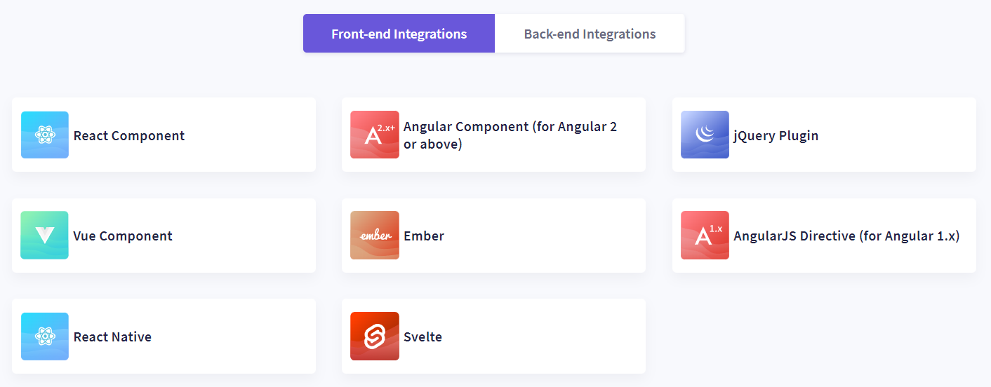
FusionCharts' dashboard, map, and chart templates are readily integrated with front-end languages such as JavaScript, React, AngularJS, React Native, and others. These templates are also simple to integrate with server-side programming languages like Java, PHP, Django, and others.
Thus, app developers who utilize the FusionCharts services do not need to employ several development tools to create usable dashboards. Because the library pieces are interoperable with front-end and back-end (server-side) development frameworks, your apps can process real-time data streams fast and effectively.
This JavaScript charting library is now used by over 800,000 developers to embed charts, graphs, maps, and dashboards into a variety of apps. It is ideal for applications such as:
- Real-time search and analytics of big data
- Power output and usage
- Network monitoring and management solutions
- Collaboration tool
- Customer experience analytics
- E-commerce
- Corporate management suite (CMS)
- Banker’s training
- Car rental
- Customer service and internal corporate service
- Online healthcare practice
- Business intelligence (BI)
Now that you've learned about the capabilities of FusionCharts in mobile and web apps, it's time to learn about the products through which the charting library provides its brilliant and remarkable services.
FusionCharts XT
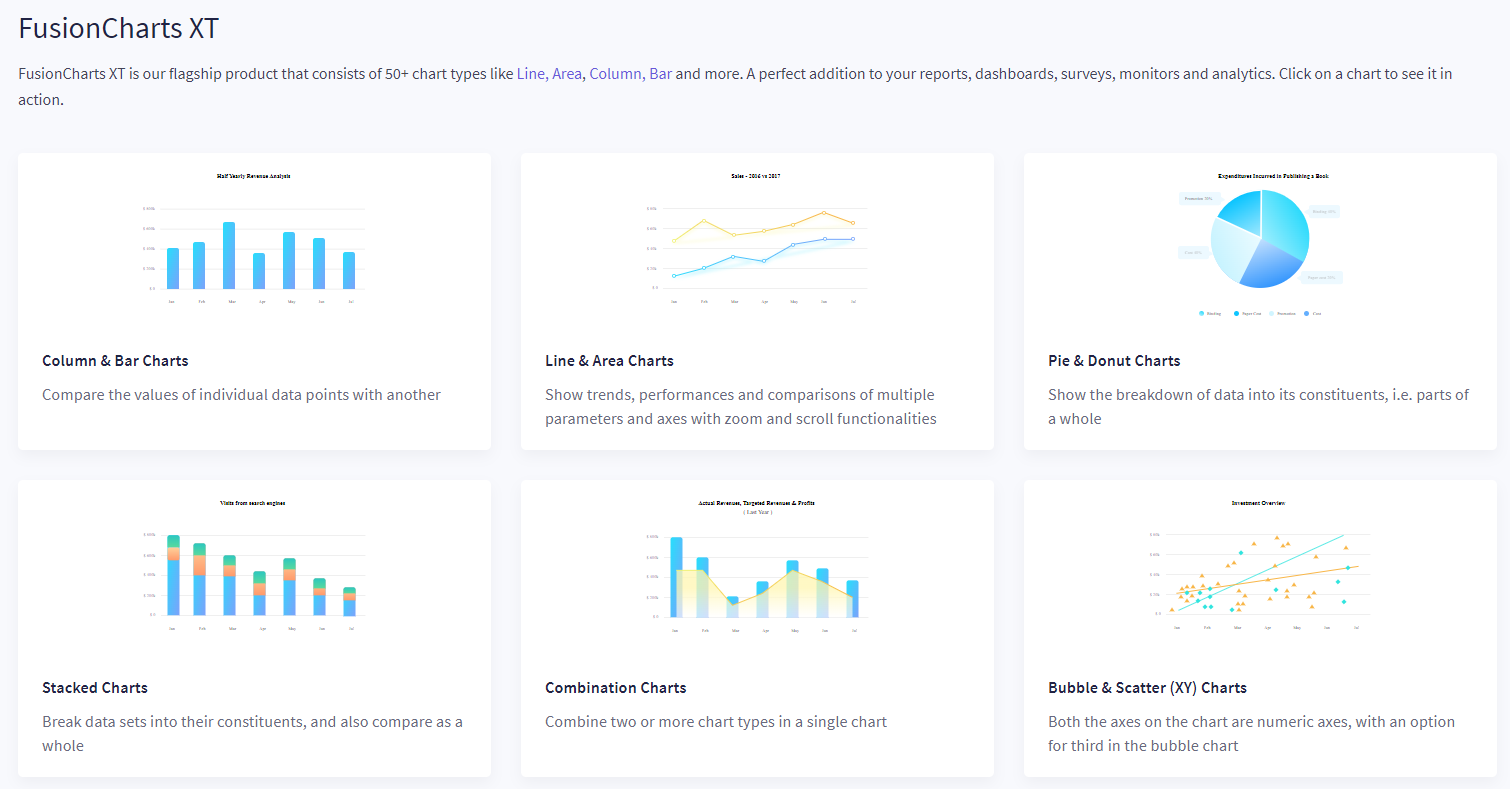
FusionCharts XT is the home of FusionCharts' sleek and professional charts and graphs. Its chart elements are divided into 16 major categories, such as Column Chart, Chord, Pie in 3D, Bubble Chart, USA Map, Sankey, and so on.
The backgrounds of the data visualization charts can also be customized. FusionCharts has four charting themes to choose from — Fusion, Gammel, Candy, and Umber. As a result, you can use functional charts and themes to create unique designs for your dashboards, surveys, reports, monitors, and data analytics.
FusionWidgets XT
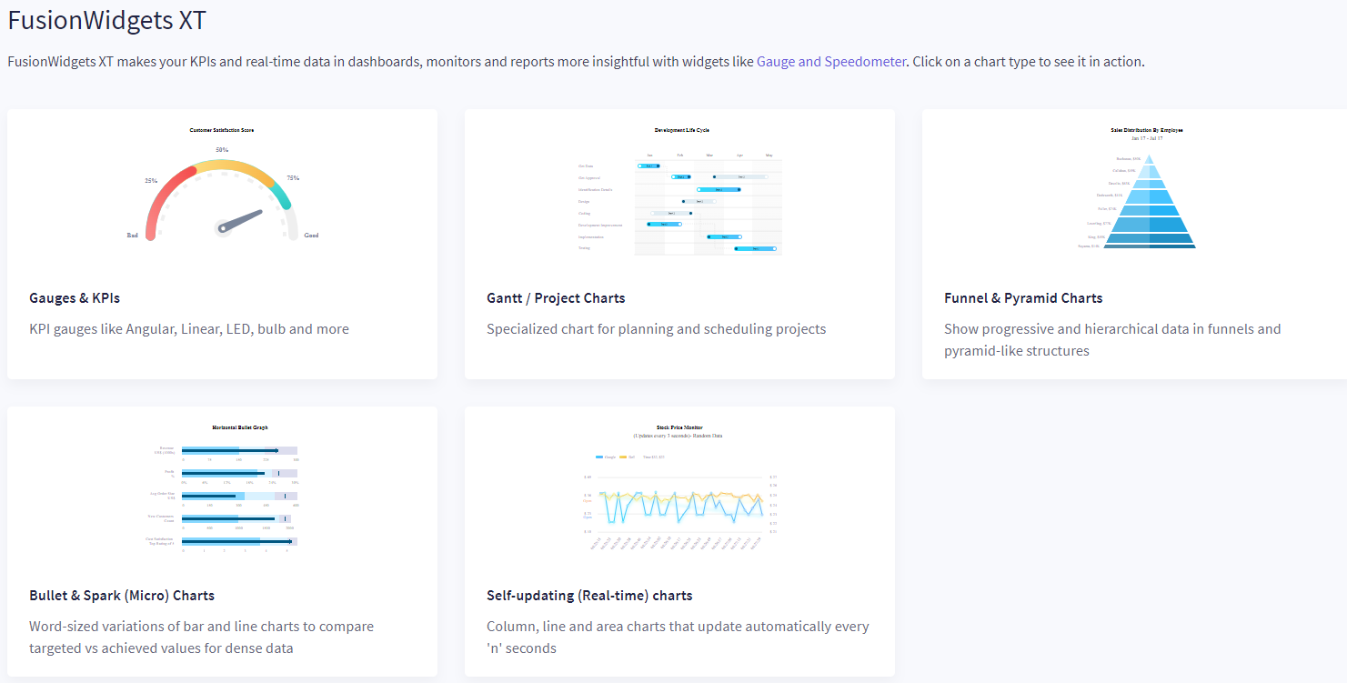
FusionWidgets XT assists developers in creating key performance indicators (KPIs). You may also utilize these widgets to make monitors, dashboards, and reports more informative while analyzing real-time data from database servers.
This development core provides your team with a variety of speedometers and gauges for displaying data as performance for an app, website, employee, company operation, or any other business asset.
If you're a developer and wondering which widgets can help you with your app development project, have a look at the list below:
- For performance indication, power use, resource utilization, and operations output, use linear, angular, bulb, LED, RPM monitors, and so on.
- In project management and task scheduling software, use simple Gantt charts, grouped views of tasks, hourly tasks, milestone indicators, and so on.
- Funnel and Pyramid charts are ideal for illustrating hierarchical and progressive data.
- You can use bullet and spark charts to illustrate the target versus achieved values of complicated data.
- Line, area, and column charts that update themselves can be used to display real-time stock market, corporate operations, and cryptocurrency data.
Furthermore, you can change widgets in a variety of ways to match the look of your app.
PowerCharts XT
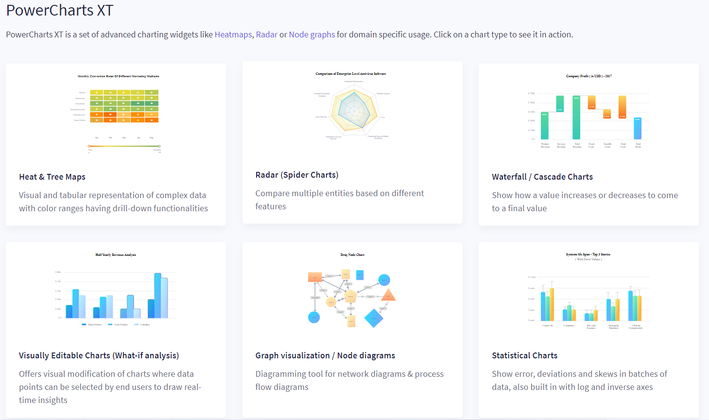
If you need to see domain-specific data on a clutter-free and tidy interface, check into the PowerCharts XT area. It includes 10 advanced and complicated charts such as heat and tree maps, spider charts, waterfall charts, graphically customizable bar charts, node diagrams, and more.
The aforementioned chart elements are ideal if you're creating an app for performance analysis, financial planning, network diagrams, profit-loss analysis, hierarchical structures, or stock price graphing.
FusionMaps XT
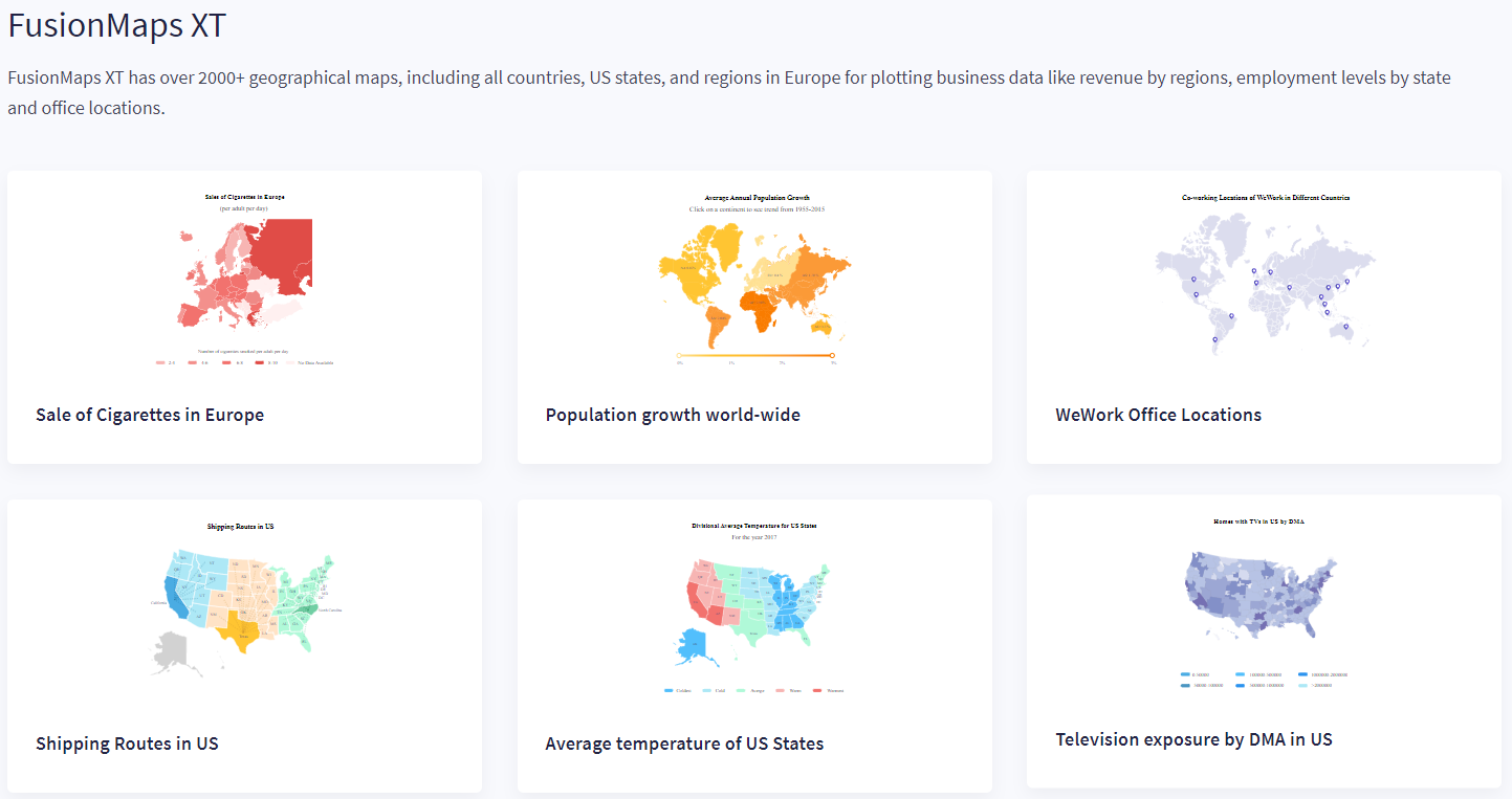
You may encounter app development projects that require the use of global, countrywide, or regional maps to show data in a meaningful way. FusionMaps XT is a package that includes over 2,000 maps.
These maps cover the United States, individual US states, counties in the US, European regions, and so on. These maps can be used to plot data on product sales, population growth, company locations, manufacturing facilities, shipping routes, weather/temperature, fertility rates, mobile or computer exposure, and environmental contaminants.
FusionTime
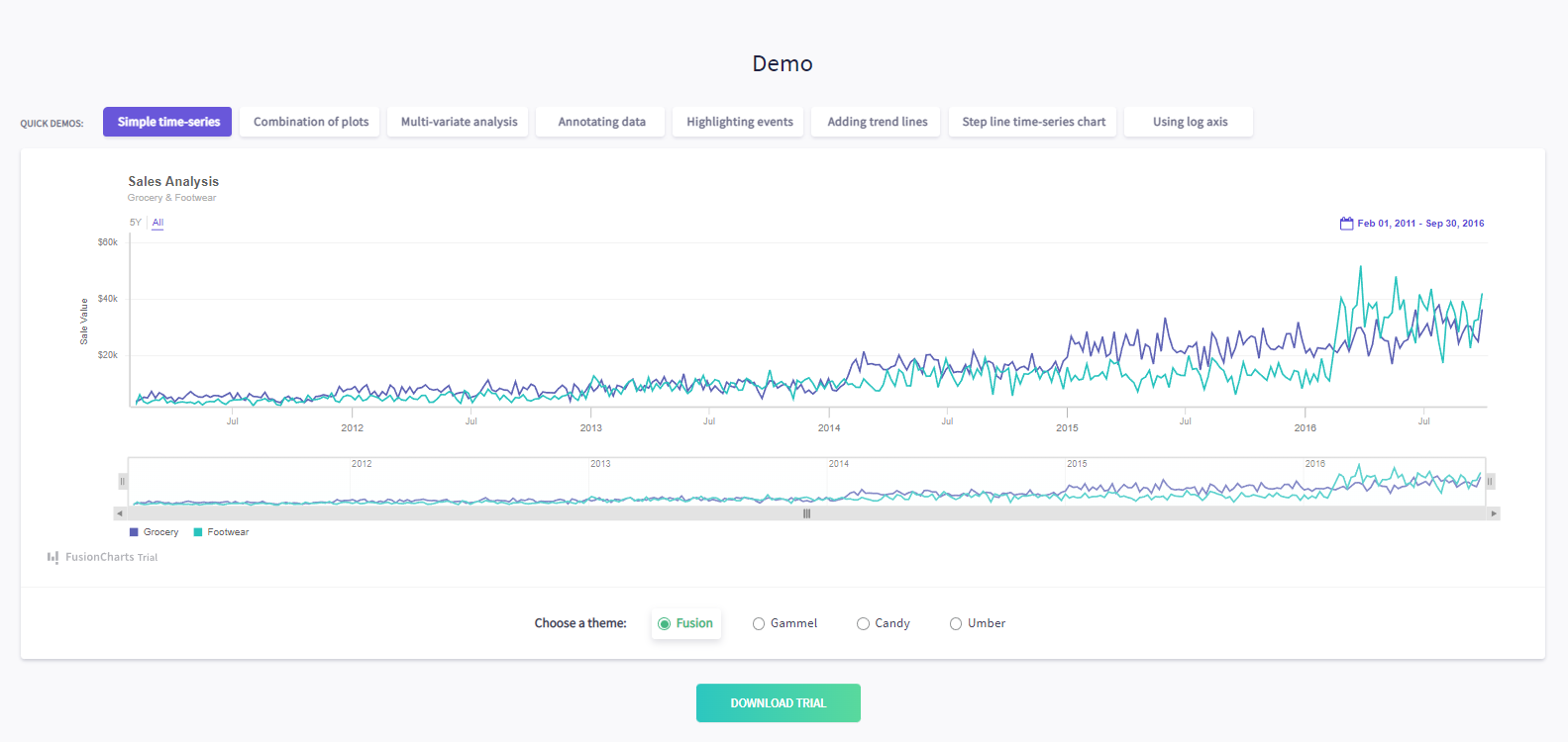
Since fintech and decentralized finance (DeFi) apps are emerging rapidly, time-series visualizations with interactive actions are appreciated. If you are developing cryptocurrency trading, stock trading, or personal financial software, FusionTime has all of the necessary charting templates in JavaScript (HTML5) format.
Furthermore, constructing these charts involves only a few lines of programming code. As a result, FusionCharts makes it simple to create stock charts, basic time-series charts, complicated multivariate analyses, and millions of data point illustrations on any mobile or web app.
FusionCharts integrations
FusionCharts supports all technology stacks, including Vue.js, Angular, and React. If JavaScript isn't your thing, you can utilize back-end plugins for ASP.NET, Java, and PHP for launching your applications more quickly.
What makes FusionCharts unique?
FusionCharts is well known for delivering excellent technical assistance. Help is required whenever a user becomes stuck or needs an explanation of a rule or function because dissatisfied consumers are not loyal. You won't have to worry about anything after installing FusionCharts since you'll get excellent support to help you present your data.
Conclusion
FusionCharts provides all of the contemporary components required to create an app that caters to numbers and statistics. You can quickly integrate these JavaScript charts and dashboards into your app to meaningfully view raw data. You can also inject scripts for interactive activities so that end users can slice and dice data to obtain meaningful insights.
Furthermore, the charting library's SWF file copy-paste capabilities, JSON/XML/URL data interface, visualization development in under 15 minutes, accessible developer documentation, and transparent licensing make it a must-have for your app development tech stack.
Try FusionCharts Suite XT
Get a 14-day free trial of FusionCharts XT.
