What’s new in the iPad App?
A post by Yellowfin CEO, Glen Rabie
Just recently, I was asked if our Business Intelligence (BI) application for the iPad was a native app, or just made use of Safari to access the standard Yellowfin functionality.
Well let’s set the record straight. It is a native app. In fact, if there’s any doubt, why not download it today and try it yourself?
The latest version, as you may have seen from all the press bits and pieces circulating around, has just been made available by our friends at Apple. So, let’s have a quick look at all the new features available.
Let me start by helping to position our mobile apps. They are aimed at the BI consumer – people who want access to data – not the data analyst. After all, who wants to conduct analysis on a postage stamp? So the new features have been designed to assist them – the business users.
OK; let’s explore what’s new. Or at least the big stuff that matters...

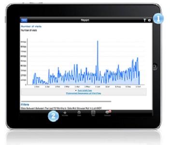
As you will see on the image of the iPad – handily created for this post – there are two big numbers (1 and 2). These are the two menu bars that have been added to the report view page, and they let you do a few cool things.
Top Menu (#1)
The most important new element is filtering. This provides the ability to filter reports based on the user parameters that are required for a report. This includes drop down lists (etc), and in my opinion, is the best enhancement to the app. This enhancement means that in addition to being able to drill down and through data, users can actively filter their reports for the data sets they need.
Included in the top menu bar (#1), is a little “i” icon, which provides information about the report. This handy addition supplies users with information regarding the usefulness and purpose of the report type.
Bottom Menu (#2)
In bottom section (#2), you will see a range of new buttons. In fact, the entire menu bar is new.
These new features include the following functions:
- Add to favorites: A good way to find those reports you always use
- Email: Nice to know you can send a report to someone when you see a problem or issue
- Table/chart toggle: Better use of screen real estate – toggle between table and chart mode
- Comments: Yep, a bit of that social BI has crept into the app – users can add and view comments made about the report
So what?
So there you have it; a quick snap shot of the new features included in the latest release of Yellowfin’s Mobile BI app.
So, download it today, and get a taste of what your mobile workers could experience with Yellowfin’s Mobile BI solution.