One of the things that I'm really passionate about is great design. Design is important in all aspects of our lives and it's really important for analytics as well. When you're the recipient of bad design, you know it immediately.
Have you ever seen those emails that have been completely misaligned or sat through a PowerPoint where everything is in the wrong colors and fonts? How does it make you feel? You’re probably not emotionally attached to it and don't feel love for the person that created it for you.

One of the most interesting things about design is that the person that wrote that email or created that PowerPoint actually can’t see the bad design. But as a consumer, you see it and feel it.
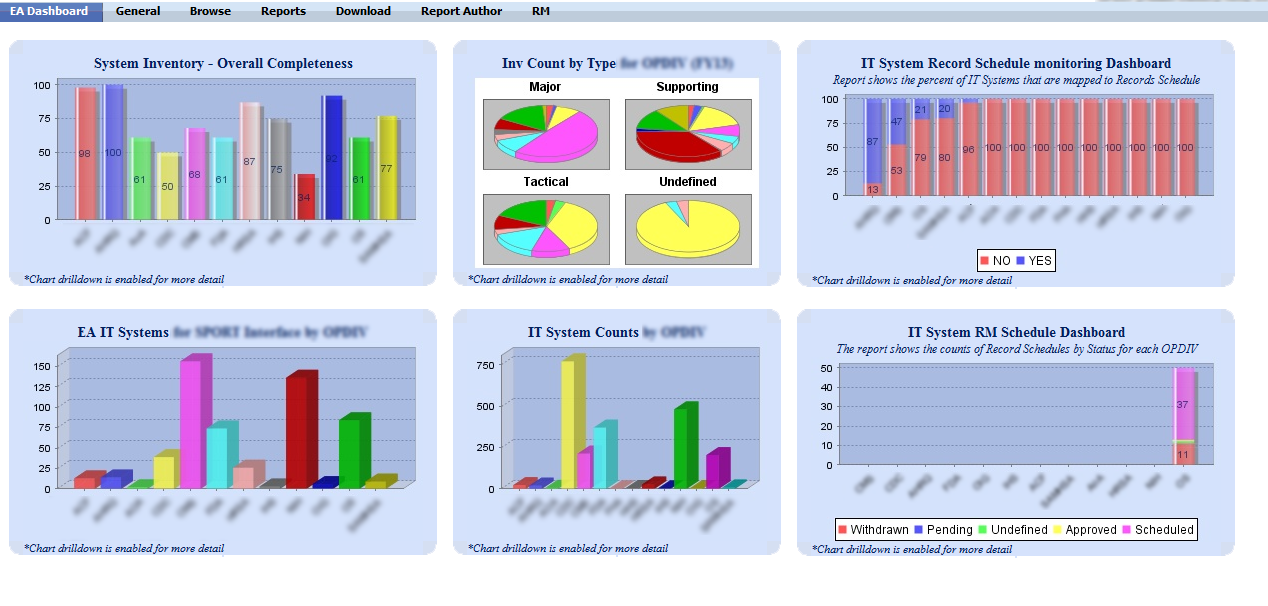
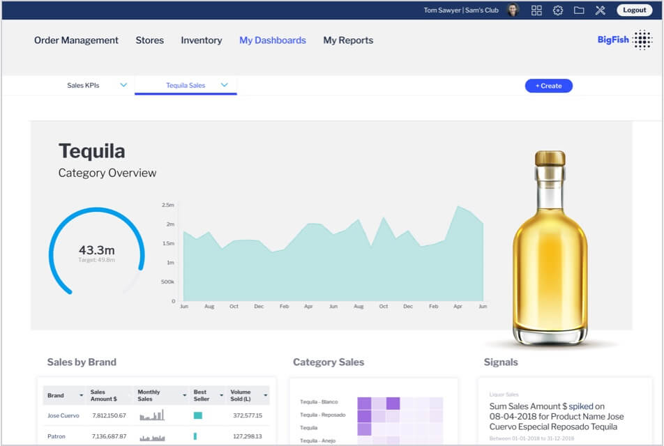
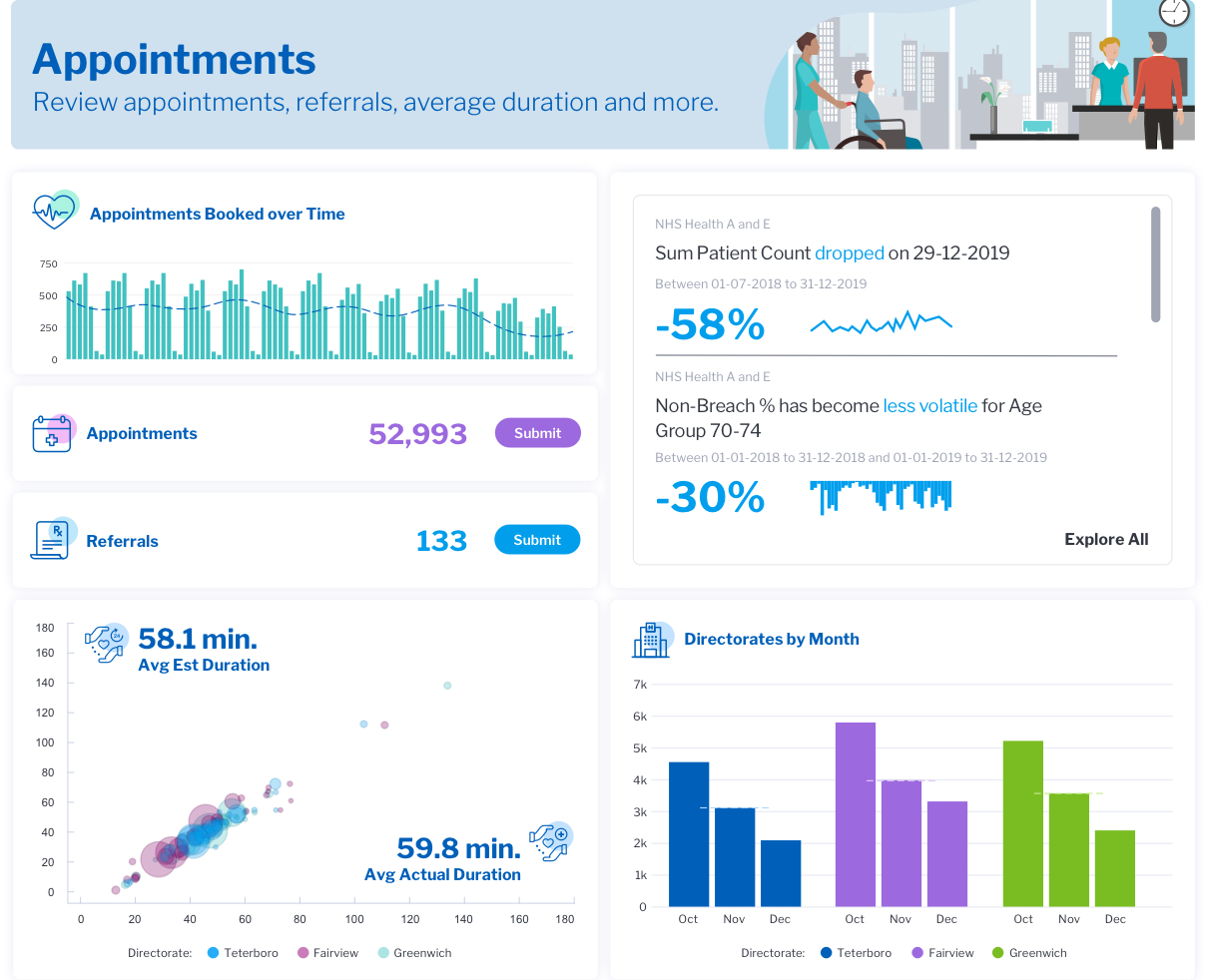
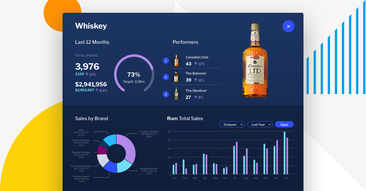
So when we think about this concept of good design and how we communicate with data, design is critically important. It’s about putting dashboards into your own brand colors, and thinking about the layout, the look and alignment. All of these things matter to the consumer, because it'll make them feel good. It'll give them an emotional attachment to the dashboards that you're creating and as a result, it'll drive higher adoption.
Most corporates have a brand style guide that they use for all their internal communications. But when it comes to analytics, most vendors just say here’s the color and fonts that our product comes with and ignore the standards that an organization has defined for their communications. That approach doesn’t take into account that you’re trying to use data as a communication mechanism. So when you design dashboards and analytics that reflect your brand, people automatically feel empathy towards that product and that's really critical. Getting the data correct is the bread and butter, but you take it up a notch if the dashboards look and feel like your business. People are more likely to use it and share it, because it resonates with them.

The vast majority of people, including me, can't design well but we know great design when we see it. Take an Apple Mac and a PC - they’re the same. What you're buying when you choose a Mac is good design and people are willing to pay for it. It’s the same in analytics - the numbers are the numbers. But if I offer you a choice between a product that is really easy to use, intuitive, beautiful and reflects your brand, versus throwing you a clunky old spreadsheet, what would you choose?
From a purely rational perspective the outcome is identical but how you feel is significantly different and that ultimately matters.
Good design, no matter how simple it is, makes people feel like it's a luxury. Someone has gone to the effort to make something beautiful. If someone's pitching to you and giving you a deck that's not well designed, it feels like they don't care enough to polish the pixels. That’s the subliminal message in design.
That's ultimately what we want in analytics. We want more people using data and adoption is paramount to that. The reality is if you're going to design dashboards, you're going to need a tool that's flexible enough to do it. Your dashboard tool has to be much more like a design tool than an analytics tool because ultimately you're communicating data.
So if you want to build dashboards that are phenomenal you have to have all the design flexibility you need to create something that your users will love. That’s what will make them use it and that's why design is important.

How design flexibility gives you a better dashboard experience
Our Head of Product Design and Creative Director, Tony Prysten, has worked in brand, design and advertising roles over the course of his career. Bringing his wealth of experience to Yellowfin, he now shapes the creative and UX experience of our product. Here he shares his thoughts on how design flexibility improves the dashboard experience.

