Yellowfin Evaluation Guide
Yellowfin is used for both enterprise analytics and embedded analytics use cases and for building bespoke analytical applications. Use this guide to ensure Yellowfin is the right technical fit for your requirements.
Dashboards, Reports & Visualizations
-
In this section
Updated 15 October 2024 -
Dashboards
What is a dashboard?
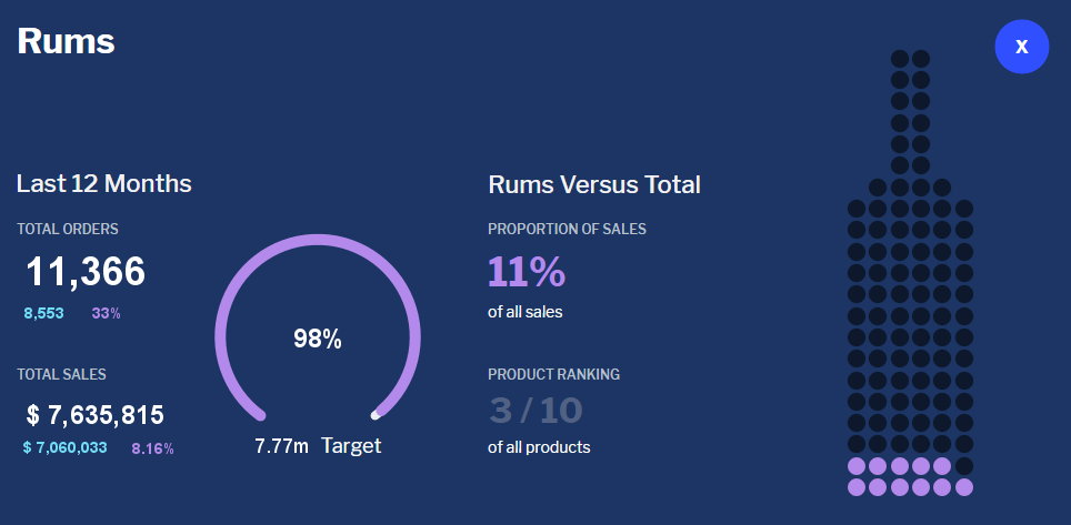
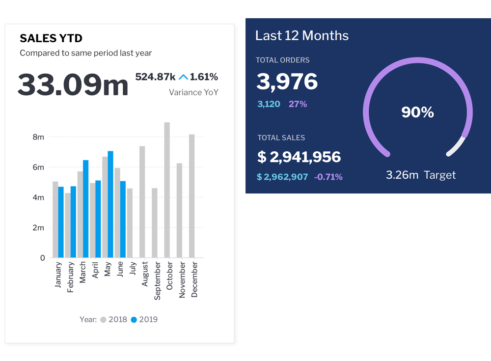
A dashboard is a Business Intelligence tool used by business users to communicate and track Key Performance Indicators within particular subject areas or end user roles – such as finance, sales, marketing etc. Similar to a dashboard on a car it organizes multiple visualizations and tables from various data sources into a well organised format to provide the user with an at a glance view of business performance.
Using a variety of data visualizations across a range of metrics, dashboards help users to understand complex relationships in their data. A dashboard enables users to identify trends, discover their causes and act on the opportunities or challenges they imply.
A dashboard is a combination of one or more charts and or tables on a page (tab). The purpose is to aggregate various reports (metrics and dimensional view of your data) in different combinations so that end users get a full understanding of their key metrics and drivers. Typically to do this, you will need multiple unique reports which results in multiple database queries being generated.
The data returned from a report can be displayed in as a tabular or cross-tabular report or as one or more visualizations (charts, maps etc).
Dashboards may also include filters as well as images and text. It can also be made up of multiple tabs.
What type of dashboards do businesses need?
Businesses typically require a range of dashboards to support their needs. These include strategic, analytical, and operational use cases.
Strategic Dashboards
Strategic dashboards, often called executive dashboards, provide the at-a-glance overview that decision makers at all levels of the organisation need to monitor the performance of their business. These dashboards support users by providing them insight into the opportunities or challenges that their business may be facing by focusing on high level measures of performance and forecasting changes in those measures. Typically strategic dashboards are built from aggregated data – especially time aggregations such as weekly, monthly or quarterly views so as to highlight longer term trends and patterns.
Analytical dashboards
Analytical dashboards are designed to enable end users to drill into the detail of their data and support root cause analysis. These are typically used by line management and business analysts. They include more contextual data, comparative analysis along with historical trends. These types of dashboards should enable the user to manually discover the reasons why changes occur by enabling drill down or drill through or automatically with augmented discovery capability. The data in analytical dashboards can be
Operational Dashboards
Operational dashboards support the monitoring of specific business processes, activities or events where the data is constantly changing. These dashboards assist end users to act on changes immediately and as such the data is much more real time and reflective of what is occuring at the moment.
What business functions can I create dashboards for?
Dashboards can be used to track all corporate functions and across industries. Functions such as finance, sales, customer success, human resources, operations, IT, project management, and many more departments can benefit from dashboard either strategic, analytical or operational.
How do multiple reports work with my dashboard filters?
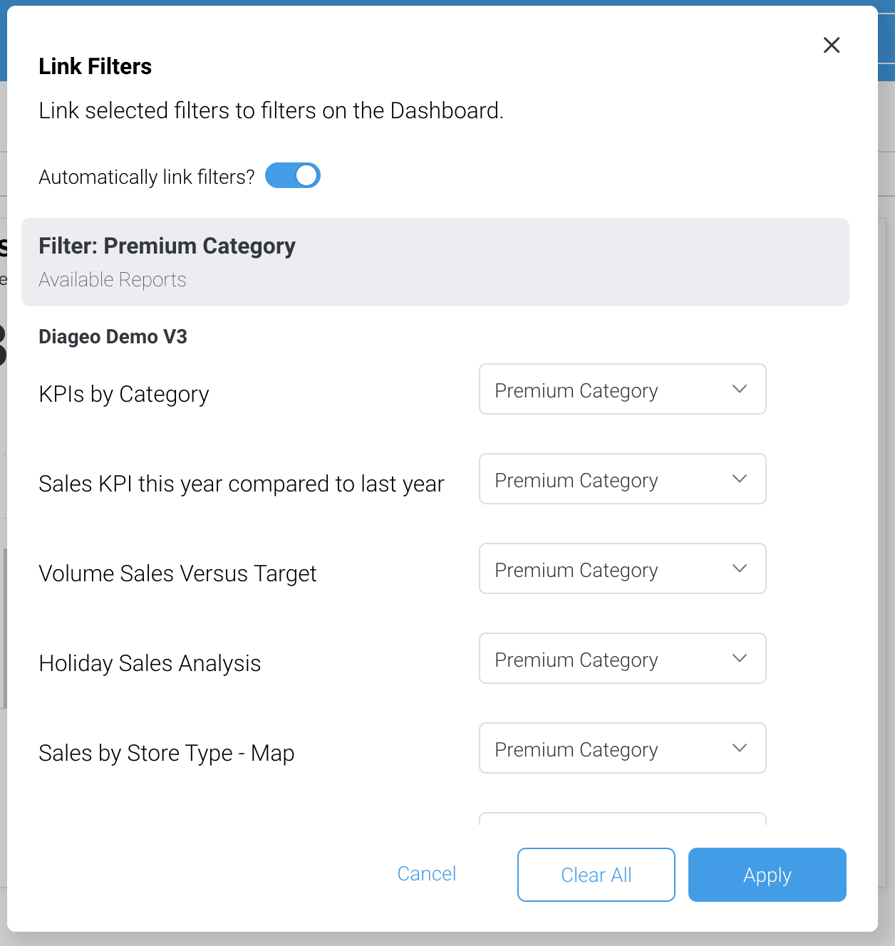
Reports can be wired together into a single set of common filters – so for example a single data filter, can filter every visualization on the dashboard regardless of the source of that visualization. Likewise, actions in a given visualization such as brushing and drill, can trigger corresponding actions in other visualizations.
Can my dashboard have multiple pages?
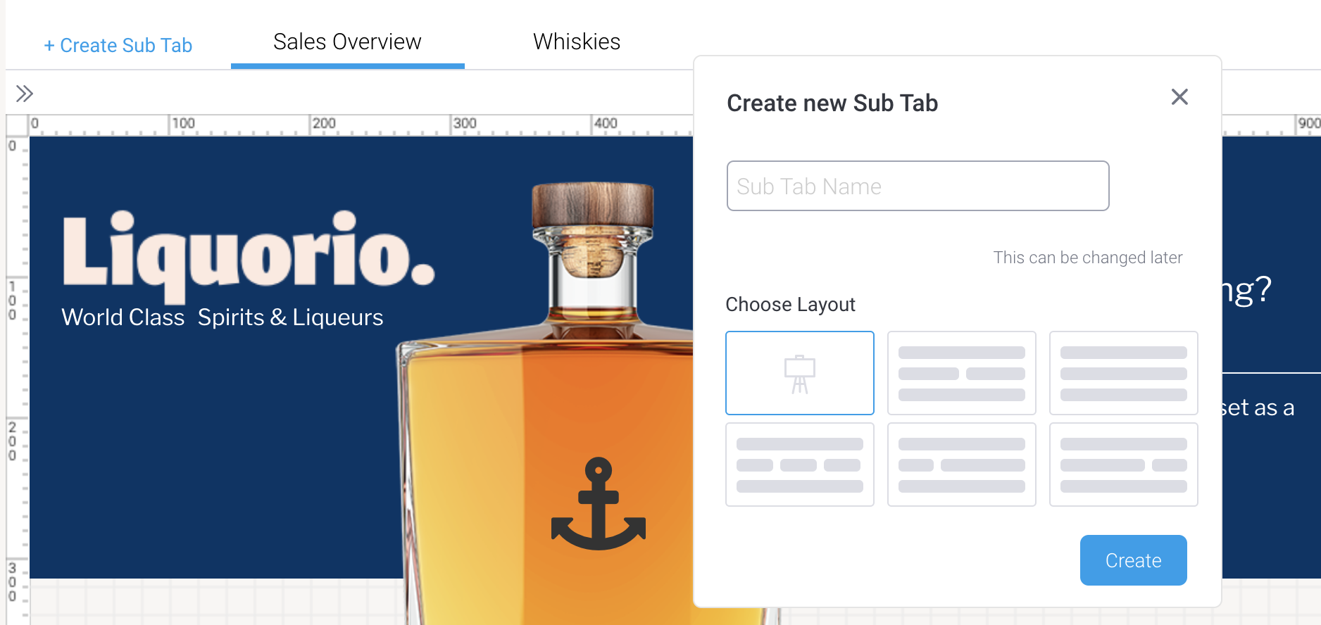
Dashboards can consist of a single page, or multiple pages arranged as sub-tabs. Filters can be passed between sub tabs so that if you user filters data in one tab, those filter values will be applied to reports in subsequents tabs.
What layout options do Yellowfin dashboards support?
Dashboard layouts can be pre-defined or canvas style.
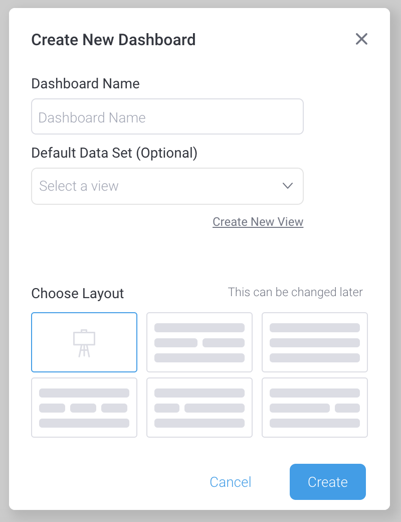
Predefined layouts are used when you want to quickly create a dashboard and ensure all report objects are aligned relative to one another. There is a large variety of predefined layouts available.
Canvas style layouts are highly flexible allowing multiple object types (report visualizations, text, images, buttons, filters and custom objects) to be arranged freely together, including in overlapping fashion to achieve complex designs. The canvas gives you the greatest amount of design flexibility.
Can I integrate data from different data sources on a single Dashboard?
Yes. Any report or visualization from any defined data source can be combined together on a Dashboard. Further, reports and visualizations from different sources can be linked to a common set of filters.
How can I create visually appealing Dashboards that my users will love?
Yellowfin provides all the tools necessary to create stunning Dashboards. Using Dashboard Canvas, complex designs can be achieved with the ability to freely place a variety of rich content items in any position, and to fine-tune the look and feel of those objects.
Good design principles should be followed at all times to ensure that your Dashboard is not only aesthetically pleasing, but also conveys the necessary information in the most effective and efficient way for users at all skill levels.What level of design flexibility do I have when creating a dashboard?
Canvas style dashboards have unlimited flexibility. The Dashboard Canvas provides a WYSIWYG editor so you can quickly see your designs come to life – and a preview mode so you can interact with the draft Dashboard before publishing.
Multiple object types can be included on a Canvas:- Report content (tables, charts, maps, canvas)
- Text
- Images
- Buttons
- Lines
- Shapes
- Icons
- Custom objects
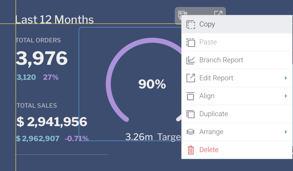
Content can be freely manoeuvred – using drag and drop or via the properties editor. Control down to the pixel level (x and y coordinate).
Content can be overlapping and it’s z coordinate position can be manipulated – by sending the object backwards and forwards).
Fine grained control of appearance is possible, including defining colors from a preset palette, or even using the hexadecimal color code. Borders, edges, shadows and many other aspects of appearance are configurable.
Objects can be grouped together for easier manipulation.
Code mode allows for direct editing of certain html properties that define appearance – as an alternative to using the properties editor or drag and drop.
Further, code mode can be used to create custom objects and UX experiences.How can I allow users to take action directly on a dashboard in order to update another application?
There are a number of ways to achieve this in Yellowfin.
Action buttons can be added to a Yellowfin tabular report. These buttons can be configured to launch a url when clicked – data from the report can be inserted as variables into the url prior to it being called. Logic can be added to disable to the button based on data appearing in the report.
Logic can be added directly to a dashboard using Code Mode. Code Mode provides access to some of the underlying code of Yellowfin objects – allowing the behaviour to be modified, or for custom UI objects to be created. This allows for example, a custom button to be added that executes custom code.
Code widgets can also be created – these allow for server side execution of code and for reuse across the Yellowfin application.
Developers have complete control of this code, this includes the ability to connect to third-party APIs.
Using these capabilities, Developers can build Dashboard experiences that connect workflows across applications. For example, a developer could code a custom button that updates a third party application using the context of data selected from a chart or a report table. This could create a new lead record for a prospect in a CRM database for example. Alternatively, Code Mode can be used to create custom navigation experiences, such as buttons to toggle between different reports or custom filter logic.
Further Reading:
Read about the full set of Dashboard capabilities in our user-guide
-
Charts and Visualizations
In Yellowfin, charts are created on top of the result set returned from a report. Each Yellowfin report can contain multiple charts. This becomes highly advantageous on the dashboard, as the number of times the underlying dataset needs to be queried and processed can be highly optimized.
What charts and data visualizations are provided out of the box?
Yellowfin provides over 40 different visualization types out of the box ranging from standard line and bar charts, to more use-case specific charts like waterfall and funnel charts.
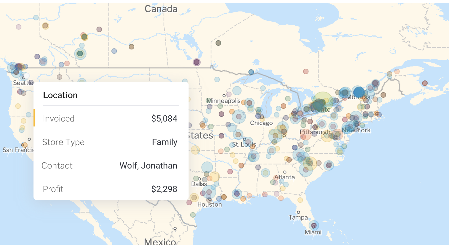
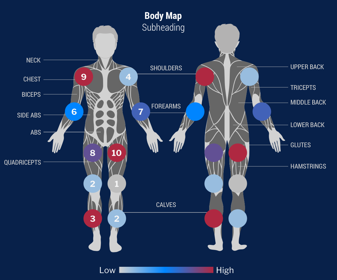
Scatter A scatter plot (points not joined) chart that allows the charting of 2 related attribute series. Can only be used if the data series are related. Useful for seeing trends in data that is not linear. Treemap Compares metric values via a size relationship. Can also be used to show hierarchical relationships. Histogram Shows the number of times a given value occurs in the dataset. Box & Whisker A chart which gives a quick overview of a series of values and their statistical properties. Trellis A segmented chart for which the behaviour is determined by the data selected. Heat Grid Plots the intensity of a metric across multiple categories. Area Charts You want to emphasize the magnitude of change over time. Use an area chart to show how much the value of a measure changes over time. Bar Charts You want to highlight values for easy comparison and plot your numbers horizontally. Use a bar chart to place less emphasis on time and focus on comparing values. Column Charts You want to highlight values for easy comparison and plot your numbers vertically. Use a column chart to place less emphasis on time and focus on comparing values. Combination Charts Combination charts, in effect, superimpose one chart type above or below another. Use to improve clarity and highlight relationships between data sets. Financial Line Use this chart to display a trading value with a subchart displaying volume. Line Charts You want to view trends over time by plotting data at points connected by lines. Use a line chart to plot many metrics. Image Maps If you do not have GIS defined columns you can use the Image Maps to create heat maps – these are a good way to display metrics with a spatial element such as Revenue by State or Country
You will only be able to render maps for which an image map has been defined.Google Maps Google Maps allow you to render location data points onto a Google map which will be displayed as a Yellowfin Chart – along with associated Google map widgets. Meter Charts You want to measure the rate of change of a measure against pre-defined targets. Useful for dashboard reporting. Numeric Display Shows the value of a metric on a digital display. Pie Charts You want to show the relationship of parts to the whole. Use a pie chart to highlight proportions rather than actual values. If it is important to show actual values in the chart, avoid using the pie chart type. Further Reading
How do I create best practice charts and visualizations?
Choosing the right chart that best communicates the intent of your data is critical if you want your end users to be able to digest and act on them. To assist this process Yellowfin has an Autochart builder that automatically selects the best chart for your data selections or you can manually select the chart you want to use that best suits your data and communication intent.
Basically all charts fall into one of 6 categories:
- KPI or a simple big number highlights the current status of your Metric
- Composition – describes the makeup of your numbers like bar or pie charts
- Distribution – shows how values are distributed by time, value of dimensionality
- Relationships – shows the relationship between metrics such as a scatter plot.
- Comparison – enables you to compare metrics over time or for one or more dimensions.
- Location – show your data on a map, floor plan etc
In addition there are general principles that you should adhere to when designing your charts.
Choose the correct chart: Select a chart that suits the type of analysis that you’re trying to convey.- Understandable: It is important that the chart be understandable. For example, make sure that a map is not too stretched.
- Sort: Sort data in a logical order, where you can. For example, chronological, sequential, etc.
- Use formatting: Formatting, such as bars, icons, labels, lines, etc., help users interpret the data.
- Don’t over decorate chart: Make sure not to put in too many series and formatting on the same chart.
- Display values accurately: Visually connect values where a relationship exists in the data. For example, there is no need to use a line chart to join dimensions. That’s better represented using columns or bars.
How much of the visualization is customizable?
Charts are created within Yellowfin’s simple drag and drop chart builder, and offer a wide range of customization features including ability to change colors, fonts, axis formatting, labels and much more.
If you need to create truly custom charts that are not in the Yellowfin list or apply formatting that Yellowfin does not natively support you can use the JavaScrip Chart option in Yellowfin.
Does Yellowfin support showing data on maps?
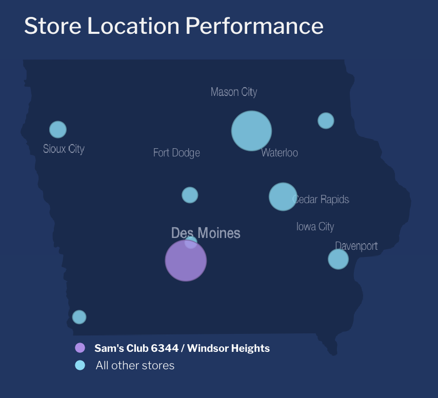
For location data Yellowfin provides multiple options to show this in maps or visualizations.
You can show points when you want to highlight a specific location, polygons when you want to show areas on a map or metrics on a rasta map image – like an SVG.
Your location data can be mapped in a variety of ways:
- Using the points or polygons to display on Yellowfin’s native GIS renderer or Google maps
- Use images to create a raster map to show custom maps like a world map or a floor plan such as a warehouse or plane seating plan.
Can the chart builder do its own calculations?
Yellowfin charts are capable of doing advanced calculations on top of the primary report resultset, expanding the possibilities for what can be done in a single report, and facilitating advanced dashboard performance optimization <see branching>:
- Trends – average , moving average, simple and polynomial regression, and holt-winters forecasting
- Set analysis – this allows you to filter a metric within the chart builder, based on other dimensions in the report. Often used when creating multiple KPI charts, for example one chart may filter the sales number to show only North America, while the next chart filters that number to focus on Europe.
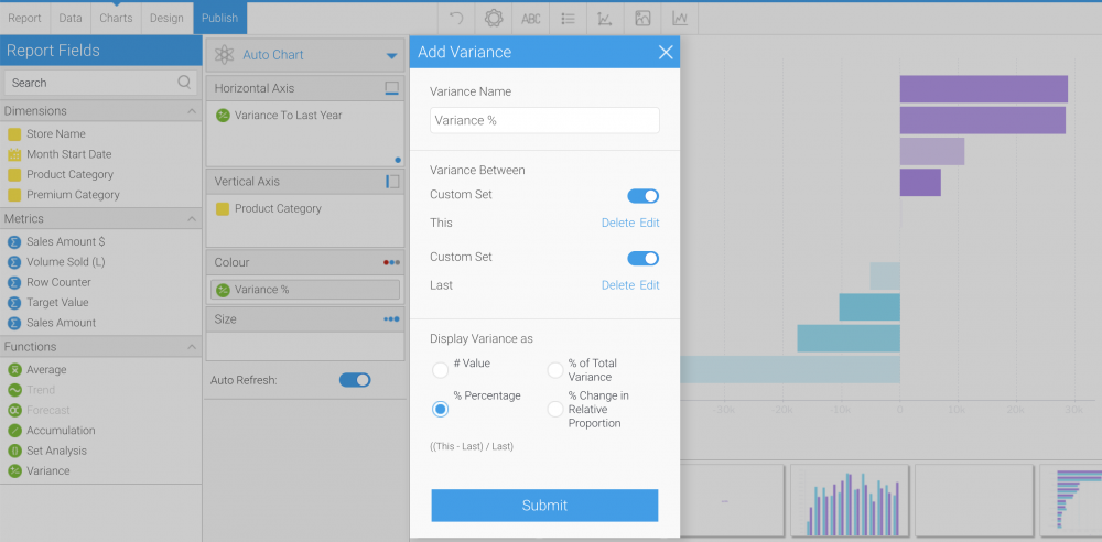
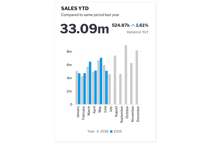
- Variance – this provides an easy interface to create charts to show the variation or change of a particular metric between periods or other dimensions in the dataset.
- Accumulation – when analyzing variables like a company’s budget it is often useful to look at the cumulative total of that value over. The accumulation function makes it possible to do this at the chart builder on either a running total or cumulative percentage basis.
It is worth noting that many of the functions above can easily be done in the report builder using calculated fields or advanced functions as well. What approach you use will depend largely on how your data is stored.
How do I do comparative analysis in my charts?
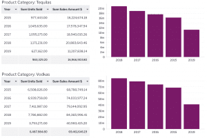
Using chart functions such as set analysis and variance functions you can quickly perform variance and comparative analysis such as year on year comparison without the need to modify your data through complex queries.
You can also use the Yellowfin Assisted Discovery function to automatically create comparative analysis for your. You simply select your data set, choose the dimension or time periods you want to compare and Yellowfin will automatically build the visualizations for you.
Can my visualizations be interactive?
Yellowfin charts are able to offer a wide range of interactivity, facilitating deeper analysis, both within the chart and in the context of a broader dashboard, driving action on related reports simply by clicking a chart.<see dashboard interaction linking>
- Drilling – Drill down, drill anywhere, and drill through can all be toggled directly from the chart.
- Brushing – Filter certain elements out of the chart simply by selecting them with your mouse. This feature is particularly useful when linked to other reports on a dashboard.
- Series Selection – There may be several key metrics that drive your business. Series selection allows you to quickly pivot which of these metrics are displayed in a particular chart. Quickly toggle between count and value, or show both at once.
- Date Slider – filter dashboard by date using a slider to focus in on key data points.
- Unit Selection – Time-series data is generally displayed in an aggregated context (sales for the quarter or month). Unit selection allows you dynamically change how a chart
Can I integrate my own custom charts?
In addition to the out of the box charts Yellowfin provides, we also provide the ability to build your own, utilizing your favorite JavaScript charting libraries such as d3, hicharts, and threejs with a feature called “JavaScript charts”.
Can I create multiple charts for a single report?
Yellowfin supports the ability to create multiple charts off a single report data set. The benefit of this is that unlike most other reporting tools only one query is generated for all charts and the data is re-aggregated in-memory. This helps to improve performance.
Some good use case for this are:
- When you want to improve the overall performance of your dashboard
- When you want to create specific composite visualisations such as KPI reports
- Or you simply want to do visual data discovery and view your data from many dimensions.
Can I apply conditional formatting to my chart colour series?
Yes chart series colour can be inherited from conditional formats applied to the report data table.
However, you do need to be aware that because charts have the capability to re-aggregate data you need to ensure your chart is at the same level of aggregation as your report data table.Further reading:
For detail on supported chart types, go to our user-guide here
For information on how to incorporate your own JavaScript Chart go here
-
Assisted Discovery
Assisted discovery is a process whereby Yellowfin automatically performs analysis on a data set based on a user’s requirements. It then creates a set of visualizations combined with natural language narrative that a user can use to create visualizations and combine into a report.
It is ideally suited for exploring new data sets and for quickly doing detailed analysis of a known change in your data to look for root cause analysis and correlations.
How do my end-users understand the underlying causes of a spike or drop in their data?
Users have a variety of options to understand why trends in their data have changed. Apart from pre-defined analytic paths like drill through or drill down they can use assisted discovery to understand what changed and why. This type of root cause analysis helps them to quickly analyse their.
How is Assisted Discovery different from Drill down or drill through?
Assisted Discovery differs from drill down or drill through in two fundamental ways:
- First, drill downs and drill through are pre-defined analytic paths. They are useful when you know the level of detail required by users to answer their questions that pertain to changes to their data.
- Second, Assisted Discovery analyses the underlying data set. It looks at all the data available to it for correlations and causes for change. In this way it is freeform and no specific analysis paths are defined.
Can I use automated analysis when creating new reports or analysis?
Yellowfin has a capability called Assisted Discovery built into its report builder. Assisted Discovery can automatically analyze data to assist with comparative and explanatory analysis by identifying important and relevant correlations. This can rapidly accelerate the work of a data analyst for example, who may be analyzing a set of data for the first time.
A series of algorithms are run over selected data, and insights are generated and displayed as a series of automatically generated visualizations and natural language narratives. The analyst can select the insights that they are most interested in, and instantly add those to the chart builder. These charts can then be shared, scheduled or combined into a dashboard.
Does automated analysis work on a dashboard?
Yes, users can initiate Automated analysis on a dashboard by simply initiating an ‘explain’ process from their charts or tables. The results of the analysis can be shared with all users.
In addition, if the user chooses they can use the results to create a new report and continue their analysis in a manual fashion or build new reports that they can share with others.
Further Reading:
Learn more about Assisted Discovery here
-
Operational Reports
Can I build my operational and management reports in Yellowfin?
Yellowfin supports traditional operational and management reporting with rich tabular report functionality and pixel-perfect reporting. Reports can be exported into a variety of common formats and reports can be distributed via email or delivered to an FTP server for mass consumption.
Operational Report
Can I produce standard tabular reports in Yellowfin?
Yellowfin supports the building of tabular and cross-tabular reports with standard reporting capability such as dynamically sectioning reports, creating totals and subtotals, and a variety of formatting and conditional options.
Can I build reports that are interactive?
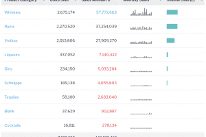
Reports are fully interactive and support drill-down (pre-defined hierarchy), drill-anywhere (drill to any field) and drill-through (drill to another report eg. more detailed report) and can even contain rich content such as url links, images, action buttons and even sparkline charts within a table column.
Can I create pixel perfect operational / financial reports?
With Yellowfin, you can use a Jasper XML report editor such as iReports, or a BIRT XML report editor such as eclipse, to create pixel perfect “Crystal” style reports. This definition can be loaded into Yellowfin and leverage our existing functionality such as security and broadcast functionality for managing the report.
Further Reading:
Read about integrating Jasper reports in our user guide
How to integrate pixel-perfect reports into Yellowfin blog
You would use these methods if you want to:
- Create a production / banded style report such as an invoice or P&L statement.
- Create specific report layouts which are not otherwise catered for in Yellowfin.
Can I create section based reports?
Yes, Yellowfin allows you to break up large complex tables into grouped sections according to selected dimensional values. Sections can be single or multiple section breaks. Any charts created will automatically be run and associated with each section.
Sections can also be formatted differently to show all sections on a single page, across multiple pages, and in tabbed display form.
Can I create paginated reports?
Yes, Yellowfin automatically applies pagination to long tabular reports according to a pre-configured row count which can be customized.
How do I include data from more than one data source into my report?
You can query and blend data from multiple data sources into a single ad hoc analysis / report using Advanced SubQueries.
Further Reading:
Read how to create advanced subqueries in our user-guide:
How can I do period on period comparisons?
Yellowfin supports multiple options for period on period comparisons. For tabular reports, if you want to include periods and their values as new columns or rows, you can either append or union data from the same data source using SubQueries. Performing this across multiple data sources into a report is done using Advanced SubQueries.
For visualizations, Set and Variance Analysis can be used to perform period on period comparisons and calculations quickly.
Further Reading:
Find more detail about Set Analysis and Variance Calculations
-
Formatting & Data Calculations
How can I format my data?
For your reports, you can apply different kinds of formatting:
- Report Formatting: applying formatting that affect the report as a whole
- Column Formatting: applying formatting that affect report columns
- Conditional Formatting: applying formatting that is affected by pre-defined rules
- Section Formatting: applying formatting that affect how a report table is shown
Further Reading:
Read about options for data formatting in our user-guide
Can I add conditional formatting to my table data?
Yes, you can create rules to highlight or change the appearance of your column values, such as adding conditional icons, that will apply for both reports and charts.
Further Reading:
Read more about conditional formatting in our user-guide
Can I create calculated fields on my report?
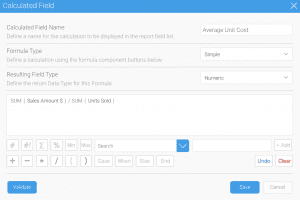
Yes, you can use the calculated field builder in Yellowfin reports to perform simple and advanced calculations. You can also use our predefined formulas for popular calculations, insert your own formulas, and even perform calculations using Freehand SQL if necessary.
How do I share commonly used calculations to all my users?
There are two ways in which you can create and share commonly used calculations:
The meta-data layer. This is the most flexible area to create new calculations. These calculations are made dynamically at query run time.
Create calculated fields stored in your database. This can be done via a Yellowfin data transformation process or done external to Yellowfin and Yellowfin just queries the results.
Both these methods allow governed formulas and calculations to be used by other report authors in the platform.
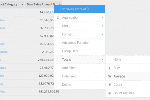
Can I add column and row totals?
Yes, you can switch on column and row totals including subtotals according to selected dimensional values and report grand totals. These can be the result of simple aggregations or you can use calculated totals for fields such as averages or ratios.
What types of advanced calculations does Yellowfin support?
Yellowfin supports both data level calculations and chart level calculations.
For data level calculations Yellowfin supports simple to advanced calculations, including complex CASE statements with the Calculated Field Builder in reports. If necessary, calculations can be performed using Freehand SQL to access native database functions as well.
For chart calculations Yellowfin ships with predefined functions that allow for set and variance analysis. The user configures these at the chart level and the calculations run against the report data set.
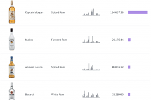
Can I add sparklines into my report table?
Yes, sparkline charts can be added into your tabular reports using our Sparkline Advanced Functions and Formatter to show sparklines as either line or column mini column charts.
Further Reading:
Read about creating report table sparklines in our user-guide
Can I add actions into my report table?
Yes, report action buttons can be added into your tabular reports using our Action Button Formatter to trigger an action that is local or remote to the Yellowfin platform.
Further Reading:
Read about setting up table action buttons in our user-guide …
Can I display images in a report table?
Yes you can add images into a report table. This is supported in multiple ways:
- Applying Column Formatters if your image data is stored in your database in HTML or as a URL
- Applying a URL Link formatter to display images if the image is stored as a URL
- Applying Reference Code images which convert values into their respective images and displaying them
- Applying Custom Formatters. You can create custom formatters to display data values as images – one example of this is the flag formatter which is used to display country flag images according to ISO country code column values
-
Scheduling, Distribution and Exports
Can I schedule and distribute reports across my organisation?
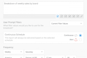
All reports in Yellowfin can be distributed to users, or groups of users, via email or FTP using Yellowfin’s “Broadcast” functionality – either as a link (which opens Yellowfin for full interactive viewing), or as a file attachment (Spreadsheet, html, word document, pdf).
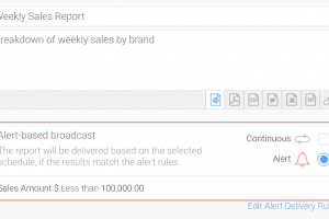
Report broadcasting can be made contingent on meeting a predefined rule. For example, alert style reports can be triggered to only be sent when a key metric or the report meets a predefined threshold.
To configure standard email broadcasts you will first need to set up an SMTP server for Yellowfin to use.
Further Reading:
Read about the full range of scheduling capabilities here
Can data for a distributed report be filtered for a specific user?
Yes, when setting up a broadcast schedule this can be done in two ways:
The first, reports can be broadcast with different filter values set, and can be set up centrally by an administrator, or by individual users (personal broadcasts).
The second, reports can be broadcast where the list of recipients and filters for each of those recipients, is sourced from another report. This allows broadcasts to deliver individual report results for each recipient.
Can individual users create and manage their own subscriptions?
Yes, each user has the ability to create their own “Personal Broadcasts” that distribute the report to their email on a consistent or alert-based schedule. Any user with the appropriate permissions is also able to create and edit standard broadcasts.
How can I create rules to only send reports when certain business thresholds are reached?
Each broadcast can be configured to deliver only when a specific business rule is met. Consider a report that tracks user activity within an application. If there has been no activity, it wouldn’t make sense to send the report detailing that. By configuring an “Alert” based broadcast, we are able to define a delivery condition. Each time the report is scheduled to run, Yellowfin will compare the intended recipients’ resulting report against those rules, so only the users whose data met or cross the required threshold will receive the report.
Am I able to set consistent brand components on these exports such as headers or formats?
Every component of a Yellowfin broadcast can be customized – for multi-tenant clients – this can also be done on a tenant by tenant basis <screenshot of good looking email report, branded>:
Email template formatting – what does the body look like visually, fonts, colors, images, etc? <email template of admin>
Custom body – created on a broadcast by broadcast basis
Report context – title, description, filter breadcrumbs can all be toggled for display
Report headers/footers – common branding that can be applied to every reportMy team still likes Excel, what formats can I distribute?
Excel is one of our supported formats, others include PDF, CSV, TXT, HTML, DOCX.
