Yellowfin Evaluation Guide
Yellowfin is used for both enterprise analytics and embedded analytics use cases and for building bespoke analytical applications. Use this guide to ensure Yellowfin is the right technical fit for your requirements.
Yellowfin Capabilities
-
In this section
Updated 15 October 2024 -
Introduction
The Yellowfin application is made up of a series of modules that enable you to create and share a range of analytic content with your end users, whether as a solution for enterprise analytics, as an OEM BI tool for embedded analytics or as a stand alone analytical application that is a specialist vertical data solution. In this section each of the core components is described and its associated use cases.
-
Connecting to Data
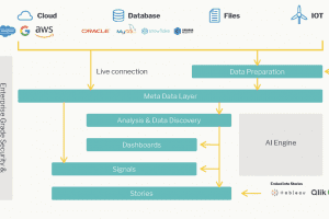
Yellowfin does not require you to import data, rather it works with data in your existing data sources. Several main types of data store are supported:
- JDBC compliant databases such as SQLServer, Oracle, Exasol, Snowflake, Redshift and many more.
- XML/A compliant cubes such as Microsoft Analysis Services, SAP BW, Oracle Essbase
- CSV files (which are then loaded in to a relational database)
- Third-Party sources including applications like Salesforce.com, Google Analytics and many others
Configuration data is stored within the Yellowfin database, but reporting data is stored separately. For optimum results, it’s recommended to use a fast dedicated reporting database which uses technology designed for high-speed analytics. This may include columnar storage, in-memory processing, massive parallel processing, or other approaches.
Yellowfin partners with Exasol, and the Exasol Fast Database can be purchased from Yellowfin directly. The Exasol database utilizes an in-memory, Massively Parallel Processing (MPP) engine specifically designed for analytics. Ranked the world’s fastest by TPC-H, the industry benchmark for evaluating performance, Exasol is highly flexible and can be deployed in the cloud, on-premise or as part of a hybrid approach.
More information on Exasol, including our whitepaper.
Yellowfin uses meta-data to generate the appropriate, optimised queries for each type of data source. Data can also be retrieved from stored procedures that output a table object. Further, reports can be written that combine data from multiple data sources.
Plugins allow for data to be extracted from any source via an implementation of Yellowfin’s Third-Party Java API. In that way custom connectors can be written to connect to data sources not currently supported.
Further reading:
Jump to the section on managing data
The full list of data source connection methods is described in detail here
Information on how to develop your own connector can be found here
Currently supported third-party connectors can be found on our marketplace here -
Data Transformation
Yellowfin has a complete ETL module that allows you to extract data from any supported source, transform that data using a variety of transformation steps, and write the output to any supported write-able database target. This capability is useful when the data you are accessing requires some degree of manipulation or enhancement in order to make it more suitable for analytical purposes. For example, this could involve:
- Blending data from disparate data sources together into a single physical table (for example, transforming data from a 3NF model into a star-schema, or aggregating data for faster performance)
- Converting data elements into a more useful form, such as transforming the data type of columns, manipulating the data in columns, creating calculated fields
- Enhancing data by calling custom transform steps – for example to add external data (such as weather or geocoding points) or calling a data science model to calculate a prediction
Custom transform steps can also be created and imported into Yellowfin.
Further reading:
Jump to the section on Preparing Data For Analysis
Access our ETL user-guide
Information on how to developer your own custom transformation step can be found here -
Data Science Integration
Custom developed data science models can be integrated into Yellowfin via an ETL flow or directly into a report. In this way, new data such as a prediction can be integrated into your analytics solution.
Yellowfin can connect live to models hosted in R, H2O.ai, AWS Sagemaker and can natively run models exported in PMML or PFA formats.
A model can be embedded as a step in an ETL flow – this allows the predicted value output from the model to be written once to a database of your choice. Alternatively, a model can be run live from within a report using an advanced function.
Both the ETL steps and advanced functions are extensible. Customers can write their own code and import it via the plug-in manager if their modeling platform is not currently supported.
Further reading:
Jump to the section on Data Science Integration
Read more in our user-guide -
Meta-Data Modelling
Yellowfin provides a comprehensive modeling layer to capture the technical and business information about your underlying data. Yellowfin uses this information to provide a business friendly layer to end-users, whilst using the technical information to generate the relevant queries.
Meta-data modeling is performed using a friendly drag and drop interface. The data relevant for reporting can be identified, technical information such as data types, join conditions and so on can be defined, business names, definitions and default formatting can be applied, and additional information can be derived such as data grouping or complex calculations. Yellowfin can analyze the underlying data and generate recommendations on what steps should be performed to prepare data for analysis.
Once defined, this meta-data underpins all other Yellowfin processes. It need only be defined once, and shared by everyone. This ensures a consistent approach to using data across your whole system.
Further reading:
Jump to the section on meta-data modelling
Read more in our user-guide -
Reporting
Once the meta-data is defined for an underlying data source, reports can be built using the drag and drop report builder. The report builder allows the creation of simple tabular reports through to incredibly complex queries (for example, correlated subqueries, unions, cross-tabs etc). Yellowfin uses the report definitions to generate query syntax in the appropriate language of the underlying data source. The complexity of defining joins and other syntax is hidden from the user – although the generated queries syntax can be accessed. If desired, queries can be written using free-hand SQL.
Filters, aggregations, calculations, advanced statistical and analytics functions can all be defined in the query. Reports can be visualised as standard tabular reports, as one or more charts, or as a collection of objects on a free-form design canvas (infographic).
Yellowfin’s Assisted Discovery capability can be used to run statistical algorithms against the underlying data in order to automatically identify interesting correlations and associations in data, and to automatically generate a set of visualizations to help accelerate your analysis.
Further reading:
Jump to the section on Operational Reporting here
Learn more about our extensive reporting capabilities in our user-guide -
Data Visualization
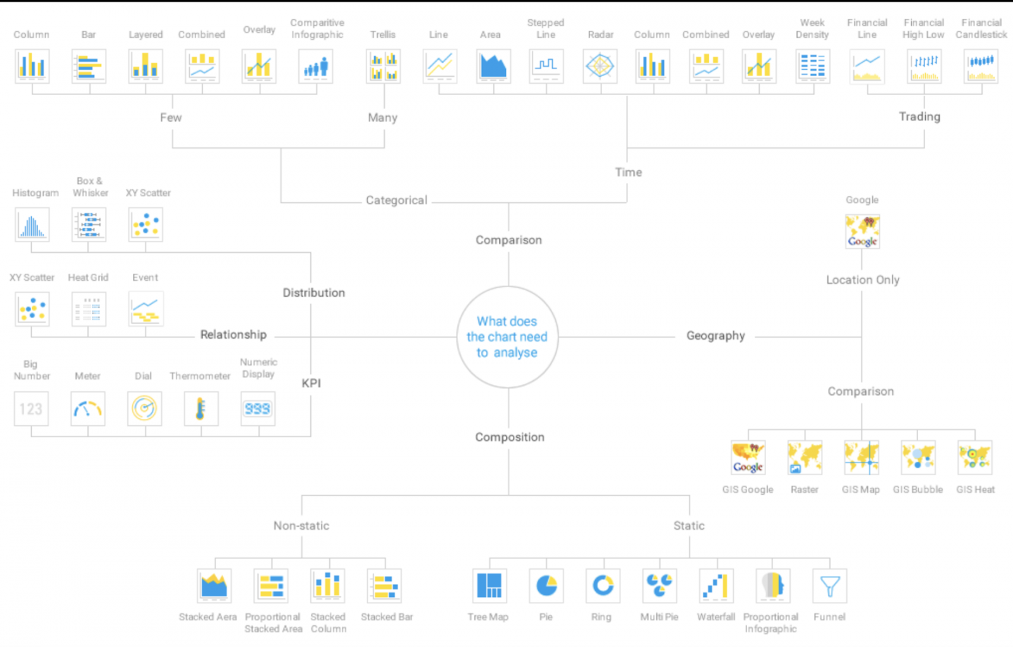
Yellowfin supports a wide-variety of ways to visualize report output. This includes tabular or cross-tabular reports, one of the many out of the box chart types, or a custom JS chart of your choice.
Users can interact with visualizations in a variety of ways – including drilling down a hierarchy, drilling through into a detailed report, applying filters to narrow down on the data required, using tooltips to show more information, brushing data to select and restrict areas of interest, exporting data to one of the wide-variety of supported sources (including Excel, PDF).
Reports can be shared with others, or scheduled to be broadcast and distributed to one or more users on a regular basis. Further, rules can be defined which indicate when a report should be sent, for example when a key metric passes a threshold.
Further reading:
Jump to the section on Data Visualization here
For detail on supported chart types, go to our user-guide here
For information on how to incorporate your own JavaScript Chart try here -
Dashboards
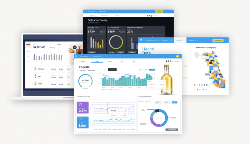
A dashboard provides at-a-glance views of key performance indicators (KPIs) relevant to a particular objective or business process. Typically multiple reports and visualizations are combined together to form a Dashboard.
Yellowfin provides two main ways to create Dashboards – using pre-set layouts (in which report and chart content can be dragged and dropped into predefined positions) or Canvas layout (a free form layout where multiple types of content can be freely positioned to create rich designs). As well as reports and charts, Canvas layout supports additional objects such as text, images, icons, filter objects, action buttons and more. Canvas mode has the additional benefit of allowing access to code-mode. Code mode allows developers the option to extend the dashboard functionality with custom-code (JavaScript, html, CSS) to create custom objects and navigation experiences, as well as connecting and invoking functionality in third-party applications.
Yellowfin Dashboards can contain data from multiple data sources, and each object can be connected to a single set of common filters. Further, user actions in one visualization (such as a brush or drill) can be used to initiate actions in other visualizations (filtering, drilling).
Further reading:
Jump to the section on Dashboards -
Automated Monitoring & Data Discovery
Yellowfin has developed advanced machine learning capabilities that assist users in the discovery and interpretation of AI driven data insights. These capabilities augment the capabilities of the user and enable them to analyze more data, find more insights and understand root cause – far faster than a human alone ever could.
Signals
Yellowfin Signals can be used to automate the process of discovering important insights in your data. Signals leverages the meta-data layer and can be easily configured to continually scan your data, identify changes that exceed thresholds, and create personalised notifications to your users.
Signals deploys a variety of complex algorithms aimed at detecting interesting and relevant changes in your data. This autonomous analytics includes changes in total and average, trend direction, volatility, step shifts and outliers (spikes and drops). Signals algorithms can automatically detect and allow for natural seasonal variation in data. Signals setup is simple, however if required, fine-grained configuration of thresholds and algorithm parameters is available if desired.
Signals can be configured to simultaneously monitor many metrics and across many dimensions – and thus scan and examine far more data than a human ever could. Signals deploys a complex ranking algorithm to determine the most relevant data events, and then further ranks the data for each individual user based on that users preferences and previous system usage. This ensures only the most relevant and important insights are alerted to the user.
Signals can be notified via a timeline notification, email or via the Yellowfin mobile app. Once a Signal is delivered, Yellowfin provides additional information to assist the user in understanding the root cause of the data event – including identifying other highly correlated data events from the same or different data sources.
Collaboration features allow Signals to be shared, discussed, followed and added to Data Stories. The Signals workflow allows Signals to be assigned an owner, and managed via a workflow until a conclusion is reached and actions agreed.
Assisted Insights
Assisted Insights capability is accessible from reports and dashboards. With a simple right click, any user can invoke a powerful set of algorithms to automatically analyze the data they are currently viewing to identify hidden underlying patterns and drivers. For example, a user may see a spike in a line chart for one period – assisted insights can be used to analyze that spike by comparing it with a prior period. The analysis will determine the key drivers that led to the differences between those two periods and present those as a series of insights – ranked by statistical relevance. Each insight is accompanied by an automatically generated visualization, and a set of natural language descriptions of the finding. These insights can be saved and shared with other users.
Assisted insights can be enabled at the view level with some simple configuration steps.
Assisted Discovery
Assisted Discovery is available in the Yellowfin Report builder, and can automatically analyze data to identify important and relevant correlations. This can rapidly accelerate the work of a data analyst for example, who may be analyzing a set of data for the first time.
A series of algorithms are run over selected data, and insights are generated and displayed as a series of automatically generated visualizations and natural language narratives. The analyst can select the insights that they are most interested in, and instantly add those to the chart builder. These charts can then be shared, scheduled or combined into a dashboard.
Threshold Alerts
Individual reports can be scheduled to be run and distributed on a regular basis. Rules can be set against those reports which define when the report should be sent. This allows for example, reports to be sent on an exception basis – say when a particular metrics exceeds or falls below a predefined threshold. Rules can be set on the total value of a metric in a report, or triggered when any row in a report exceeds the threshold.
Further reading:
Jump to the section on Automated Analytics here
Learn about scheduling alert based reports in our user guide here -
Data Stories & Presentations
Yellowfin provides additional unique ways to present and share data with users.
Yellowfin Stories enables the creation of a long-form narrative augmented with rich data content (charts, reports) and non-data content (text, images, videos). Inspired by the field of data journalism, Stories enables data to be presented with the full context – providing a far more engaging information delivery process that ensures information consumers are always on the same page.
Stories are simple to create and have been designed with business users in mind – as it is the business user that typically has the important context to share. Report content can be easily added – either as a live view of the data, a snapshot (preserving the data as it was at that point in time) or a bookmark (a report saved with pre-defined filters). Full data security is maintained at all times – so users will still only be able to see data they have been granted access to. Embeddable visualizations from other reporting tools such as Tableau, Qlik and PowerBI can also be included in a story.
Stories can be shared, applauded, commented on and read on the go via our mobile app. Multiple users can collaborate on a single Story, with all contributors and reviewers being acknowledged in the story credits – thus adding transparency, credibility and trust to the story.
Further reading:
Jump to the section on Data Stories and Presentations -
Mobile (and collaboration)
The Yellowfin mobile app allows you to stay up to date on the go.
Built with a familiar social media feel – the app experience is centred around a feed. The feed provides everything that users need to stay up to date – including alerts about new Signals, published Stories, mentions in discussion threads and notifications on new content (reports, dashboards).
With a simple self-onboarding experience, and integration with biometric authentication on your Apple or Android device, getting up and running with mobile is simple and fast.
The mobile experience is fully interactive and enables users to easily share insights across the organisation. All the common app capabilities are there – including liking, sharing, commenting, posting, connecting and following others.
Further reading:
Learn more about the mobile app here


