

What is Data Visualization and its Importance in Business Intelligence?
Like dashboards, data visualization is synonymous with business intelligence, but what does it mean exactly? As a core capability of analytics solutions, it’s important to know its role in the BI process today, to understand just how much it can transform your reporting.
Data visualization is the practice of representing information graphically to communicate and contextualize data. It highlights important changes, patterns and trends using a visual format, such as charts, graphs, maps and plots, to help make data easier to understand.
So, what is data visualization best at? When used correctly, visualizations help business people interpret complex data-sets, draw conclusions, and make informed decisions faster, and identify correlations they may not see in static tables or text-based reports alone. Integrating business intelligence and data visualization tools allows companies to analyze data more effectively, uncover hidden insights, and make strategic decisions.
Finding the right BI solution with data visualization built-in, then, is a critical need.
What is data visualization in the context of BI?
The aim of business intelligence is to collect and turn data into actionable information that fulfill operational and strategic objectives, and support a person's decision-making.
After business data is collected, curated and modeled, organizations are keenly aware they need to provide their users and decision-makers numerous ways to easily interpret and drill down into data without requiring technical expertise to get started - otherwise, they may remain reliant on experts to provide analysis, or under-utilize BI tools altogether.
Data visualization tools is one such method. They are provided as a self-service BI reporting capability in modern analytics solutions, enabling companies to display and share quantitative data in a much more data driven, digestible and user-friendly manner for their customers and end-users to get up to speed on the most important figures fast.
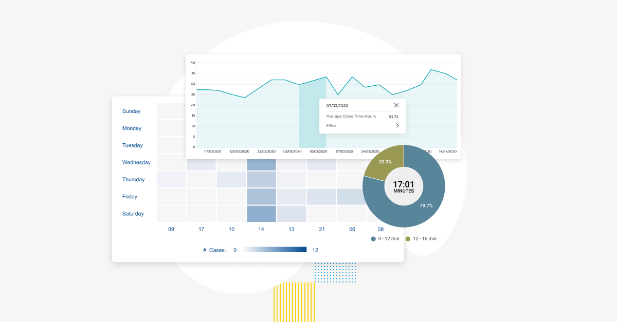
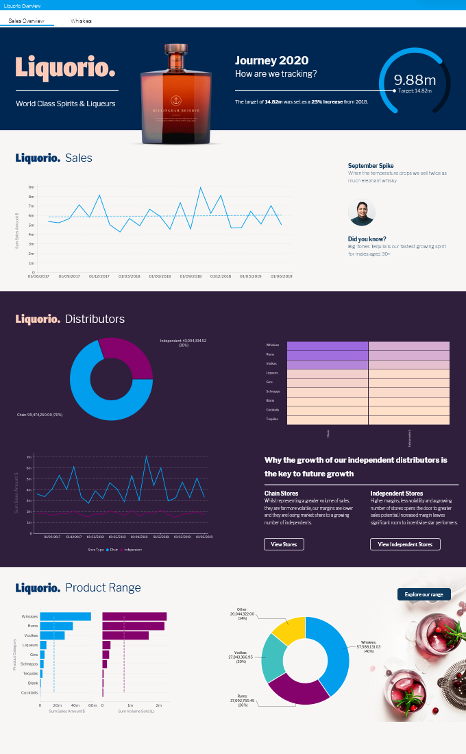
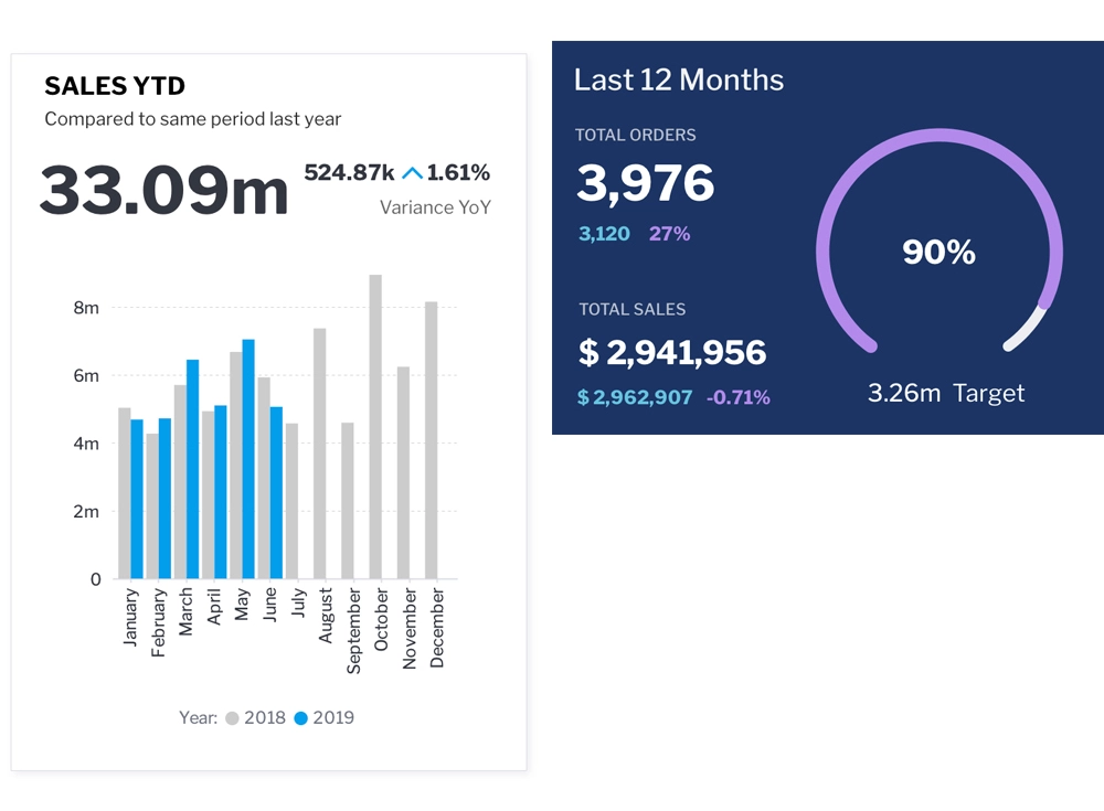
Data visualizations are typically used in a business intelligence dashboard or report as a way to condense complex or high-volume data using engaging graphics. The increased interactivity of these data visualization reports also make it easier to identify trends, patterns, and opportunities for growth. The importance of data visualization, then, lies in its critical ability to bridge the gap, translating raw business data into clear, visually interactive insights that empower users at all levels.
Organizations can deliver day-to-day key performance indicators (KPIs) and business metrics in a more interactive way using data visualization tools, which are increasingly combined with data storytelling narratives to provide deeper context and meaning.
Enterprise and software companies across multiple industries, including retail, science, finance and healthcare, ultimately adopt BI solutions to break down their data and provide a clearer understanding of business performance, objectives and potential insights. Data visualization tools are one such way of realizing this important goal.
What types of data visualization are in BI tools?
Historically, the earliest forms of data visualization - simple pie charts, line graphs and tables - were used to supplement text-based operational reports and spreadsheets. As BI has become more of a priority in the past decade, analytics solutions increasingly support newer options to visualize complex sets of data and realize effective data visualization.
Today, there are many types of data visualization to show and represent data in a more engaging way, with the exact output dependent on the analytics solution in question.
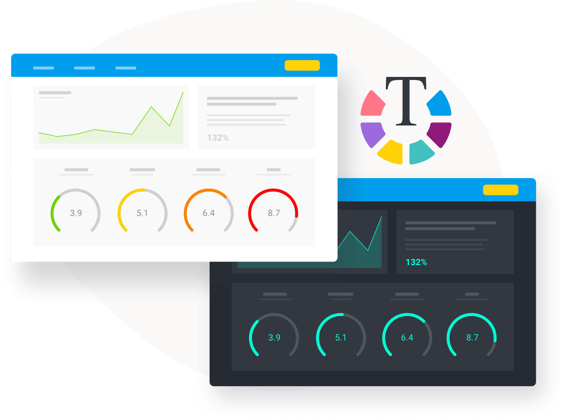
For example, Yellowfin provides the following types of tabular and chart visualizations out of the box for data analysis, just to name a few of its 50+ options:
Area chart
Bar chart
Column chart
Image map
Meter chart
Numeric display
Pie chart
Scatter plots
Stacked bar
Treemap
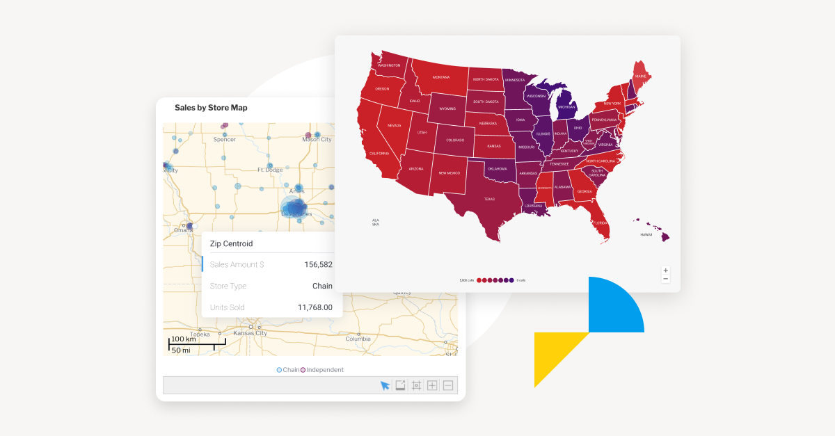
Selecting the appropriate types of data visualizations that best communicate the intent of your data is key if you want to ensure end-users will be able to interpret, understand and act on it, such as store sales by region across several states.
Learn more: Top 10 Essential Types of Data Visualization of 2025: From Basic to Advanced
What are the categories of data visualizations?
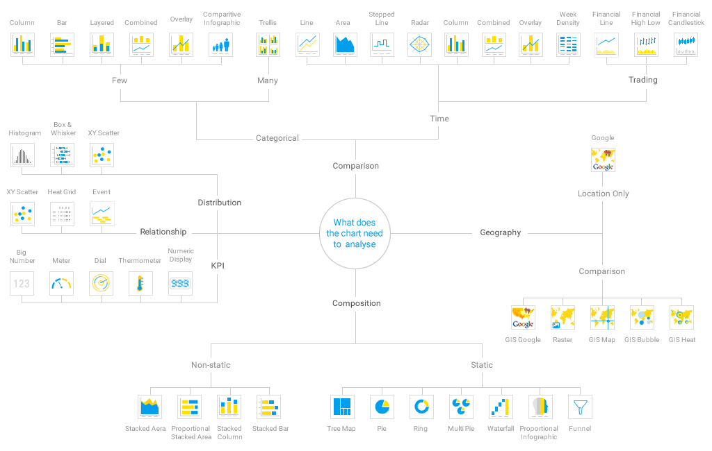
Most types of data visualizations today fall into six distinct categories:
Comparison – enables comparison of metrics over time or for one or more dimensions
Composition – describes the makeup of your numbers like pie or bar charts
Distribution – shows how values are distributed by time, value of dimensionality
KPI - Key performance indicator; highlights the current status of your metric
Relationships – shows the relationship between metrics such as a scatter plot.
Location – show your data on a map, floor plan, and so on
The BI visualization you choose to use in a report or dashboard to visualize business data is dependent on what the visualization needs to display, and what your end-user needs to analyze.
Do you need to show a relationship between a set of metrics?
Do you need to compare two data-sets closely together?
These considerations should ideally be mapped out prior to using any visualization, so you, your team and end-users understand just what data visualization is best used for.
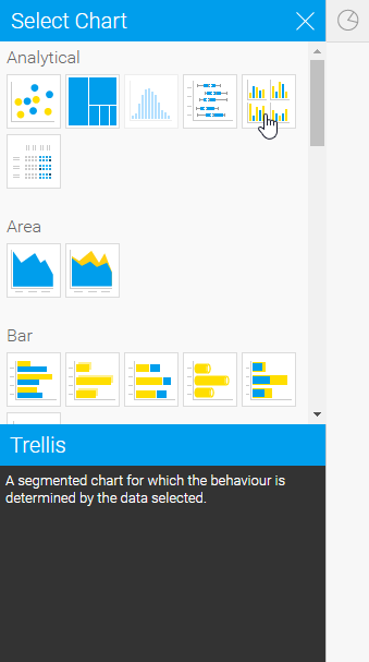
Some BI solutions assist organizations in selecting the best chart category, such as Yellowfin, which has an Autochart builder that automatically selects the best chart for your data selections, as well as provides a short explanation of what the chart is and what it is best intended for.
What is data visualization best practice for BI reporting?
There are many general data visualization best practices and principles to adhere to when designing your visualizations.
Define your audience: Keep the intended audience front-of-mind when designing your data visualization to ensure it can address their needs and motivate them to take action on a data-point.
Keep colors and fonts consistent: Color is a valuable method of drawing attention to data the users need to see, in the order you need them to see it, highlighting changes to figures and charts, while fonts help guide the users. Pick a complementary color theme and font, and stick with it to maintain consistency.
Context is key: Showing and telling your audience why the data in your visualization matters is crucial in ensuring to care enough to act on it. A compelling graphic combined with a data story narrative can help drive action better than just a pretty chart on its own. When done right, data visualization and reporting can transform raw numbers into meaningful insights that inspire informed decision-making.
Use formatting and sorting: Organize data in a logical order (chronological, sequential) and use bars, icons, labels, and lines to keep things simple and help users interpret the data.
Know when to hero tables: Visualizations will typically be the attention-drawer in any BI dashboard, but tables are still useful for dense visual design depending on the data-set - take advantage of sparklines and conditional formatting to make them just as impactful as your charts and graphs.
Present values accurately: Connect values where a relationship exists in the data, not just for the sake of it - using a line chart to join dimensions, for example, isn’t needed, and is better represented using columns or bars.
You can learn data visualization best practices in more detail in our video guide, which we’ve embedded below for your convenience.
What are the 5 C's of data visualization?
There is no one source from where data is derived and stored. But there are five characteristics (the 5C’s) that should be each set of data, no matter how big or small.
Conformed
Conformed data aligns with the goals of your analysis and audience needs. It avoids unnecessary elements, focusing on delivering clear and relevant data visualization insights. For example, a line chart tracking sales trends serves its purpose better than an overcrowded dashboard.
Comprehensive
When the data is comprehensive, one can get a full picture without omitting important information. It avoids biases by presenting balanced information without overwhelming the viewer. Layered charts or annotations can highlight key points while offering deeper insights when needed.
Consistent
Consistency ensures clarity and comparability. Use the same color schemes, business intelligence charts, and data formats across visuals. Uniform scales and labels eliminate confusion, helping your audience interpret insights quickly and accurately.
Clean
Clean data is free of clutter and unnecessary elements. There should not be any missing values, no out-of-range data, no errors/typos, or inaccurate information.
Current
Using current data ensures relevance and credibility. Outdated visuals can mislead or confuse. Regularly updating datasets and automating updates through BI visualization tools keeps visualizations fresh and aligned with real-time insights.
Who is data visualization for?
Making data easier to understand and more consumable is a universal business objective, making data visualization useful for organizations in every business industry and sector - retail, human resources, finance, telecommunications, healthcare, government, automotive, manufacturing, media and entertainment, education, transport, you name it.
From interactive dashboards to heat maps and trend graphs, there are many good data visualization examples that showcase how different industries can turn complex data into actionable insights.
Whether it’s a sales department manager in a media company wanting to make their quarterly KPI report more engaging for executives, or a C-suite in finance using visualizations to represent their total investments, data visualization is equally important.
Need some examples? Visit Yellowfin’s interactive data visualization gallery to interact with visualization elements in the Yellowfin BI suite, and see which types best suit different business sectors and departments, including sales, HR, healthcare and more.
What are the advantages and disadvantages of data visualization?
It’s clear that BI visualization tools help organizations better understand complex data through graphical representations such as charts, graphs, and maps - when used correctly. While it offers numerous benefits, it also has some limitations that must be addressed to ensure you are getting the most out of your BI tool’s data visualization capabilities. Let’s learn more about the advantages and disadvantages:
Advantages of data visualization
Enhanced data comprehension
Having the capability to visually represent our most important data in KPI dashboards and operational reports simplifies complex datasets, making it easier to identify patterns, trends, and correlations.
Quick decision-making
Both regular business users (non-technical) and advanced users (developers, IT, analysts, etc) can make faster and more informed decisions that impact business outcomes by being able to interpret data visually and efficiently.
Improved data storytelling
Visual representation of key metrics makes it easier to present raw data in an engaging and meaningful way, helping stakeholders grasp insights quickly.
Better identification of trends and outliers
Graphs and charts highlight key trends and anomalies that might be overlooked in raw data.
Simplified large datasets
Instead of manually analyzing static spreadsheets, users can interpret vast amounts of data in a clearer and more concise manner.
Disadvantages of data visualization
Misleading representations
Poorly designed visuals, such as distorted scales or omitted data points, can lead to incorrect interpretations, making it important to follow data visualization best practices to ensure graphs and charts are effective in conveying key insights, rather than detrimental.
High dependence on tools and software
Creating effective business intelligence visualization requires specialized data analytics software, which can be expensive and require training - making the process of researching and selecting the right BI and analytics vendor a very important exercise.
Data security concerns
Sensitive data, when visualized and shared, may pose security risks if not handled properly. This makes ensuring the data visualization tool your business chooses has proper data security an essential consideration.
Why is data visualization so important for BI?
90% of information transmitted to the brain is visual, and global data creation is forecast to grow more than 180 zettabytes by 2025. Incoming big data, and the complexity of that data, can prove overwhelming without the right tools to translate it for the masses.
It’s no surprise businesses today have gravitated toward wanting to understand why data visualization is important and leverage data visualization capabilities as an efficient way to help make sense of business critical information and large sets of complex data at scale.
Humans are naturally visual beings. Data visualization ultimately helps provide more people who use BI tools and analytics solutions a familiar, engaging, interactive way to absorb information at a glance and understand the insights hidden beneath the numbers. It also assists enterprises and product teams in building an analytics experience for their end-users that encourages and facilitates data-driven decisions.
By integrating business intelligence and data analytics and leveraging their embedded data visualization tools, organizations can essentially enhance their ability to analyze large datasets, uncover trends, and optimize decision-making processes.
Conclusion
Data visualization is a critical component of business intelligence, enabling organizations to transform complex datasets into meaningful insights through charts, graphs, and interactive KPI and dashboard output. By leveraging BI visualization tools, businesses can enhance decision-making, identify trends, and streamline reporting processes. However, it is essential to use visualizations effectively to avoid misrepresentations and ensure data security.
With its intuitive embedded data visualization tools, top business intelligence tools, Autochart builder, and interactive visualization capabilities, Yellowfin helps organizations across industries make informed decisions quickly. By adhering to best practices and leveraging the 5 C’s of data visualization, businesses can maximize the impact of their data and gain a competitive edge in today’s data-driven world. Whether you are analyzing KPIs, tracking trends, or uncovering hidden insights, Yellowfin’s BI solutions offer the tools needed to visualize data effectively and drive business success.
Where do I get started with data visualization?
If you haven’t already familiarized yourself with what’s possible, now is the time to explore what embedded analytics solutions like Yellowfin offer with our unique data visualization tools, and see for yourself how it can transform your datasets with stunning, interactive, action-based reporting in our free demo.