
Line chart colour requires cross tab
11 June, 2014
Why do I need to make the report a cross tab report before the colour field appears for a line chart? If I use auto chart without making it a cross tab it chooses a line chart and works fine, however then I don't get the option for setting the scale of the vertical axis.
Hi Michael,
Can I clarify you query? Do you require chart options that allow you to use colour without making a cross tab report? If this is the case you can use vertical column or horizontal bar without needing to create a cross tab report.
OR, are you wanting this function on a line chart?
Please let me know you have further questions.
Kind Regards,
Katie
Hi Katie,
Yes I want to use colour without making it a cross-tab report. I want to use the line chart with time series which leads to the line chart being the optimal display.
Horizontal bar doesn't suit and I never use the vertical column chart because it results in poor display and hides values because the series are rendered on top of each other instead of being side by side as shown by the below pictures. Funnily though, the series that is hidden is the series that is shown when mousing over the column. Is this also a known issue to fix as I might need to use it one day?
Column chart

Table highlighting hidden values
First hidden value
Second hidden value
Yes I want to use colour without making it a cross-tab report. I want to use the line chart with time series which leads to the line chart being the optimal display.
Horizontal bar doesn't suit and I never use the vertical column chart because it results in poor display and hides values because the series are rendered on top of each other instead of being side by side as shown by the below pictures. Funnily though, the series that is hidden is the series that is shown when mousing over the column. Is this also a known issue to fix as I might need to use it one day?
Column chart

Table highlighting hidden values

First hidden value

Second hidden value

Hi Michael,
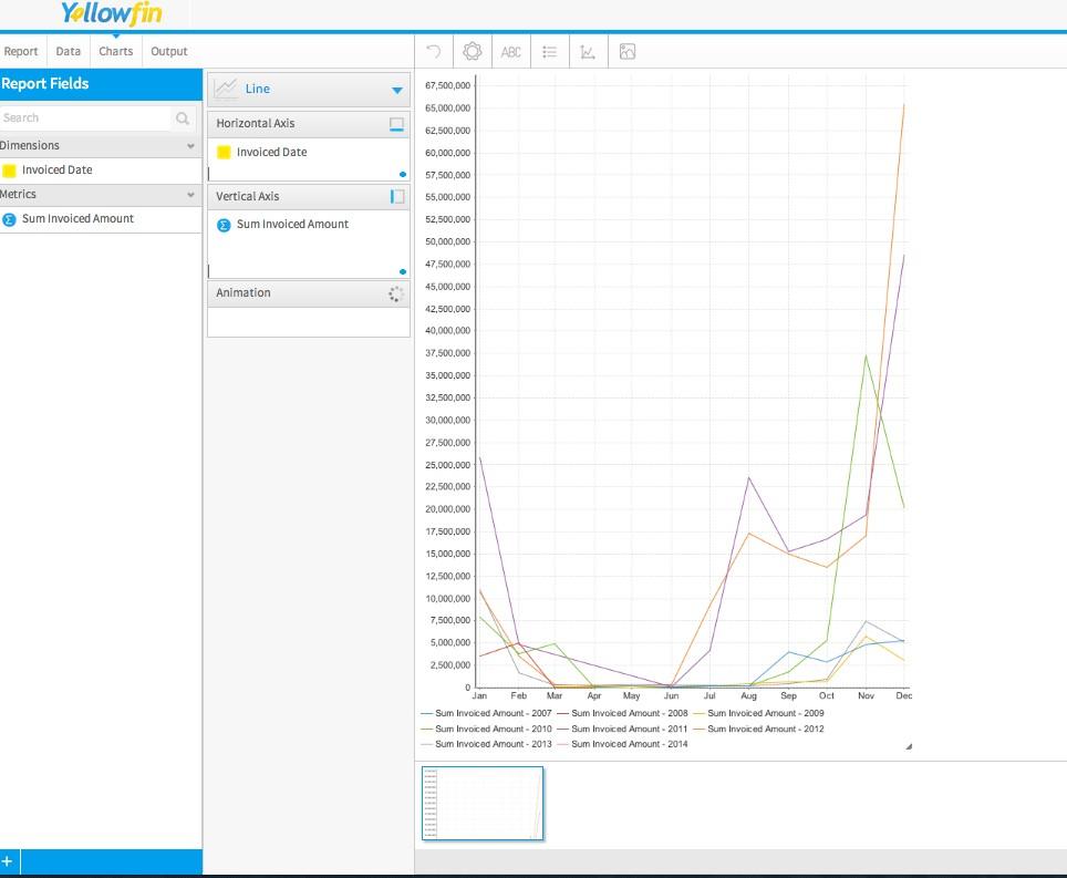
Re your first query on the line charts I just wondered what version and build you are using. I have just tested (YF 7, BUILD 20140528) creating a line chart using a time series. Is this desired effect you are after? Please let me know if this is not what you are after or if you want to send us details of how you are trying to set up the chart and we can assist further.
Re you second query re the Vertical Column chart, I have had a look into this and an enhancement task has been created (TASK ID: 158508). I currently do not have an ETA on this but hopefully it will be considered for a future release.
Please let me know if you have any further questions.
Kind Regards,
Katie
Hi Katie,
Yes, I want to colour them differently, however I want to be based on a category field instead of the year comparison example. As you said, I could do it for column and horizontal charts, and I don't see a reason not to do so for line charts. I don't want to have to display the data table differently so that the chart can be displayed in a certain way.
Ok, thanks. Yeah I think I might have logged that task through support before I started documenting all the tasks we are interested in and that is why I couldn't find it in the forums.
Regards,
Michael
Hi Michael,
Thank you for the extra information.
I have spoken to our Dev team and created an enhancement task (TASK ID: 164874) for the colour option to be added to the line chart.
Please let me know if you have any further questions.
Kind Regards,
Katie
Thank you for the extra information.
I have spoken to our Dev team and created an enhancement task (TASK ID: 164874) for the colour option to be added to the line chart.
Please let me know if you have any further questions.
Kind Regards,
Katie
Thanks Katie.